
TLDR
Financial brand design does not need to be complicated. The design should come from something real about the firm and look the same on the website, in pitch decks, fund reports and factsheets. It fails when the logo looks like every other finance logo, when each fund has its own brand, or when the website and the reports look like two different companies. Before investors trust you with their money, they look for signs that your firm is well run. Your brand is one of the first things they see.
Some finance brands make you trust the firm before you’ve read a word. Most don’t.
Good financial branding is clear, simple and easy to recognise. It stops working when it blends in with the rest of the market, or when all the effort goes into the logo and almost none into the pitch decks and reports clients actually read.
We’ve been designing brands and websites for venture capital companies, private investment offices and banks for more than 20 years. A few things matter every time: one clear accent colour, a brand built around something true about the business, and a design system that works in every document, not just on the website.
Related Articles:
What makes financial brand design work?
The brands that work are the ones that look the same everywhere people see them. Three things make the biggest difference.
Use one accent colour and stick to it
Most finance companies choose a dark, safe main colour. That is fine. The problem is that nothing on the page stands out.
When we designed the brand and website for Capricorn, a London private investment office, we wanted to keep a link to the wider Capricorn Group while making the brand feel more modern. We kept the group’s dark green, but used it sparingly next to light, neutral colours. Then we added a stronger orange for contrast.
Our tip: the accent colour should cover less than 10% of a page. Use it for the one thing you want people to notice, like a button, a key figure or a line under a heading. Use it everywhere and it stops standing out.

Start with the company, not the brand
Build it around a fact about your firm that competitors can’t claim. Not words like trusted or established. Anyone can say those.
Write down three facts about how your firm actually works. Not values. Facts. Where you invest. How many companies you invest in each year. Who your clients are and how they usually find you. Then ask yourself which of those facts could shape the brand. It could be a shape, a type of image, a colour or simply how the pages are laid out.
A firm that invests only in early stage companies might use rough sketches and working notes instead of photos. A firm that has worked with the same families for decades might take a quieter, more bookish approach, with more text and fewer graphics. Neither is better. They just reflect different companies.
Here is a simple test. Can you explain the visual idea in one sentence that connects it to your clients?
- Rough sketches, because we invest before there is a finished product. Good.
- Blue, because blue means trust. Not good. Every bank could say the same thing.
Design for the places clients see your firm
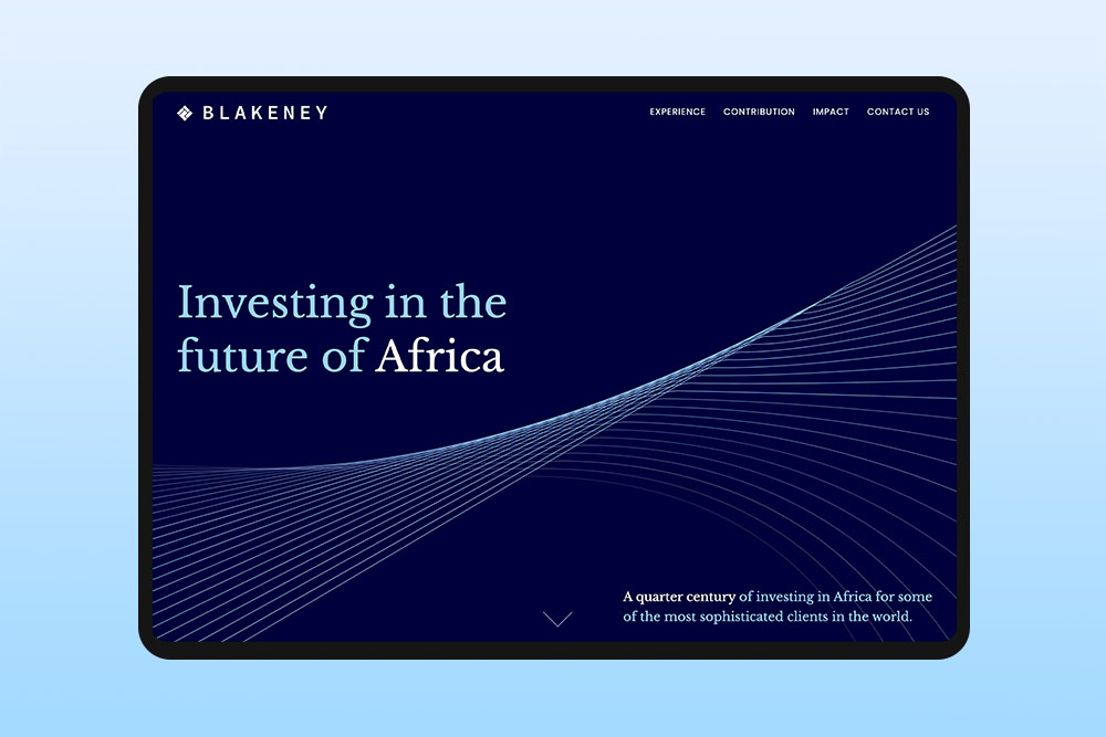
Blakeney is an institutional investor working across Africa and the Middle East. They keep a low profile and do most of their business face to face. There wasn’t much content to work with, so we didn’t try to fill the gaps. We created a simple brand in two shades of blue and a one-page website.
Their manager later told us:
The brand identity, website design and the assistance that Reactive have provided with our company reports have all been well received by our target market.
Look at the reports. For a firm that does most of its business in person, the document on the meeting table can matter more than the website. The website mainly needs to show that the firm is real and give people a place to find out more.
Think about where a new investor will see your firm in their first three months. The meeting. The pitch deck. The quarterly letter. LinkedIn. The website. Put your time and money into those things first.
How should a financial brand look in pitch decks and reports?
It should have clear rules, just like your logo. Investors spend much more time looking at your reports than your logo design. But most brand guidelines we see have pages on logo spacing and nothing about charts.
A fund report can be full of charts and tables. If there are no rules for them, every analyst will make them differently.
Set rules for charts, tables and numbers
Decide these once and add them to your brand guidelines:
- Chart colours. Choose four or five colours and always use them in the same order, with your main colour first. Make sure they are easy to tell apart when printed in black and white.
- Tables. Use light lines between rows and no vertical lines. Align numbers to the right so the decimal points line up.
- Numbers. Use either a minus sign or brackets for negative returns, not both. Decide how many decimal places to use. Write either “£m” or “£ million” and use it consistently.
When page 3 shows −2.4% and page 9 shows (2.4%), even though both mean a negative 2.4%, the report looks like it was put together by two different people. Readers who check numbers for a living will notice.
Hand over templates, not a rulebook
The analyst putting a deck together at 11pm isn’t going to read a 40 page brand guide. They will open the last deck and copy it.
Give them the templates they need: a PowerPoint template, a report template, a factsheet and an email signature. Make sure they all work before you hand them over. Otherwise, your documents will slowly start to look like they came from different companies.
What doesn’t work in financial brand design?
Most problems come from copying how other firms look instead of showing what your firm is actually like. They also come from making design decisions that don’t work well together.
Logos built on finance symbols
Lions, pillars, globes and arrows pointing up are some of the most common symbols in finance logos. They tell people you’re a financial firm, which they already know. An upward arrow can also look like a promise about returns, which is not something a regulated firm should suggest.
You have two better options. First, drop the symbol and put the effort into the name itself, with a good font, careful spacing and maybe one small detail in a letter. Some of the strongest finance brands are just the name, done well. Second, keep a symbol, but base it on something real about the firm, such as where you invest or how you work. If the symbol only says finance, it isn’t doing much.
Initials in a box
Three letters in a square or circle are one of the most common logos in investment. Put 40 of them on a conference sponsor wall or in a data room and they all start to look the same. Initials only work when people already know the firm. For a young firm, write the full name.
Should each fund have its own brand?
Usually not. If the firm launches Fund II, an advisory business or a co-investment vehicle, they don’t all need a completely new logo and visual style.
Keep one main brand and write fund names in the same font. If you need to tell the funds apart, give each one a colour and use it on things like covers and charts. If every new fund gets its own brand, the firm can end up with several different identities that don’t look related. It also means more work and more design to keep everything up to date.
Letting every partner vote on the design
Five partners can mean five favourite colours and a compromise that nobody really likes. Agree on the brief first: who the brand is for and what you want people to think when they see it. Then let one person make the final decision based on that brief. It’s much easier to have those discussions before any design work starts.
Why does design matter so much for financial companies?
In finance, people can’t see the work behind the service. An investor can’t see how you make decisions or how carefully you check an investment before they commit. They have to judge the company from what they can see, including the documents you put in front of them.
When the deck, report and website all look like they belong to the same company, it shows that someone has paid attention to the details. When the fonts, colours and number styles change from one document to the next, it can make the firm look less organised. Investors are trained to spot small differences. They are going to notice them in your documents too.
Time is another reason. Most firms raise money over many years, and investors see the brand again with each new fund. If you base the design on a trend that is popular today, it might look old in a few years. If you base it on something true about the company, it is more likely to last.
Three tests to run before you financial brand design launch
A brand can look great in the agency’s presentation but still not work well day to day. Try these tests before you approve it.
Shrink the logo
Look at the logo at 16 pixels wide, about the size of a browser tab icon. Also look at it in the round LinkedIn profile picture. Thin lines and small text disappear first. If the logo doesn’t work at that size, ask for a simpler version.
Give the template to your most junior person
Give them 30 minutes to make a five slide deck. If it doesn’t look right, fix the template, not the person.
Open everything on a phone
An emailed deck might be opened on a phone between meetings. If the charts are hard to read, change the document.
Final thoughts on financial brand design
A strong financial brand isn’t one perfect logo. It is a simple set of choices that hold up in the meeting, the deck, the report and on the website, year after year. Most companies are closer to that than they think. Often they need tighter rules and better templates.
If you are not sure which one you need see our brand identity design services, or start your project and tell us about your firm.

Andrea is our Marketing Manager at Reactive, responsible for shaping the agency's brand presence and ensuring smooth communication between clients and our creative teams. With a sharp eye for detail and strong organisational skills, she helps translate client ambitions into clear, actionable briefs that set every project up for success.