TLDR
AI-built websites often look the same because the tools learn from the same popular websites and tend to repeat the same design choices. The result is the same fonts, layouts, colours and sections across different businesses. To make your site feel like yours, make a few clear choices. Use a colour and font with some character, build the page around your own story, use your own images and give the site one thing people will remember.
A website can be perfectly designed and still feel like nobody made it.
AI website builders often end up creating the same kind of websites. Same font. Same big centred headline with two buttons under it. Same three little cards with icons. Same soft purple gradient. The way out is to make more specific choices. Use a colour with personality, choose a typeface that feels different, build the page around your own story, and use your own photography instead of stock images.
The difference is in the details. A few thoughtful decisions can make a website feel like yours instead of another AI generated template.
Related Articles:
Why do all AI built websites look the same?
Because they are trained to copy what already works. AI website builders have seen millions of websites. When you ask one to create a site, it does not start from scratch. It looks at patterns from existing websites and creates the version it thinks will work best.
The result is often the safest option, something familiar, but not always something unique. It is fine if you want to blend in. Not so useful when you want your website to stand out.
And it keeps repeating. A pattern becomes popular, so the tools copy it, so more sites use it, so it becomes even more popular. The more common it becomes, the more it gets copied. That is why the same look has spread so quickly over the last two years.
The tells you can spot in three seconds
You start to see the same patterns everywhere:
- A centred headline with a short line underneath and two buttons, one filled and one outlined.
- Three cards in a row, each with a simple icon.
- A soft blue or purple gradient.
- The same font, usually Inter. Once you notice it, you see it everywhere.
- A row of grey client logos and a scrolling testimonial.
- Rounded corners and a light shadow on every box.
None of these things are wrong on their own. The problem is when they all appear together, on every website, in the same order. People have seen this layout many times before. It does not tell them anything about who you are or what makes you different.
AI can make a website but it cannot make it yours
The tools are built to make things look finished, not necessarily make them right. An AI builder is good at creating something that looks clean and complete in a few seconds. But it does not know if the design fits your business, your audience, or what you are trying to say. So it plays safe. Safe looks clean. Safe also looks like everyone else.
A designer might choose something that feels different at first, but makes the whole site feel like it belongs to you. AI usually chooses what feels familiar.
Does it matter if my website looks like everyone else’s?
Yes, more than it used to. AI makes it very easy to build a website that looks clean and finished. But now that so many websites are being built this way, clean and finished is not enough. The same layouts, fonts, colours and sections keep showing up. They work, but they also make it harder for one website to stand out from another.
The safe choice used to be the low risk choice. Today, the safe choice can be the risky one. When your website looks like every other AI built web design in your industry, people have no reason to choose you over someone else. And when there is no clear difference, they compare on price, or they move on.
The limitations of AI‑generated design
Many AI‑built sites are shaped primarily by the prompts provided, but they often miss out on deeper strategic groundwork (e.g. competitor research, target audience analysis, sitemap reviews and detailed wireframing for content placement and user journeys). These steps are essential to ensure the foundation is solid and tailored to the right audience before any design work begins. This is missed by majority of users using AI to design their websites.
Without this, an AI‑generated site isn’t necessarily designed with the end user in mind. In contrast, a skilled web designer will make hundreds of small, informed decisions based on a deep understanding of the target audience, resulting in a more thoughtful, tailored website that resonates better and ultimately converts more effectively.

How do you make an AI-built website look unique?
You don’t need a hundred changes. You need a few brave ones. Here is where the difference actually comes from.
Commit to one colour your rivals would avoid
Most finance sites hide behind navy and grey. It feels safe. It is also invisible. Pick one accent colour and use it with confidence.
When we designed the site for Capricorn Private Investments, a private investment office managing $3bn for families and institutions, we used their dark green as a base and added a strong orange accent. Orange is not the obvious choice for a wealth manager, which is exactly why it works. It feels warm, confident and is exactly the kind of branding that makes a firm easy to recognise.

Change the font
Fonts have a big impact on how a website feels. Default fonts are often one of the first signs that a site has been built from a template. Choosing a typeface with more character can change the whole mood of a site. For Capricorn, we chose a precise sans-serif that feels confident and trustworthy. The font was a choice, not a default.
Change the order of the template sections
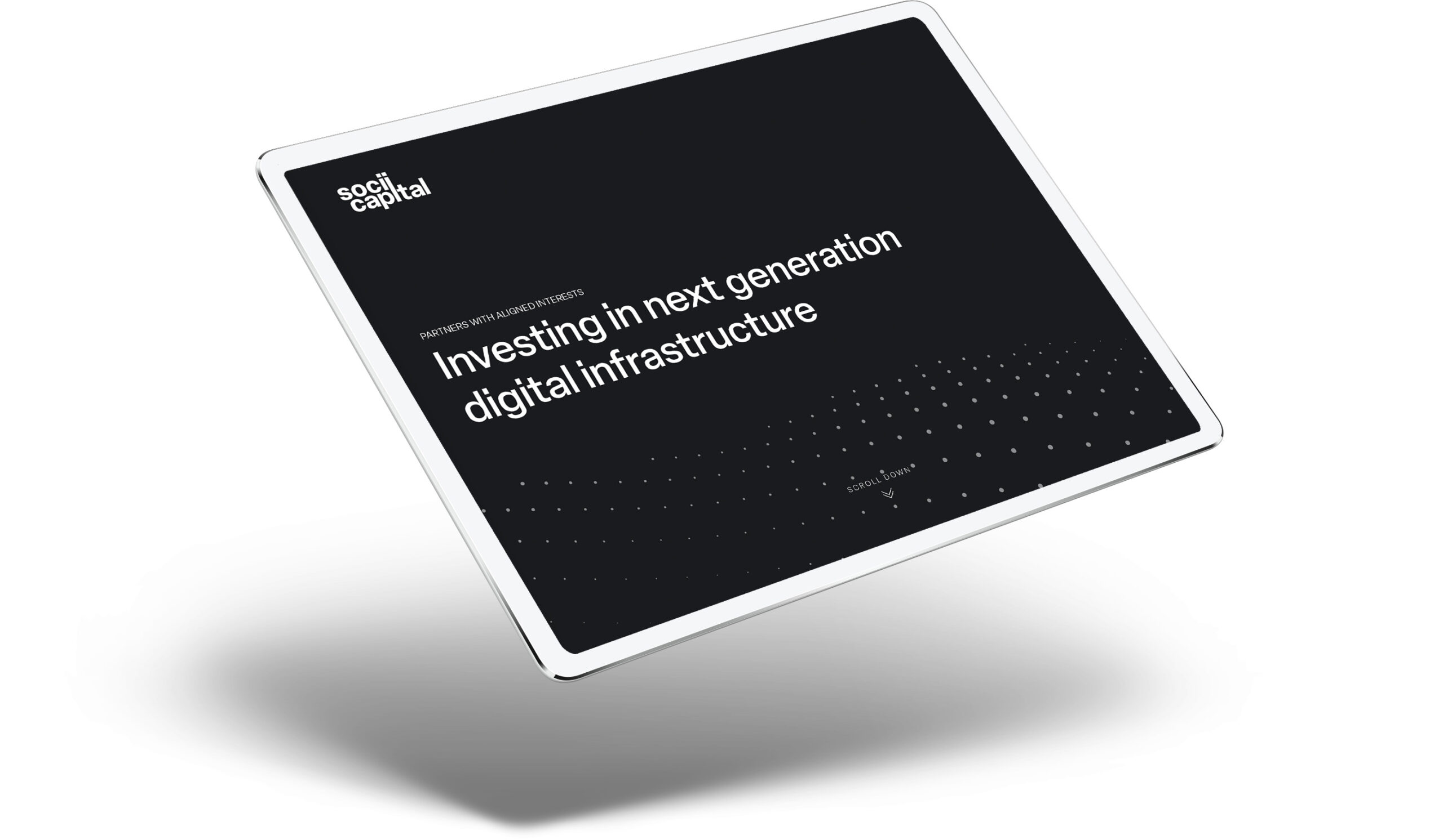
Most sites use the same sections in the same order. You don’t have to. Build the page around your story instead. Socii Capital, a venture capital firm that invests in digital infrastructure companies, didn’t need ten sections. We built them a simple one page site in black and white, bold, clear and without the filler.
Ask yourself what your site really needs to say. Then remove anything that is there just because most sites have it.
Use your own images, not stock
Nothing makes a site feel generic faster than stock photos of people shaking hands, or AI images that people can tell aren’t real. Research shows that people pay more attention to real photos than generic stock images. Your own work is the one thing your competitors can’t copy. For interior designer Natalia Miyar, whose studio works in London and Miami, we kept the text to a minimum and used full screen photos of her projects instead. When you have work worth showing, you don’t need much else. If you have your own photos or real work, use them. Your own people, places, and projects will always feel more real than stock images.

Don’t use pure black on pure white
This is a small detail, but it makes a difference. Most sites use pure black text on a pure white background. It can feel harsh, and it’s also the default choice. Try using a very dark grey instead of black, and an off-white instead of pure white. It feels softer right away. It only takes a few minutes, but it can make a site feel more designed and less like a generated one.
Pick one signature move, then stop
The best sites usually do one thing well. They don’t need ten animations and effects all competing for attention. In fact, adding more animations and gradients can make a site look more generic, because everyone uses them. Start by taking things away, then add one detail that feels right for the brand. Natalia Miyar’s site starts with a simple animation of her logo. It’s quiet, but it gives the site a clear starting point.
Art Turner, a cultural agency that connects artists with luxury brands, takes a different approach. The site uses a lot of white space, so nothing feels crowded and each section has room to stand on its own. You don’t need to add more just to make a site feel interesting. One good idea is usually enough.

Use one full block of colour
Most generated sites are white, white, white, with a faint gradient if they are feeling brave. Try giving one section a solid colour across the whole background, your brand colour, not a pale wash. It breaks up all the white and gives that section some weight. It also makes the site feel more intentional. One bold colour block can be the thing people remember.
Make it yours
Standing out isn’t about spending more or adding more. It’s about making a few clear choices: using a colour most firms would avoid, cutting sections you don’t need, or building the site around one strong idea. AI will get better at making things look good and familiar. But it won’t decide what makes your site different. That still takes a person.

Andrea is our Marketing Manager at Reactive, responsible for shaping the agency's brand presence and ensuring smooth communication between clients and our creative teams. With a sharp eye for detail and strong organisational skills, she helps translate client ambitions into clear, actionable briefs that set every project up for success.