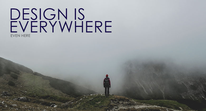
Design is everywhere. Stop for a second. Take a look around. Wherever you may be in the world it is likely that the design of the space around you has been carefully orchestrated for certain utilitarian or atmospheric value. Yes, that’s right, it is all part of a plan!
Whether you are in a hipster cat cafe with reclaimed wood furniture playing whimsical folksy tracks or if you are in queuing in a airport departure lounge surrounded by sign posts and instructions, every aspect of your experience is intentional…and it’s all down to design.

As mentioned on thecreativeindustries.com
‘Design is all around you, everything man-made has been designed, whether consciously or not’.
Even if you are all alone in the middle of nowhere, some type of design will be contributing to your experience – for example, your weather proof jacket or the infinitely useful Google Maps app (signal permitting!)
You only need to look right in front of you to foresee the ‘Z’ space that surpasses the depth of your digital device. Envisage that ephemeral digital space that lives beyond the screen, which whoishostingthis.com describes as being a space that is:
‘Spread across almost 75 million interconnected servers …connects more than five billion computers, smartphones, and other devices…!’
The Internet! Wherever and however you click, hover or scroll, every single interaction on the web has been negotiated and interpreted through website design and development.
A predetermined world
If the way we see and interact with almost everything is somehow part of another plan or underlying objective, then how are we supposed to develop our own interests and perceptions of the world and more specifically, the digital world?
As humans, we have huge desires to curate interesting experiences for ourselves, design informs and massively contributes to how we approach this. The specific choices that we make, and more quantifiable, the things we buy, eventually shape the way we (in a broad sense) function. We are living in a consumer driven world. A consumer driven world, which is fuelled by clever design.
It’s big stuff. Design is the man made world, as we know it. Furthermore, as our lives become increasingly more digital, with websites, apps and our devices synchronising ever closer with our most intimate thoughts and feelings, it is ever more prevalent that digital design is slowly infiltrating our psyches and somewhat exploiting this elasticity of human thoughts.
Thankfully this exploitation is used positively to attempt to create a digital framework by which online interactions and navigation is completely intuitive. This is a concept which over the last decade has become more efficient and decidedly more significant as the internet becomes more ingrained in the development of younger generations.

If we are thinking of the psychology of digital design, than there a few key components or fundamentals, which we should address.
Colour theory
One predominant player in the psychology of design is colour theory. Let’s start with the infamous colour wheel. Many designers use the colour wheel (shown below) to choose complimentary colours, to utilise within a website theme, for example. Others use the wheel to choose a colour palette for which they will use as the basis of a branding design.
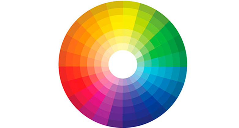
Whichever way the colour wheel is used it is first and foremost a guide to help engage the user on a rudimentary level. Beyond that foundational level of understanding, however, colour can be very suggestive, with people deriving meaning from social, historical, cultural or symbolic associations of colour.
The Psychology of colour is probably the most obvious design perception of all . and Jill Morton (psychologist and brand identity expert) says:
“There are hardwires we have about colours, Blue is associated with water, green with grass, red is fire.”
Red can also be associated with love, lust, passion, desire as well as heat, pain, death and warning. Both lines of association can be interpreted differently dependent on the way the colour is manifesting and what our ‘hardwires’ mean to us.
Two other systems used by designers within the colour wheel, is colour harmony or complimentary colours. Colour harmony is the process of design where a designer utilises three colours that sit alongside one another on the colour wheel, which compliment each other in a subtle way. This might be a way to utilise various colours without creating a dominant style within an umbrella website for example.
Complimentary colours on the other hand are usually colours which sit on the opposite end of the spectrum from one another, creating quite a dynamic and eye catching effect. This might be used within a logo (think McDonalds) or perhaps to make text stand out on a business card.
Semiotics
For many visual thinkers the word semiotics is narrowly understood yet thoroughly practiced across the board of design.
Semiotics is, in a broad sense, the science of understanding signs or systems of significance. This element of our psychology, despite being changeable over time, is a point which can be and needs to be navigated carefully by designers. In web design specifically, semiotics can be applied to the design of an interface, the navigation of a page or the overall understanding of the intuitiveness of the website.
Daniel Chandler author of Semiotics: the basics states:
“The study of signs is the study of the construction and maintenance of reality. To decline such a study is to leave to others the control of the world of meanings.”
This in a sense encapsulates why digital design needs to be sympathetic to semiotics. In a way, all design work should be approached with an awareness of how it could potentially be interpreted.
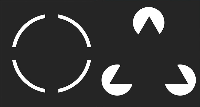
Law of Closure
In design, the law of closure or the gestalt theory in psychology is something that appears to be complete. As explained in explorable.com, law of closure is when ‘the brain tends to perceive forms and figures in their complete appearance despite the absence of one or more of their parts, either hidden or totally absent.’
In digital design this approach can be used to draw specific attention to a particular image or space on the web page.
“Unpleasant design”
Unpleasant design is in many ways the opposite of useful design. The term started out life as an initiative to collect examples of unpleasant design in society by Gordan Savicic and Selena Savic. Although a term derived for the description of mainly physical objects in public spaces, the ethos and philosophy behind it also describes something that can occur when digital design is approached with ignorance. Gordan and Selena describe it as:
“[Unpleasant Design] is an umbrella term for all objects, devices and strategies aimed at influencing behaviour of people in ways that benefit particular social groups. It understands a design approach in which social impact is an inherent feature, preceding ergonomics or usability in the design brief.”
In thinking about digital design with this ‘unpleasant design’ hat on it
A little about logo design
The facts:
- 97% of purchases are made from the interpretation of a visual image
- Logo colour can sway the choice for people, in making purchases
- 80% of people agree that colour increases brand recognition
- Psychologist shows that colour helps improve learning, readability, understanding – thus why not many logos are monochrome.
- For monochrome logos, typography is sooo much more important in understanding the business.
Language and Visual Thinking
Language is not just verbal. In the digital world, it is so much more. In fact, all written language originated in picture representations of objects (think hieroglyphics and cave drawings)!
Visual symbols/imagery are intrinsic to human nature. They inform our creative imaginations, which is embedded not only in visual perception, but amazingly enough in what we hear, what we taste and what we smell!
Speech and visual symbols work together seamlessly. The way in which we interpret them in synchronisations is how we exchange knowledge. It’s imperative that online platforms integrate these parallel modes of communication, in a way that is both scientific and artful. Your online platforms need to embody the best of both. For more on this, read our previous blog on Visual Story Telling.

The Neuroscience behind it all
According to leading neuroscience experts, digital design needs to first capture our attention and then engage our emotions for us to make a connection with it. As noted on advertising company Ocean Outdoors website; ‘A strong emotional response drives memory encoding, and this is key for any communication, because memory encoding correlates with subsequent purchase behaviour.’
To conclude
Design is something that infiltrates our minds whether we want it to or not. So it is our duty as web and graphic designers to approach this fact with care. Here at Reactive Graphics, we aim to work closely with our clients to create digital spaces that reflect and work for the audiences that they are aimed at.
If you want us to develop your next website or marketing strategy, then please get in touch!