Web design agencies and graphic designers are always trying to come up with creative solutions to encapsulate the identity of a brand into one clear, memorable logo design.
Unless you are a world renowned company with an army of clients or consumers then it is unlikely that your brand will be recognisable with only an obscure symbol or shape as your main logo.
This is why typography is taking the logo design scene by storm and it is becoming increasingly important that web designers challenge the boundaries of everyday typefaces by experimenting with contrasting font families, letter tracking and image manipulation in order to create memorable, long-lasting brands.
Sometimes referred to as wordmarks these text reliant logos can really make or break a branding or marketing campaign.
Logo design
Reactive Graphics believe the logo to be the face of your company. A company logo is the quickest and most direct way of representing a business; it can instill core company values and strengthen your brand identity. Think of your profile picture on Facebook. Generally you choose a photo that represents you at your best and usually the photo will capture and share something that is intrinsic to you as a person. Party girl, family guy or serious office professional, your profile picture will usually give something away.
The general rule of thumb for a business logo is no different. You want your logo design to represent your business and the personality of the company. Whether that be to suggest a professional real-estate firm, a serious corporate brand or a energetic exercise company your logo should whet the appetite of a potential client by firstly engaging them and then reeling them in.
Here are some of our wordmark typography logo designs. View more here.
Phoenix Spree Here we married the ‘rising from the ashes’ Phoenix image with a strong sans serif font. Using bold and regular typefaces and all caps in a strong blue, made for a clean crisp business-like logo.
![]()
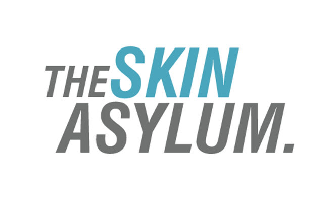
The Skin Asylum The logo is edgy and bold to reflect a young and dynamic company that aims to empower people, with clean clinical colours to reflect the business.
Hampton Mortgage Services The logo incorporates a well balanced sans serif business like font with the H of Hampton designed like the facade of a two story building. This fits in with the businesses brand and services.
![]()
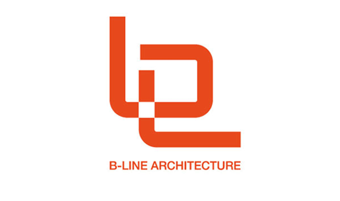
B-Line Architecture This logo was created for a start up company and required a strong company name line with an image that reflected the business. The company initials were formed into a graphic design that incorporates curves and lines to symbolise structure and form, two aspects of architecture that the company wanted to show.
Our wordmark design process
At Reactive Graphics we have worked with numerous clients who wanted logo designs that were clear, simple and timeless. Within this is the need to create a brand that works well across various digital platforms and a logo that confidently speaks for itself. With a 10 year history of launching successful businesses online, we have a tried and tested process that we adhere to every time.
Firstly we find out about your business by understanding your product or service and building up a profile of your target market. Once we understand your audience we can decide what the overall theme of the logo should achieve, then we get to work with the creative stuff. We select a typeface, identify your company colours, and build the brand identity around you as people and the overall ethos of the company. Once the Wordmark has begun to evolve, we offer the client a few variations understanding difference in taste and style. By this point the brand identity is usually pretty well established and there aren’t many modifications that take place.
Key considerations when designing a logo include
- Perfect fit with your target market/industry sector. We have experience in designing logos for B2C and B2B
- Logo designs should scale and not lose detail when you make them smaller
- Logo designs should look good in black and white (for faxes, copies, etc.) as well as colour
- Logo designs should look distinctive and memorable
To read more about our design services click here.
What’s your type?
When designing a typographical logo one of the first things to think about is the font. Below are some famous typographic logos that you may recognise designed in particular font styles.
Serif fonts
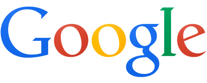
Serif fonts have a line at the end of each stroke, these are usually the fonts which symbolise professional, elegant, no-nonsense brands. Serif fonts pay homage to traditional hand typesetting. Ruth Kedar, designer of the world-famous Google logo chose to based the design on the Catull serif typeface, experimenting with various different colours. Kedar says ‘We ended up with the primary colours, but instead of having the pattern go in order, we put a secondary colour on the L, which brought back the idea that Google doesn’t follow the rules.” Which shows that a very simple design can still incorporate a company’s ethos.
Sans serif fonts
Sans translates from the French ‘without.’ So basically a sans serif font is a serif font without the flicky bits. When used this typeface appears crisp and modern in design and is often used for cool minimal brands and edgy social media logos. Social media giant Facebook has a wordmark based on the Sans serif Klavika font apparently a font created for the 21st century.
![]()
Script fonts (and italics)
Most script fonts are generally formal and decorative.They give off the vibe of being sophisticated and sometimes girly, but if used correctly can also appear playful and personal. The type appears to flow like liquid which is possible why it has been the typeface of choice for beverage giant, Coca -Cola for many years.
![]()
5 tips to achieve great logo design
-
- Complementary fonts
When combining different fonts you need to consider the way the letters will sit together in a space. For example, pairing a script with a handwriting font or italic might not work due to the height and direction of the letters. An experienced designer will usually choose a contrasting font (if any) like a strong sans serif typeface alongside a swirly script text. - Number of fonts
There are so many beautiful fonts available these days, and many ways to manipulate them to get the exact look you are going for. But it is essential that you use fonts sparingly, particularly in a logo as otherwise it will appear messy and inconsistent. One or two carefully paired choices will make for a strong eye-catching logo. - Tracking, kerning and line spacing
Tracking is the overall letter spacing between a line of letters. Kerning is the space between each individual letter. Tight tracking, especially with a bold font, can be very impactful. Loose tracking can be a beautiful treatment for sophisticated, minimal look – particularly with all caps. Line spacing can be used as a defining design style, it can also be used to balance out a logo that incorporates an image if used correctly. - Font weight
Traditionally a heavy-weight font is bold and strong and a light-weight font is elegant and soft. Consider these definitions when explaining the ethos of your business. Of course colours and complementary fonts can alter the appearance of these fonts. - Capitalisation
Uppercase can create a more streamlined look. Capitalisation also creates a sense of shape and authority. It can also appear ‘shouty’ if combined with harsh colours, so it is to be used carefully.
- Complementary fonts
Getting really creative…
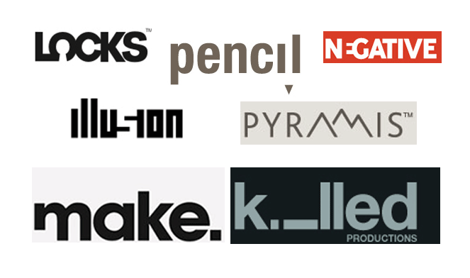
Many designers choose to combine typeface designs with certain images that correspond to their business service or what they represent. This can be achieved by cleverly changing one letter in the logo to an image of a similar shape, always ensuring that the text is still legible.
This requires out of the box thinking and precise design techniques. Sometimes letters are shown in the negative space in order to create an illusion of depth within a logo or even skewed to form a completely different shape.
This technique is used by many innovative designers and it is a very clever way to capture the essence of your company, particularly if your company name is a little obscure or you simply want to add a creative twist to your logo. Here are some more examples of this technique in logo design.
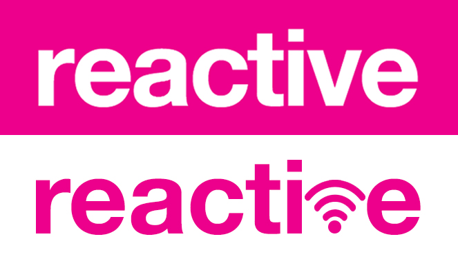
Here is an example of our existing Reactive logo, re-imagined with a wireless logo replacing the v. This incorporates the fact that our services are in web design and that we aim to promote your online identity.
Our custom logo design service is bespoke to cater for your needs. Once we’ve agreed a design brief where we take care to understand your target market and design preferences, we produce a number of custom logo design concepts.
The logo design concepts are created by more than one creative designer with experience in a wide variety of industry sectors. Once a custom logo is finalised, we can provide it in all industry standard formats for web and print use as well as JPEGs and PNG files for use with Microsoft software such as Word and Powerpoint and online.
If you would like Reactive Graphics to design your next logo, then please get in touch.
Or alternatively take a look at our web design portfolio and logo design portfolio.
#wearereactive

Andrew began his career in web design and development in the late 1990s. His eagerness to embrace the medium saw Andrew setting up Reactive Graphics in 2004. With over 20 years plus working as a London web designer supporting a wide range of clients, Andrew’s experience in web design, web development and graphic design have helped him to build a growing business.