Mobile web design for ambitious businesses
Leading mobile web design agency creating mobile-first websites that look immaculate on every device.
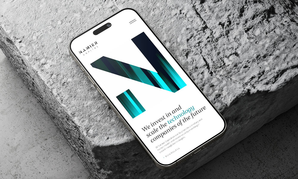
Namier Capital
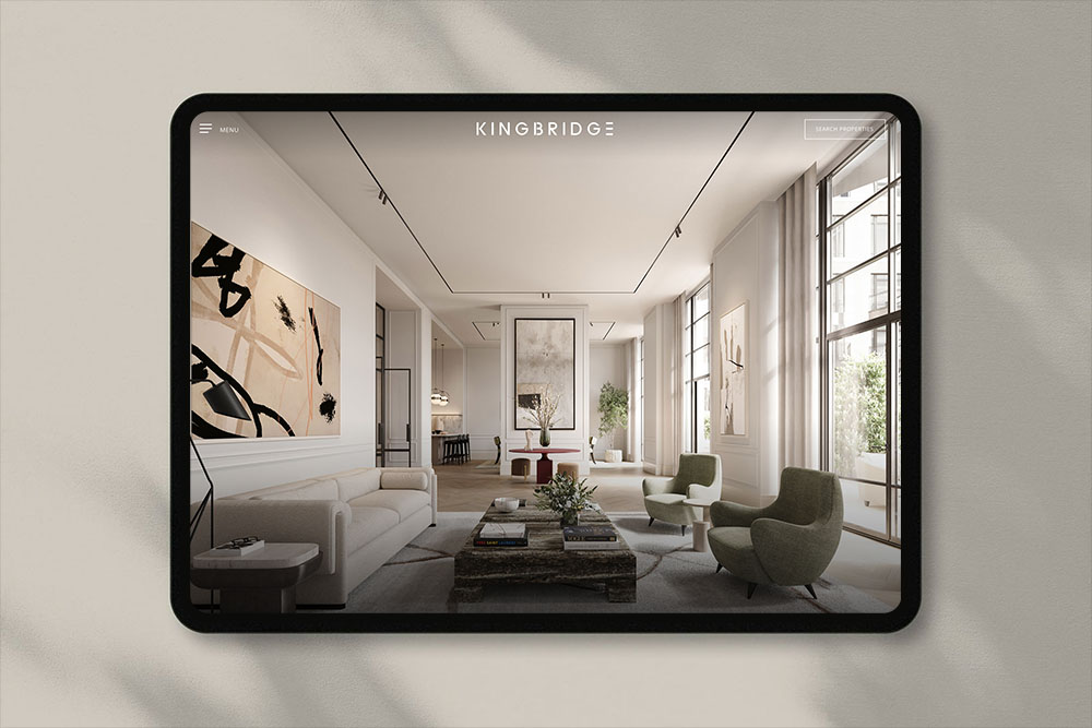
Kingbridge
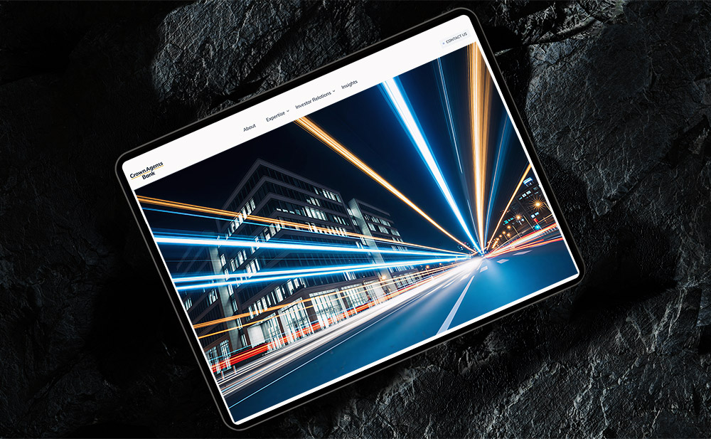
Crown Agents Bank
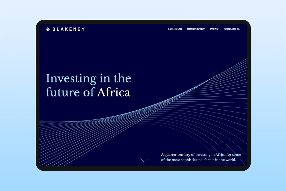

Kreos Capital

Health Axon

Aquila Films
Mobile web design
We design mobile-first websites that work as hard on a phone as they do on a desktop.
Mobile is where most people will see your website first. With more than 60% of web traffic coming from phones, the small-screen experience is no longer secondary, it is the version of your site that matters most.
Many websites are still made for desktop first and then changed for mobile later. We do it the other way around. We start with the smallest screen and decide carefully what content, layout and navigation are needed. Then we build up to tablet and desktop. Nothing is squeezed in at the end and nothing is removed just because there is no space.
Our mobile web design services
Mobile-first by default
No shrinking desktop layouts for mobile. We build for small screens and grow it up from there, so mobile isn’t an afterthought.
Performance optimisation
People on mobile leave quickly if a site is slow. We optimise from the start. We use smaller images, compressed files and clean code so pages load fast, usually in under three seconds and Core Web Vitals stay good.
Tap-friendly design
People use their phones one-handed and quickly. So we keep buttons, menus, and forms simple and easy to use with a thumb, not made for a mouse.
Device testing
A web design can look fine in a preview and still break on a real phone. We test it on actual iPhones, Android devices, and tablets, across different browsers, so it works properly in people’s hands when it goes live.
Accessibility on mobile
An inaccessible mobile site excludes a significant portion of users. We follow WCAG standards and web development accessibility guidelines, ensuring sufficient contrast, scalable text, and accessible touch targets.
Mobile SEO
We build with structured data and clean code so your site is easy to find, gets indexed correctly, and ranks well, without being held back by a poor mobile experience.
Your questions answered
Why choose our mobile web design services?
We have been building websites for over twenty years and understand how people actually use them today. Most visitors now see your site on a phone first, so we design for that from the start, not as an afterthought.
Every mobile site we create is tailored to your business and your goals. We do not use one size fits all templates. Andrew, our founder, is involved in every project from start to finish to make sure the work stays focused and consistent.
What is the difference between responsive and mobile-first design?
Responsive design means a website adjusts to different screen sizes. Mobile-first design means you start by designing for the phone and then build up to larger screens. The difference matters because a responsive site can still feel like a desktop page squeezed onto a phone, while a mobile-first site feels made for how people actually use their phones.
Will my existing website work on mobile?
In technical terms, the answer is probably yes – most modern websites are responsive. However, “working” and “working well” can be two very different things. Try opening your site on a phone and completing a simple task such as reading a case study, submitting a contact form, or finding your phone number. If anything feels slow or frustrating, you could be losing potential clients. We’re happy to review your site and give you a straightforward recommendation – whether that’s minor updates, a targeted redesign, or a full rebuild.
How do you make sure a mobile site performs well?
Performance is part of the design process, not something fixed at the end. We think about images, fonts, animation, and code from the first wireframe with mobile speed in mind. After launch we keep an eye on Core Web Vitals and keep improving the site as browsers, devices and Google change over time.
Do you provide support once my mobile site is launched?
Yes. Our WordPress maintenance services cover updates, security, performance monitoring and small content changes, so your mobile site stays fast, secure and current long after launch.
Discovery
We learn about your company, vision & goals and understand your target audience and their requirements.
Planning
We craft detailed strategic roadmaps that align with your objectives, ensuring every step moves us toward your business goals.
Development
Our team brings concepts to life through innovative design and development, focusing on quality and attention to detail.
Launch
We execute with precision and provide ongoing support to ensure your project achieves its full potential in the market.
Services
Web design
Whether you are launching a new website or tweaking your existing site, our London web designers transform your vision to create impactful digital solutions. A contemporary digital presence can be a clear differentiator and create a memorable first impression.
Web development
We work with our clients to create websites that are user-friendly, achieve results and generate a return on investment. Our knowledge and expertise helps us to balance aesthetic appeal with functional design.
Brand identity
We help elevate businesses with a brand identity design tailored to their target market. A well-defined and consistent brand conveys professionalism, reliability, and expertise.
Digital marketing
Alongside our brand identity, London web design and web development offering, we will design and execute engaging campaigns to ensure your business gets the attention it deserves.
Hosting & support
We’re proud of the websites we design and therefore it’s equally important for us to preserve continuity of service. We routinely host our clients’ websites and provide routine maintenance to ensure your business is online 24/7.
Pitch deck design
Alongside our key services of web design and brand identity design, we also offer assistance with the design of pitch decks, financial reports, monthly newsletters, PowerPoint templates and business stationery.