TLDR
A boutique financial website is often the first thing an institutional investor sees. Before they read about your strategy or performance, they have already decided what they think of your company. Make your regulatory details easy to find, name the people behind the firm, and use real numbers instead of broad claims. Keep the design restrained: two colours, one or two fonts and plenty of space. Skip stock photography. Investors are not looking for a website that looks expensive. They are looking for one that has clearly been done properly.
A boutique financial website has one job, make it easy for institutional investors to take you seriously.
A boutique financial website should feel like it belongs in the same world as its investors. It needs to be clear, professional and specific about what the firm does. Institutional investors aren’t impressed by flashy websites. They want to see a business that looks capable and trustworthy from the start. The details that create that impression are often small, but they make a big difference.
We have been designing websites for boutique finance companies for more than 20 years, including venture capital, private equity and private investment offices. Here are some of the things we have found make the biggest difference, along with examples from projects we have worked on.
Related Articles:
What basic details do investors check on a financial website?
Before we talk about design, there are a few basic things institutional investors expect to see on every finance website. They are simple enough, but they are often missing or hard to find.
Make your regulatory details easy to find
Investors will often check your regulator, registration number, company number and registered address first. If they are buried on a page nobody can find, it can make your firm look less transparent. Put them in the footer of every page. It is a small detail, but it helps build trust.
Put your team on the website
No generic team photos. No unclear job titles. Show real names, real roles, proper photos and a LinkedIn link for each person. Investors care about the people running the firm. A weak team page can make a strong business look less established.
Be clear about where you are authorised to operate
If you are regulated or licensed in certain countries, show them clearly. Investors want facts they can verify, not broad statements about global or international coverage.
Use case studies to prove your experience
Anyone can put logos on a website. What matters is showing what you actually did for those clients and why they trusted you. The logo tells people who you worked with. The case study shows what you actually did.
What makes a financial website look credible?
A pension fund, endowment or fund-of-funds investor will review dozens of boutique finance websites. By the time they reach yours, they have a quick sense of what looks serious and what does not. The question is simple, does this firm look ready to manage institutional money, or does it still look like a small company trying to catch up?
Good design comes before good content
That judgement is made before they read a single word about your strategy. It comes from the details they see straight away – the layout, the spacing, the quality of the typography and whether the brand feels carefully built or quickly put together. Institutional investors know what established firms look like. Your website has only a few seconds to show you meet that standard.
You can have great content, but if the website looks amateur, many investors will never get that far.
Should a financial website look expensive?
Many boutique finance firms try to make their websites look expensive. They use dark backgrounds, gold colours, large serif headings, and slow video banners. Institutional investors have seen this many times before. Spend less time trying to look premium and more time making the website feel well built.
Good design is about getting the small details right. Everything should feel like it is there for a reason. The spacing is consistent. The layout is tidy. The typography is clear. Nothing looks out of place.
When we redesigned the brand and website for Capricorn Private Investments, we kept everything simple. The homepage opens with one short headline and a brief explanation of what the firm does. Just below that is the information investors want to see: the firm was founded in 2017 and now manages $4 billion for a small group of families and institutions.
There are no stock photos, gold colours, or large video banners. The design gives the content room to breathe and the regulatory details are easy to find in the footer. The website does not try to look expensive. It is clear, well organised and professional, which is what investors are looking for.

What colours and fonts work best for a financial website?
Fewer colours than you would think. Often just two. Many firms think more colours will make the website look more expensive. In boutique finance, a simpler approach usually works better.
Why we built Socii in black and white
For Socii Capital, a venture capital company, we designed a one page website using only black and white. That was a deliberate choice. Instead of adding more colours and effects, we kept the design simple and focused. Black and white gives the website a clean, professional look. In this case, using less made the website stronger.

The typography rules
Pick one font or at most two. Use different sizes and bold text to show what is most important instead of using many different fonts. Leave enough space around the text so it is easy to read. Avoid fancy or playful fonts because a finance website should look clean and professional.
Use body text that is at least 18px or larger. Many finance websites use text that is too small because they want to fit more on the page. Bigger text is easier to read and helps busy investors find the information they need faster.
Use line spacing of about 1.5. When the lines are too close together, the text is harder to read. A little more space makes the page look cleaner.
Use only two or three font weights. Regular text and bold text are enough for most websites. Too many different weights make the text harder to follow.
How do you design a financial website with no photography?
Boutique finance firms often do not have much to show. Most deals are private, there is no product to photograph, and some firms do not even have good team photos. As a result, many websites use stock images of office buildings, handshakes, or generic business graphics. People who invest for a living see these images all the time and they do not add any trust.
When we built the site for Namier Capital, the firm did not have any photos to use. Instead of adding stock images, we created a clean, high-tech design and let the website itself do the work. On the homepage, the logo moves into a simple animation of the letter N. It is a small detail, but it gives the site its own character without needing any photos. The site was later nominated for an Awwwards award, and it never needed a single stock image.
Create interest through typography, layout, colour and motion. In our experience, a strong design without images feels more memorable than a generic website filled with stock photos.
How can a small investment firm look more established?
Small boutique firms sometimes try to present themselves like large institutions. They use corporate language, photos of big teams, and broad claims about global reach. Experienced allocators can tell when the website does not reflect the actual firm.
Every section should have a reason
Adding more pages does not make a small firm look bigger. A clear website with five strong pages is better than fifteen pages that add little, including an old blog and an empty press section. A focused site feels more confident because because nothing is there just to fill space.
Use real numbers, not vague claims
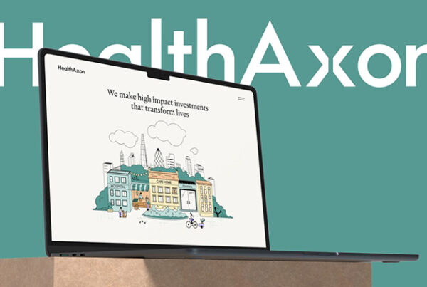
Specific numbers are much stronger than general claims. HealthAxon puts clear numbers on the homepage: 7 local authority partners, a 3.5x social return on investment and 61 employees. These figures say more than a long mission statement because investors can judge them for themselves. Real numbers show confidence.

Explain your approach in plain language
Many small firms use jargon to sound bigger than they are. The best firms do not need to. They explain what they do in simple terms because they understand it well. If an investor cannot quickly understand the business, the website is not doing its job.
Get the small brand details right
Small details are easy to miss. The favicon, LinkedIn preview, 404 page and a logo that looks good at every size all matter. Big firms pay attention to these things. Small firms often do not. A broken preview when someone shares your site can be enough to make the site feel unfinished.
What should a financial website show first?
The first screen is the most important part of the website. Use it to answer three questions straight away: who you are, what you do, and who you work with. Nothing else is needed.
Capricorn Private Investments does this well. The homepage opens with one line Delivering returns from high conviction global investing. It then explains that they are a London private investment office and that they manage $4bn for a select group of families and institutions. In a few seconds, an investor knows who they are and what they do. No scrolling needed.
Hide everything below the first screen. Would someone who has never heard of your company understand what you do?
Final thoughts on how a boutique financial website should attract institutional investors
A boutique financial website does not need to be flashy to win institutional investors. It needs to be clear, fast and specific. The goal is not to impress investors with the website. It is to help them understand the firm quickly.

As Head of Development at Reactive, Ben brings over a decade of hands-on experience to every project he touches. As a web expert based in London, he guides projects through their full lifecycle - from initial strategy, sitemaps, and wireframes, through design coordination and development, to hosting infrastructure and ongoing client management. Ben's love for problem-solving gives him a unique ability to bridge the gap between technical complexity and business goals.