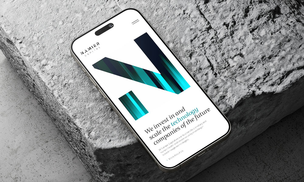
Mobile optimisation for ecommerce websites
Most online shopping happens on a phone. Most online shops are still designed as if it does not.
Most ecommerce sites are designed and approved by people working on big desktop screens. They look great on a large monitor, but often break down on a small phone screen. For many online stores, that small screen is where most sales actually happen, and also where most of the problems show up.
Mobile optimisation in ecommerce in 2026 is not about the basic things everyone already knows. It is about the changes that actually improve a real site when you work on it.
Why is page speed important for mobile ecommerce?
Mobile speed is not just one of many things that affect ecommerce conversion. It is the biggest one. Google’s research shows that even a one second delay on mobile can reduce conversions by around 20%. Pages that take three seconds to load can lose almost half their conversions compared to one second pages. None of the other changes matter much if the site is slow.
Images
The biggest problem on most stores is images. Product photos are often uploaded straight from a phone or camera and end up being 4 to 6MB each. A category page with 20 of those can force the browser to load 80 to 100MB before anything even shows.
The fix is simple but not exciting. Every image should be compressed before upload. Tools like ImageOptim, Squoosh, or Cloudinary do this. New formats like WebP and AVIF also make files much smaller without losing much quality. On WooCommerce and WordPress stores, plugins can handle this once they are set up properly.
Scripts and third-party tools
The second problem is too many scripts. Chat widgets, analytics tools, popups, review apps and marketing pixels all add load time. Most stores have 15 to 20 of these running without really noticing. Check what is actually loading using PageSpeed Insights or GTmetrix. Remove anything you do not really need. For the rest, make sure they load after the page is already usable instead of slowing down the initial load.
A responsive site is not a mobile-friendly site
This is one of the most common mistakes that quietly costs stores money. People design a desktop site first, then make it responsive, which usually just means stacking columns and turning the menu into a hamburger. It works, but it is not designed for how people actually use a phone and you can feel that straight away.
Watch someone use your site on a phone for a minute or two and it becomes obvious. They hold it in one hand and use their thumb. The bottom right of the screen is the easy reach area. The top left is awkward. But many sites still put key actions there, like the cart, account or search. People end up stretching their hand just to tap something that should be easier to reach.
Scrolling is different too. Long hero sections, detailed descriptions, testimonials – things that look important on desktop get skipped in seconds on mobile. The first screen is what matters most. The product and the Add to basket button need to be visible without scrolling.
People are usually on their phone while doing other things, like watching TV, sitting on a bus or not fully focused. There is always something competing for their attention. So every delay, every confusing step, every extra tap matters more. What feels good enough on desktop often turns into lost sales on mobile.
Forms are where mobile sales die
The right keyboard for each field
Here is something we often see when reviewing ecommerce sites. There is a simple HTML attribute called inputmode=”email” that tells a phone to show the correct keyboard when someone taps the email field. It has been available for years. Every developer knows it. It takes seconds to add, yet many checkouts still do not use it.
So the customer taps the email field, gets the standard keyboard, has to switch to numbers to type the @ symbol, then switch back again. This happens on every order. Over time, across many customers, it adds up.
The same applies to phone fields, where type=”tel” brings up the number keypad, postcode fields and other numeric inputs. None of this is complex. It is usually just overlooked.
Autofill that actually works
Autofill is the same. Modern browsers and phones can fill in names, addresses, card details, and emails automatically if the form is set up properly with autocomplete attributes. Without them, autofill just doesn’t work and people end up typing everything manually. Nothing looks different on the page, but checkout gets faster and conversions usually improve.
Cut fields you do not need
And then there is how many fields you are asking for in the first place. A phone number field you do not actually need for delivery? Cut it. A second address line most people leave blank? Cut it. Every field you remove makes checkout easier on mobile. Every field you add can cost you sales.
Tapping, not clicking, changes the design
How big buttons need to be on mobile
Buttons on mobile need to be bigger than buttons on desktop. Apple recommends at least 44 pixels. Google recommends 48dp. But many product pages still have buttons and links smaller than that, especially when they try to fit too many products into one row on a phone.
How many products per row
Two products per row on mobile usually works best for clothing, furniture, electronics, anything where the photo matters. Three can work for small items. Four is too many. The images get too small, the buttons become hard to tap and people end up squinting or zooming.
Spacing matters as well. If buttons are too close together, people tap the wrong one. Always leave enough space so each button is easy to tap.
A finger cannot hover over a button
On a laptop, people can hover their mouse over things like buttons or images. That can show extra info like a price, another photo, or a small tip. On a phone, there is no mouse. People only tap. So anything that only works on hover won’t show up on mobile unless tapping does the same job. If designers forget this, mobile users can miss important information.
Real mobile testing is not opening dev tools in Chrome
Most teams test their mobile site by shrinking the browser or using device mode in Chrome. That helps with layout, but it doesn’t show real behaviour. A fast desktop doesn’t reflect what a phone feels like on weak signal with apps running in the background.
You need to test on a real phone, not just a new expensive one, but also a cheap or older device. Try it on mobile data, not office Wi-Fi and even slow it down if you can. When you do this, problems show up quickly. Buttons get hidden by the keyboard, pages freeze while loading, pop-ups can’t be closed properly. These issues don’t always appear in dev tools, but they do affect sales.
Mobile checkout is its own design problem
Mobile checkout should be designed for phones, not copied from desktop, because people on mobile have less patience and different limits. Use Apple Pay, Google Pay, and PayPal Express at the top since they skip forms and let people pay in seconds, which is much easier than typing a long address. For card payments, keep everything on one page if possible, because multi-step checkout feels slow on mobile, especially with weak connections.
Also make sure the page works with the phone keyboard. When the keyboard opens, it can cover important things like the Pay button. The screen should scroll on its own so the important part stays visible, not hidden behind the keyboard.
How do you know if your mobile ecommerce site is working?
One number matters most, the difference between mobile and desktop conversion rates. In a good store, mobile conversion is about 60 to 70% of desktop. That gap is normal because some products are harder to buy on mobile, especially expensive or complex ones that need more research. That is fine.
But if mobile conversion is under 50 percent of desktop, the problem is not the product. It is the design. A big gap means you are losing sales because the mobile experience is not good enough to close people who already came to the site.
Mobile metrics to check
Check how long people stay on mobile and how many pages they open. In ecommerce, if many people leave after one page or in under 30 seconds, it is usually a bad sign because most buyers need a bit more time to look at the product and decide. This often means they are not finding enough information quickly or the first part of the page does not grab their attention enough for them to stay.
Check these numbers every month
Look at these numbers every month and compare them to the month before. Small improvements add up over time. A 10% increase in mobile sales, if it keeps going for a year, can make a big difference by the end of the year. Most stores only look at total conversion and assume mobile is fine, but it usually is not.