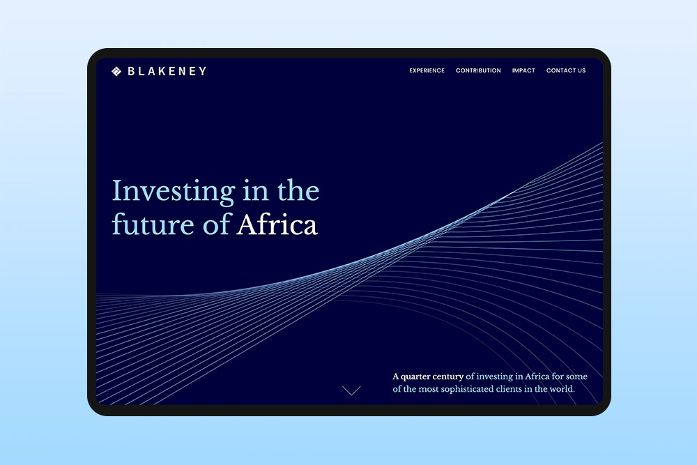
Composition and layout in graphic design
Composition and layout shape how all the elements on a page work together, organising text, images and visuals to create clear, easy to follow designs.
Layout and composition are what give a web design its structure. Designers use them to guide the eye, connect elements and arrange space so the page feels open rather than crowded. Good layouts create harmony between text, images and shapes, so everything feels intentional without forcing the viewer to think about it.
At Reactive, we make every element work together. We balance headlines, images and space so the design feels natural and organised. The result is a layout that is easy to read and looks effortless.
What is composition in graphic design?
Composition is how a designer arranges text, images, shapes and colours on a page so it feels balanced and easy to follow. It guides the eye, shows what is most important and helps the page feel organised.
A strong composition also considers relationships between elements and how size, colour and placement affect what the viewer notices first. For example a bold headline or large image draws attention immediately, while white space gives the eyes a place to rest.
Why does layout matter in graphic design?
Layout matters because it affects how people see and understand a design. Even a nice looking design can feel confusing if the elements aren’t organised clearly. A good layout shows what is most important and makes the content easy to follow.
A strong layout also helps the viewer know where to look first and next. Spacing, alignment and the size of elements guide attention naturally, making the design easy to understand at a glance.
What are the key principles of good composition?
Good composition is about making a design feel clear and balanced. Designers think about things like alignment, contrast and hierarchy to guide the viewer’s eye. Even small choices, like the size of a headline or the space around an image, can change how easy the design is to read.
These principles guide every decision in a design. Alignment keeps elements organised, contrast highlights what is important and hierarchy shows the order to follow. Proximity groups related items and white space gives the design room to breathe.
How does composition affect user experience on a website?
Good composition has a big effect on how people experience your website. When everything is in the right place and the layout is easy to follow, visitors feel comfortable and know where to go. But if the design is cluttered or confusing, it can feel overwhelming and leave before they even explore the site.
Composition also influences how users feel about your brand design. Thoughtful placement of visuals, buttons and text can make a website feel friendly, professional or exciting. For example, grouping related content together and using consistent spacing can make a site feel reliable and trustworthy, while bold headlines, dynamic images and unexpected layouts can make it feel energetic and creative.
How designers guide attention through a layout
In graphic design, layout is used to control what people see first and how they move through the design. Designers don’t place elements randomly. They think about where attention will start and how it should continue across the page. This depends on things like size, position, contrast and spacing.
A large headline or a strong image usually gets attention first. After that, the position of other elements helps guide the viewer to the next part of the content. If things are placed without a clear structure, people may feel unsure where to look. A good layout makes this process simple. It helps people move through the design step by step without needing to stop and think.
How spacing and alignment change a design
Spacing plays a big role in how a design feels and how easy it is to read. When elements are placed too close together, the design can feel crowded. When there is enough space between elements, the content feels more open and easier to follow. Small changes in spacing can make a big difference in how clear the layout appears.
Alignment affects how clean or organised a design looks. When elements line up properly, the page feels structured and easier to scan. If elements are slightly off or not aligned, the design can start to feel messy, even if the content itself is good.
When adjusting spacing and alignment, it helps to change one part at a time and compare it with the original. This makes it easier to see if the layout actually looks clearer or if something still feels off.
Common mistakes in composition and layout
Too many elements
One common mistake is trying to include too many elements without clear structure. This often leads to crowded layouts where nothing stands out and the viewer does not know where to focus.
Poor spacing
Another issue is poor spacing. When elements are too close together, the design feels heavy and harder to read. On the other hand, uneven spacing can make the layout feel unbalanced.
No clear focus
A lack of clear focus can also weaken a design. If everything has the same visual weight, the viewer may not understand what is most important. Good composition makes that clear from the start.
Inconsistent alignment
Inconsistent alignment is also a frequent problem. When elements are not aligned properly, the design can feel messy, even if the content itself is good. Clear alignment helps everything feel connected and organised.
Inconsistent alignment is also a frequent problem. When elements are not aligned properly, the design can feel messy, even if the content itself is good. Clear alignment helps everything feel connected and organised.
How composition changes across different formats
Composition is not the same in all types of design. The way elements are arranged depends on the format and the amount of space available. A layout made for a large poster will not work the same way on a small mobile screen or a social media post.
In smaller formats, designers usually focus on one clear message and use fewer elements. Space is limited, so the layout needs to stay simple and easy to scan. In larger formats, there is more space to organise content into sections, group related elements and create a more detailed structure.
The purpose of the design also affects the composition. Some formats are meant to be seen quickly, while others give people more time to look and understand the content.
Common layout considerations in real projects
In real projects, designers think about how the layout supports the content, not just how it looks. For example, on a product page or landing page, important actions like Buy or Sign up are often placed close to the key information, so users do not need to scroll or search for them. The layout is planned around how people read and make decisions, not just where elements are placed.
Another practical point is how the layout works for different ways people use a page. Some users only scan quickly, others read more carefully and some come back to the page later. Breaking content into clear sections with short parts and visual separation helps people re-enter the page without losing context.
How to check your own layout
When you finish a layout, it is easy to miss what is wrong because you have been looking at it for too long. You start to fill in things in your head and stop noticing small issues. Doing a quick audit just means taking a step back and looking at it again as if you are seeing it for the first time.
The squint test
The squint test is when you step back from your screen and squint so the design looks blurry. This helps you stop focusing on small details and see the big shapes instead. You should still be able to tell what stands out first and how your eyes move across the page. If nothing stands out or everything feels the same, the layout needs more work.
Turn it to greyscale
Turn your design to greyscale so you only see black, white and grey. This helps you stop relying on colour and focus on the layout itself. Colour can hide problems with contrast or structure. In greyscale, it becomes clear if things still stand out and feel organised. If some parts disappear or look too similar, it means you are relying too much on colour instead of spacing, size or placement.
Cover and reveal
Hide parts of your design one at a time and see if the rest still makes sense. This helps you notice if one part is doing too much work or if removing something makes things unclear. A good layout should still feel clear even when you only see part of it.
The 5 second test
Show your design to someone who has never seen it before for five seconds, then hide it. Ask them what they noticed first and what they think the page is about. If their answer is different from what you meant, your layout is not clear enough yet.
Check your spacing
Look at the space between all the parts of your layout. It is easy to miss uneven gaps when you are building it, but they stand out fast later. When spacing is even, the design feels clean and calm. If the gaps are uneven, the design can feel a bit off, even if you can’t tell why.
Doing these checks before you finish a design takes just a few minutes, but it can help you find problems you don’t notice when you have been working on it for a long time.
How we you approach composition and layout at Reactive?
We start by thinking about the story your design needs to tell and who your audience is. From there, we figure out how each element can play its part. We consider where images, text and buttons should go and how the page should flow. We also think about how the layout feels and the mood it creates. Every choice is made to give the design character and make it memorable.
Final thoughts on composition and layout in graphic design
Composition and layout are what turn individual elements into a complete web design. Without clear structure, even strong visuals can feel disorganised or difficult to follow. The goal is not to add more, but to arrange what is already there in a way that makes sense. Good layout decisions are often not obvious on their own, but they shape how the whole design is experienced.