Typography in graphic design
Typography is how text is arranged using fonts, sizes and spacing to make content easy to read and understand.
Typography is used in almost all areas of graphic design, including web design, print design, logo design, ads and packaging. It will impact the user experience and even the SEO in web design.
In graphic design, typography is often treated as a small detail, but it has a strong impact on how a design looks and how people read text. It affects how content is set out on a page and how people go through it. On a website, this is where you see it in headings, body text and the space between sections. It changes how heavy or light a page feels and how easy it is to read.
What is typography in graphic design?
Typography is how text is set up and organised so it is easy to read and matches the brand. It includes the choice of fonts, the size of letters, spacing and how text is laid out on a page or screen. For example a bold geometric font can feel modern and confident, while a soft serif can feel approachable and trustworthy.
Things like headings, line spacing and contrast guide the reader’s eye and make information easier to scan. Good typography works with images, colours and layout to create a complete visual experience.
Types of typefaces
Different kinds of fonts have different uses.
- Serif fonts have small lines at the ends of letters and often feel traditional or formal.
- Sans-serif fonts are simple and modern, and work well for websites and digital text.
- Script fonts look like handwriting and can feel elegant, but they should be used carefully so they stay readable.
- Display fonts are decorative and used mainly for headlines or posters, not long text.
These types help you choose the right look for different parts of a design.
Why is typography important in graphic design?
How people understand information
Good typography helps people find information faster. When text is clear and well organised, it is easier to read and scan.
For example, on a news website, clear headings and spacing help people quickly find the article they want to read.
Emotional response
Different fonts can create different feelings. Some look serious, some feel modern, and others feel friendly. This means the font you choose can change how people feel about a design.
For example, a law firm might use a simple, serious font, while a children’s brand might use a softer, playful one.
Clear communication
Typography helps highlight important information and makes it easier to follow a page. When the same style is used across a brand, it also helps people recognise it more easily.
For example, brands like Apple use simple and consistent typography across their website and products, which makes everything feel connected.
Typography and corporate identity
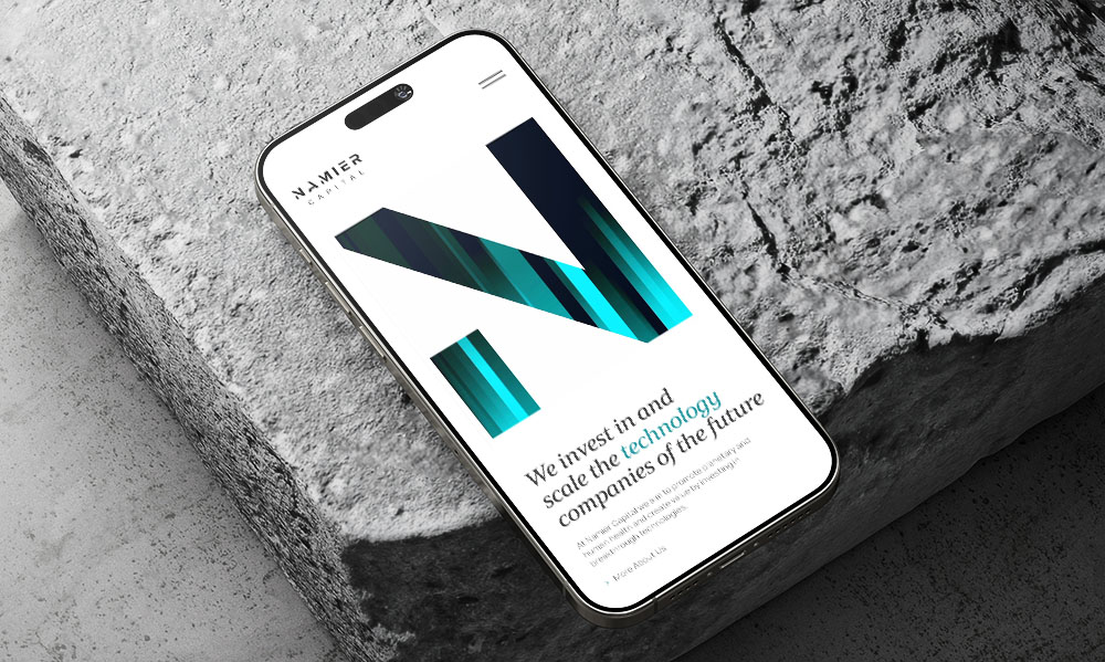
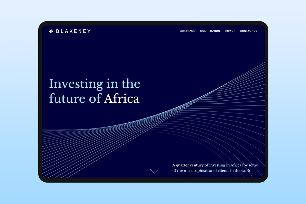
Typography is an important part of a brand’s identity. Using the same style of text across all materials helps people recognise the brand and makes it stand out. Every typeface has its own feel and can create a certain mood. Choosing the right one helps show what the brand is about. For example,Nike uses bold, simple text that feels strong and direct, while Google uses simple and clear typography that makes information easy to read and understand.
Why does typography matter for your website?
The right fonts, sizes and spacing make reading comfortable, highlight the most important information and give your site a clear structure. It can also set the tone for your brand. Making your business feel modern, friendly or professional just through the way text looks.
Subtle differences in font weight or spacing can show which actions are clickable, which information is related and which sections are most important. It helps visitors see the hierarchy of information, where to look first and how to follow your content.
Basic principles of typography
Good typography is about making text easy to read and easy to understand.
Colour and contrast
Text should be easy to see against the background. Dark text on a light background is the most common. If the contrast is too low, the text becomes hard to read.
Hierarchy
Different text should look different. Headings, subheadings and body text help organise content and show what is important. This is done by changing size, weight or style.
Alignment
Text can be left, right or centre aligned. Left alignment is best for longer text because it is easier to read. Centre alignment is usually used for short text like headings.
Consistency
Using the same styles across a design keeps it clear and organised. This includes fonts, colours and spacing. If styles change too much, the design can feel messy.
Spacing
Space between letters, lines and paragraphs is important. Too little space makes text hard to read. Too much space can break the flow. Good spacing makes reading more comfortable.
Readability
Text should be easy to read without effort. Clear fonts, good spacing and simple structure help people read the content quickly and easily.
Best practices for typography in graphic design
- Keep text and images balanced so one does not overpower the other.
- Use empty space (white space) to separate sections and make text easier to read.
- Make sure text colours stand out clearly from the background so everything is easy to see.
- Keep line length short so text is easier to read. Very long lines can feel tiring and hard to follow, especially because people have a short attention span when reading online.
- Align text in a way that feels natural to read. Left alignment usually works best for longer text.
- Use headings to break up long text so people can quickly scan the content.
- Use bold or italic text only to highlight important information or add emphasis. For example, bold can draw attention to key points and italics can slightly stress a word or phrase. If you use them too often, they lose impact.
- Make sure there is enough space between lines of text so words do not feel crowded and the content is easier to scan.
How do you choose the right fonts for a website?
Choosing the right fonts is not just about what looks good. It is about how the text works in real use. A good approach is to start with commonly used web fonts or system fonts. These are tested, load quickly and usually work well on all devices without issues.
It also helps to test fonts early in real layouts instead of choosing them on their own. A font can look fine on its own but feel different once it is placed in full pages with headings, paragraphs and spacing.
Another practical step is to check how the font behaves in different weights. Some fonts have a good bold version for headings but a weak or unclear regular version for body text. This can affect how clear the content feels.
Finally, always check how the font works on mobile. Text that looks fine on a large screen can become tight or harder to read on smaller screens.
How many fonts should a website use?
As a general rule, two fonts is the sweet spot for most websites. One for headings and one for body text. Similar to newspapers and magazines. For example The New York Times uses a single serif font for body text and a sans-serif for headlines. Using only a small number of fonts keeps content easy to read, creates a clear hierarchy and prevents the page from looking messy.
How does typography affect mobile readability?
On mobile screens, space is limited, so every text choice becomes more important. Long lines of text, small fonts or tight spacing can make content hard to follow and tiring to read.
Typography is very important on mobile devices. What looks fine on a computer can feel too small or crowded on a phone. The right font size, spacing and line height make text easier to read without zooming. Clear headings and subheadings also help people scan the content and understand it quickly on a small screen.