Just like a real shopping experience, your customers are looking for a place that is well organised, easy to browse and quick to checkout. That means no fuss, no mess and no queues! The exact same principle should be applied to your ecommerce store.

ecommerce is the fastest growing retail market in Europe and North America. Online sales in the UK, Germany, France, The Netherlands, Sweden, Italy, Poland and Spain grew from £132.05 bn [€156.28 bn] in 2014 to £156.67 bn [€185.39 bn] in 2015 (+18.6%). Online sales are expected to grow again to reach £182.80 bn [€216.32 bn] in 2016 (+16.7%) and £215.38 bn [€250.28 bn] in 2017.
Franticly rushing around the shops a few days before Christmas is a thing of the past now that we can do it all online (and sometimes with same day delivery!)
If you would like your online shop to succeed then here are a few key features to include
Header and Footer
Header
You’ll find that, despite design differences, most ecommerce web site design have similar aspects to their headers and footers.
The header is the best place to keep your company logo, navigation and shopping cart at the bare minimum. Other great features to include up here would be a contact number, customer log in link and social media icons.
Footer
The footer however should be where the rest of your important information is kept. Mainly anything you leave out of the header, contact details and address, delivery information, account information, opening times and any links to important pages (FAQ’s, T&C’s) etc..
Homepage
Your homepage is one of the most important pages of your ecommerce website. It is your storefront and instantly leaves an impression on your potential and returning customers. Keeping this page fresh and up to date is key to thriving in your industry. Remember to keep it tidy, easy to follow, responsive and engaging.
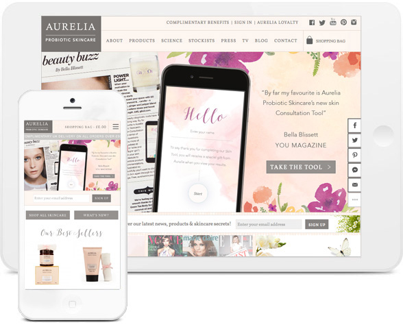
Logo
First of all, lets talk about your company Logo. This is one of the most important parts of any website and your online shop should be no different. Ensure that your logo is always visible, clear and recognisable. Your customers will build up a rapport with you and having an easily recognisable logo will help to strengthen the bond and trust that you share with each other.
Slider
Another design feature that has become popular in ecommerce web site design over the past few years is the image slider. This is a great way for you to showcase some of your top products and achievements. It also livens up your homepage and gives it a nice refreshing look, so your customers are not always peering at the same image. The slider is also a great way to give your homepage a spruce of colour or seasonal feel without changing your theme as the images can be updated quickly and easily.
Featured Products
One great way to share your most popular items is to have a featured products section. This is a good way to show new visitors to your site exactly what kind of items you have to offer. You can use it to display your most popular items, your most recent items or perhaps just your favourite!
Featured Posts
Many online shops have a “Featured Posts” section on their homepage, highlighting either their most recent or most helpful blog posts. This is a really great way for your customers to interact with your company and generally learn more about your brand and values before deciding whether to make a purchase.
Newsletter Sign-Up
One feature that almost all websites (not just ecommerce stores) now have is a newsletter sign up form. This could be anywhere where you want to put it. Some websites include this in the header, at the side of the page, as a simple form somewhere on their homepage or in the footer. This is a great way for your customers to opt-in to hear about promotions and new products etc, rather than having inconvenient pop-ups or intrusive tick boxes during checkout.
Remember, your homepage is your shop front. If you have anything important to say, here’s the place to say it! Do you offer free shipping over a certain amount, or maybe you’ve got some freebies to give away? Who doesn’t love freebies! You need to let your customers know… so having a banner on your homepage to highlight these will really make a difference.
Navigation
Menu Structure/Usability
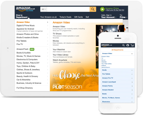
There are many aspects to ecommerce web site design navigation. The first being the navigation menu itself. This may include links to: product and product category pages, an account or login page, blog pages and a contact page etc.
From a navigation perspective, there are a number of ways your product categories and products can be arranged but one of the most commonly used solutions is the mega menu, which allows you to link to multiple categories or products from the header, reducing the amount of steps needed to reach the product you are looking for. A search bar can make the process of finding your desired product even quicker while the mega menu gives customers who are browsing a nice overview of the items you sell.
If you have a simple website with only a few products, you may not need anything overly complicated. However, if like Amazon you have thousands, then a well thought out and organised menu is important.
Category Pages
The second aspect to consider is the formatting of your category pages i.e how the products are displayed and how easily you can find products relevant to you. Something that can improve the browsing experience of these pages is the inclusion of product filters. For example buttons or drop downs that allow the customer to arrange products on the page by price, colour, material or manufacturer etc.
You may also find it beneficial to include options such as quick view, quick buy, stock status and anything else that you feel will encourage your customer to purchase the item or better inform them about the item.
Search Function
Lastly, you need to consider how a product search bar can benefit navigation and ultimately help your customer find and purchase products more easily.
Depending on what technology/software your ecommerce website is built on, it may be that it comes with a search facility built in. For example Magento provides a basic catalogue search which can be modified with bespoke customisation or plugins.
If you include a search bar on your ecommerce website it is important it works effectively. You don’t want it listing results of red hats if you’ve specifically searched for blue hats! Remember that the search bar is more beneficial to customers who know exactly
Products
Like with a shop you wouldn’t display a product that is poorly made or damaged, so you shouldn’t on your product pages either!
Key Aspects
Some key aspects are: Product name, product code, add to cart, price, specific attributes to the product (size, colour etc..) quantity and stock status. Let’s delve a little further…
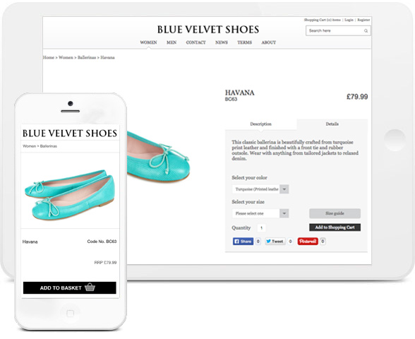
The placement of this information is almost always right at the top of the page next to the product image, not hidden down the bottom where it can’t be seen. You want your customers to easily be able to choose which size and colour they require rather than having to scroll down the page or even look on other pages. The easier you make the shopping experience, the more likely your customers are going to checkout and return to the site in future.
The placement of your “Add to basket” button is extremely important as well (you may not think it is, but really, it is!) You want it somewhere that it won’t be missed and somewhere that is easily in your eyesight without searching.
This top section is also a good place to highlight any promotions you may be running i.e. free delivery over a certain amount, buy one get one half price, etc..
Short Description
It’s also highly beneficial to display a short description in this top section, so that your customers can read about the product at a glance but aren’t being drowned in information.
One common mistake to make is having your short description the same as the first paragraph of your long description. Try to switch things up and re-write this section so that is isn’t just repeated further down the page.
Images
Images images images! If you have no images, you’re essentially selling nothing! No-body is going to come into a shop and ask to buy a product if they can’t see it, so why should it be any different online? You should spend the time to make sure all of your products have at least one image. There are several ways to display these, you could have a slider or a light box image grid for example. For a uniform look across your website, try and make sure your images are all the same size and that the products inside the images are positioned within the same borders. Not only does this make the product page look neater, but the category pages and homepage too!
Stock Status
Another important aspect to consider is your stock status. Having some sort of stock level indictor on the front and back end of your website can cut down the admin work your sales team (and stock manager) are going to have to do when a customer places an order. Instead of having your staff spending their valuable time contacting customers to say their item isn’t actually in stock (the conversation goes something like; “But your website said it was in stock” “Well actually, our website says it’s available to order not actually in stock”) A stock indicator (live feed of your actual stock levels) can save you a lot of hassle! It will also help you maintain a good rapport with your customers, the last thing you want to do is disappoint customers with unfulfilled orders.
Tabs
All other information that is important for your products can be easily be displayed in tabs underneath the product image or price etc. Expandable and collapsible accordion tabs can hold lengthy information that may otherwise be overwhelming or create unnecessary distraction. This has become the most common way for ecommerce sites to display any extra information, such as long description, videos, reviews, any additional product need-to-knows and specs, and any downloads.
Checkout
Add To Bag
There is lots you can do to make sure that your customers can easily add items to their basket and checkout quickly. Firstly, as mentioned above, when viewing a product make sure the add to basket button is always clearly visible. Also make sure its always clear to the user how many (and what) items are in their basket at all times. A discreet notification that appears when items have been added to the basket may be helpful. A clear indication of the total cost of your basket contents rules out any nasty surprises when the customer reaches the checkout page (Hidden costs are a no no!).
That being said, as soon as your customer has gone through to their basket and clicked “proceed to checkout”, you want to drop all mentions of any other products. There’s nothing more distracting than trying to checkout for items you have already selected and then being prompted to buy more on each page. It can come across as desperate and generally just really annoying.
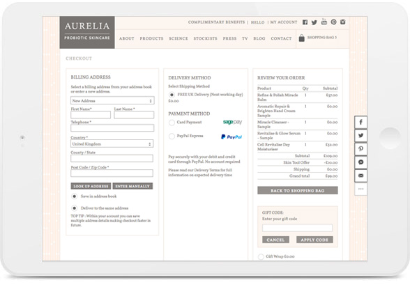
One-Page Checkout
Many ecommerce stores now offer one-page checkouts, so that your customers can fill in all of their information, any promotional codes, payment card details etc.. all on one page. This cuts down their line so to speak (imagine queuing in a store..) and makes the process a lot smoother for the customer, most likely resulting in them returning to your store in the future.
Payments
Not everyone likes using their card details directly with a website, so integrating with other payment providers such as PayPal or SagePay is almost essential in today’s online shopping world.
Integration
Speaking of integration, we’ve spoken briefly about blogs already but there are several other things you can integrate into your website. You could put your newsletters on their own page, have specific social media sharing icons for each product or page, YouTube videos, podcasts and much more! Your online shop isn’t just about selling your products anymore, it’s about selling your company as a whole.
You can also link up with Google Ads to bring more visitors to your website and you should definitely also consider linking your website with some form of analytics tracking, so that you can see the behaviour of your customers and learn patterns to interact with them more.
One last but certainly not least feature to integrate is SEO. This is one of the most important features when it comes to your ecommerce website. Metadata, alt tags, links and images can boost your shops visibility and increase your sales orders.

Need help?
So now we’ve highlighted the top features of your ecommerce website, what’s stopping you setting up shop for yourself?
Still a bit confused or have more question? Don’t worry! We have been designing and creating websites for over 16 years and can help with all your ecommerce website needs. Drop us an email, call or pop in for a chat!

Andrew began his career in web design and development in the late 1990s. His eagerness to embrace the medium saw Andrew setting up Reactive Graphics in 2004. With over 20 years plus working as a London web designer supporting a wide range of clients, Andrew’s experience in web design, web development and graphic design have helped him to build a growing business.