London web development
Leading London web development agency with over twenty years experience in developing websites & brands.
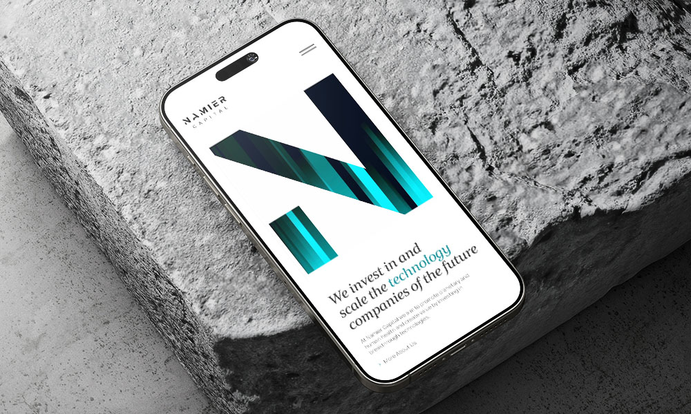
Namier Capital
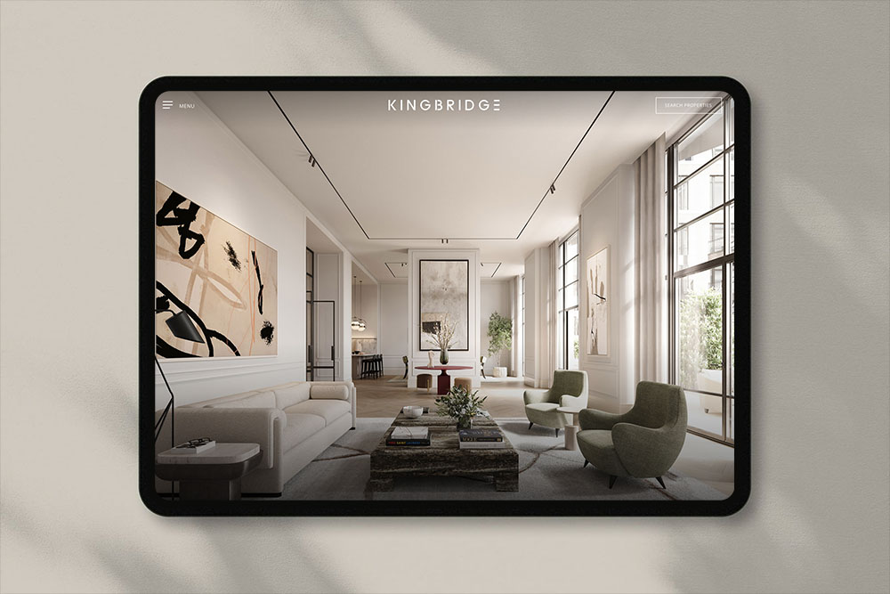
Kingbridge
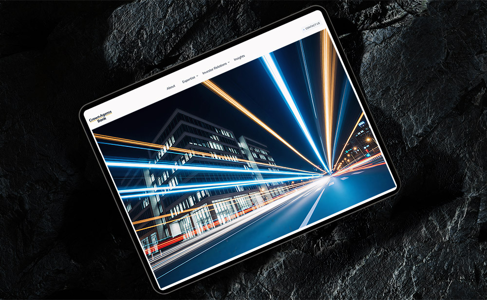
Crown Agents Bank

Kreos Capital
Health Axon


Aquila Films
Website development agency in London
Our London web development services are guided by your business requirements, offering only the web development tools that we consider a best fit for the job.
We work carefully with our clients to create websites and applications that achieve results and generate a return on investment. Our many years of experience of building and designing websites, working for both large businesses and bold new start ups, means we have the right web development team and a range of options at our finger tips.
Our web development services
Using WordPress you will be able to self-manage all aspects of your website design and content from an online administrative console.
If you want to sell products or services directly from your website, we can create your online shop designed to engage with your customers and increase sales.
Our London web development team can integrate WordPress to enable you to self-manage all aspects of your website design and content from an online administrative console.
You will be able to self-manage all aspects of your web design from a content management system allowing you to create and edit pages anywhere where there is an internet connection.
Your questions answered
What is the estimated time needed to construct my website?
Website development is influenced by various factors, including the intricacy of the design, the total number of pages, desired functionalities (such as e-commerce and custom features), and the responsiveness of both parties throughout the project. Generally, a basic website may require 2 to 4 weeks to build, whereas a more intricate site could take anywhere from 2 to 3 months or even longer.
What information is necessary to initiate the development of my website?
For web development to commence, we will require the following:
- A clear understanding of your business or personal objectives for the website
- A website design (preferably using Figma or other tools)
- Content, including text, images, and branding elements (such as logos and colour schemes)
- A domain name (or assistance in selecting one)
- Any specific functionalities or features you wish to include (like e-commerce capabilities or contact forms)
- Examples of websites that you find appealing (optional, but beneficial for design guidance)
Will my website be optimised for mobile devices?
Indeed! All websites we create are designed to be responsive, ensuring they automatically adapt to provide an optimal viewing experience on mobile devices, tablets, and desktops. A mobile-optimised website is essential for enhancing user experience and improving SEO, and we guarantee that your site will perform effectively across all platforms.
Am I able to make updates to my website development after it has been completed?
Certainly! We equip you with a user-friendly content management system (CMS), such as WordPress, which enables you to update your website independently. Alternatively, we can provide ongoing maintenance services to manage updates and modifications on your behalf.
View more about our London WordPress agency.
Discovery
We learn about your company, vision & goals and understand your target audience and their requirements.
Planning
We craft detailed strategic roadmaps that align with your objectives, ensuring every step moves us toward your business goals.
Development
Our team brings concepts to life through innovative design and development, focusing on quality and attention to detail.
Launch
We execute with precision and provide ongoing support to ensure your project achieves its full potential in the market.
Services
Web design
Whether you are launching a new website or tweaking your existing site, our London web developers transform your vision to create impactful digital solutions. A contemporary digital presence can be a clear differentiator and create a memorable first impression.
Web development
We work with our clients to create websites that are user-friendly, achieve results and generate a return on investment. Our knowledge and expertise helps us to balance aesthetic appeal with functional design.
Brand identity
We help elevate businesses with a brand identity design tailored to their target market. A well-defined and consistent brand conveys professionalism, reliability, and expertise.
Digital marketing
Alongside our brand identity, London web design and web development offering, we will design and execute engaging campaigns to ensure your business gets the attention it deserves.
Hosting & support
We’re proud of the websites we design and therefore it’s equally important for us to preserve continuity of service. We routinely host our clients’ websites and provide routine maintenance to ensure your business is online 24/7.
Pitch deck design
Alongside our key services of web design and brand identity design, we also offer assistance with the design of pitch decks, financial reports, monthly newsletters, PowerPoint templates and business stationery.