What is colour
Colour is an attribute of an object or image that can seen by the eye when light shines on it. In order for colour to be visible, there has to be light. The sun is a light source that contains the full colour spectrum, known as white light.
When white light hits a white object or surface, it appears white to the eye because it absorbs no colour and reflects all colours equally. Similarly when light hits a black object or surface it absorbs all colours and reflects none, making it black to the human eye.
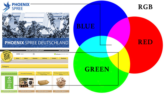
RGB
The RGB colour model is a web friendly colour model that uses the full spectrum of colours through the combination of Red, Green and Blue. The RGB colours use 8 bits each (bits being units of digital matter) and each colour has integer values between 0-256. This means that there are various shades of one colour to choose from.
R=256 * G=256 * B=256 = 16777216 possible colours
The RGB colour spectrum can only be viewed by a natural or produced light source for example the light of a computer screen, but it cannot be viewed correctly on a printed page. These colours will be viewed not only on computer screens, but smart phones, tablets and wearable devices and it is not only important to consider the responsive capabilities of your website, but it is also important to think of the impact of all of the design attributes (including colour!) and where it will be viewed.
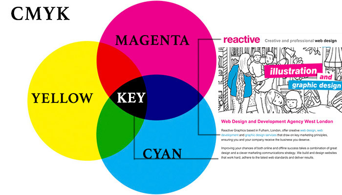
CMYK
The CMYK colour model used for print is a subtractive colour model. In print the CMYK (abbreviation of cyan, magenta, yellow, and key/black) works by masking colours on a white background to varying degrees. The ink reduces the amount of light that can be reflected which is why the CMYK model is known as subtractive.
All digital files need to be converted to CMYK in order for the printed colour to match the desired effect. As white is the presence of colour and black is the absence of colour, printing colour works best on white paper. Much like RGB there are many variables of colour that can be found using the CMYK.
Printing of these colours is created by applying dots of colour onto a page, meaning that if you apply a 50% concentration of black ink on white page, then what you will see will be a shade of grey. Dependent on the concentration of the black dots applied (from 1%-99%) the printer will produce varying shades of grey.
It is important to realise that when you are creating a brand, you understand that your digital on screen materials will be created in a different format to those printed materials. This means that each element of your branding including, logo, letter heads, icons, typography and any imagery has to be optimised differently dependent on where it will be used.
Complimentary colours
Scientifically speaking, complimentary colours are a pair of colours that cancel each other out on the colour model resulting in either black or white. These colours are generally on the opposite side of the colour model eg:-

Contrasting colours
A pair of colours that contrast with one another, can be used to create a striking effect on a website. These colours are generally next to each other on the colour model eg:

Accent colours
Additionally many designers use three colours, combining two colours that are next to each other on the colour model then using the hybrid of those colours as an accenting colour.

5 ways to choose a colour for your brand
- Consider other similar brands and notice the colour they use and what feelings they provoke.
- Think of a colour that reflects your company ethos and your demographic eg- a professional corporate business may choose muted tones over loud primary colours.
- Ignore stereotypes! As society becomes more liberal, ‘masculine’ and ‘feminine’ colours are becoming a thing of the past.
- Use colour combinations and accents that work – you want to entice people to look at your website, not create something that feels uncomfortable to read.
- Don’t be afraid to be bold and similarly do not feel you are being too cautious; minimalism can be eye catching too.
Colour in design
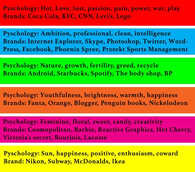
Colour in design is subjective. Colours evoke different feelings and reactions dependent on culture, background and preference. This can mean that when you are creating a website and building a brand, your choice of colour or equally the absence of colour can create quite a distinctive feel to your design.
Monochrome
Monochrome is a colour technique used where by an image is created with varying shades of a single colour. It is not the absence of colour and it isn’t simply black and white but varying concentrations of both.
A monochrome colour scheme is used quite a lot in minimalist web design and can convey beautiful simplistic designs particularly when paired with a splash of an accent colour. Hues of blues, reds, greens and all the colours in between can all play part in a monochromatic design, however simple black and white designs are timeless, stylish and very Coco Chanel.
Colour palettes inspired by the world around you
When you are launching a business and building a brand, as explained above your colour palette it is an extremely important point to consider. It will be used on your website, your logo and any printed materials designed for your company. You and your clients will have to see it, a lot. So it shouldn’t just be an off the cuff decision.
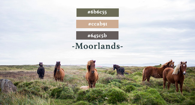
Often inspiration for colour choices can be found in rather unlikely places. From your favourite jumper, to a landscape you have visited to simply the night sky. It is important to choose a palette that reflects your business and to ensure that choice of colour doesn’t detract from what the company has got to say.
Here are a few simple palettes inspired by the everyday:





To view our web safe colour chart, please click here.
Let RG head up your next project
If you would like Reactive Graphics to help you choose a colour palette for your next business venture, then please get in touch.
Our expert team of designers and developers can be on hand to offer advice on website design, branding, print design and other services you require to help get your business off the ground.

