Website landing pages are important in all effective inbound marketing strategies because they help convert leads into paying customers.
If you have ever wondered about those special pages that seem to pop up when you click on an advertisement or a link, you are in the right place. In this blog post, we will discuss what website landing pages are, why they matter and common mistakes people often make when creating them.
Related Articles:
What is a website landing page?
A website landing page is an independent web page, created specifically for a marketing or advertising campaign. It is designed to lead visitors to take a specific action. These actions are called call-to-actions (CTAs). For example, a CTA could involve having users sign up for a newsletter, purchase a product, download a free ebook, install an app, join the loyalty program, start a 30 day free trial, follow the company on social media or RSVP for an event.
Users typically arrive at website landing pages via a pay-per-click advertising campaign. But they may also find your website landing page through your homepage, social media posts, organic search results and email campaigns. Creating website landing pages allows you to target your audience, offer them something of value and convert a higher percentage of your visitors into leads, while also collecting data about who they are and what platforms or mediums they come from.
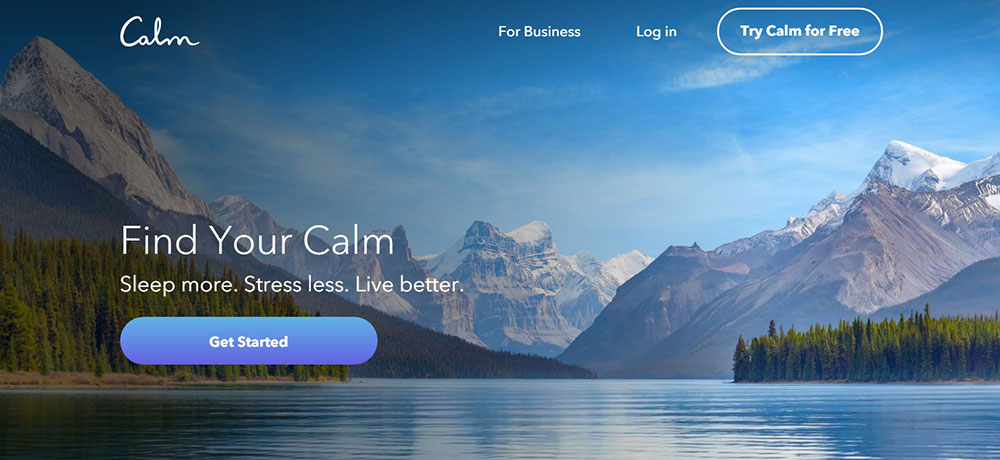
Source: Calm
Difference between a website and a landing page
Website landing pages are more focused on finishing short-term marketing goals and are usually created to complement other campaigns. It will guide visitors toward a particular call-to-action (CTA). On the flip side, a website offers visitors a navigation menu and multiple pages to explore your entire business – the different products or services available, a company’s mission and vision, shipping policies and more. Websites also serve as platforms for shoppers to complete their purchases.
Elements of website landing page
A well-designed website landing page typically includes several key elements to effectively grab the attention of visitors and encourage them to take a desired action.
A good website landing page only needs 4 important elements:
- Headline: The headline is the first thing visitors will likely see when they ‘land’ on a website landing page. A great website landing page headline sums up the offer clearly and simply. It answers the question – What will people get if they take action on this page?
- A description of your offer and its benefits: The text on a website landing page needs to show the value of the offer. Bullet points can help by showing clear points, breaking up big paragraphs and keeping things short and to the point.
- Hero image: Website landing pages that include a relevant image give visitors a concrete idea of what they will receive and make website landing pages much more visually appealing.
- Subscription form or call-to-action (CTA) button: A visible and noticeable button or link that guides visitors to take a specific action, such as signing up, making a purchase or downloading content.
These 4 elements should all be displayed above the fold before the page visitor has to scroll. All supporting information such as testimonials, reviews, additional product/service information, contact information, social media links etc. should be included below the 4 key elements of your website landing page.
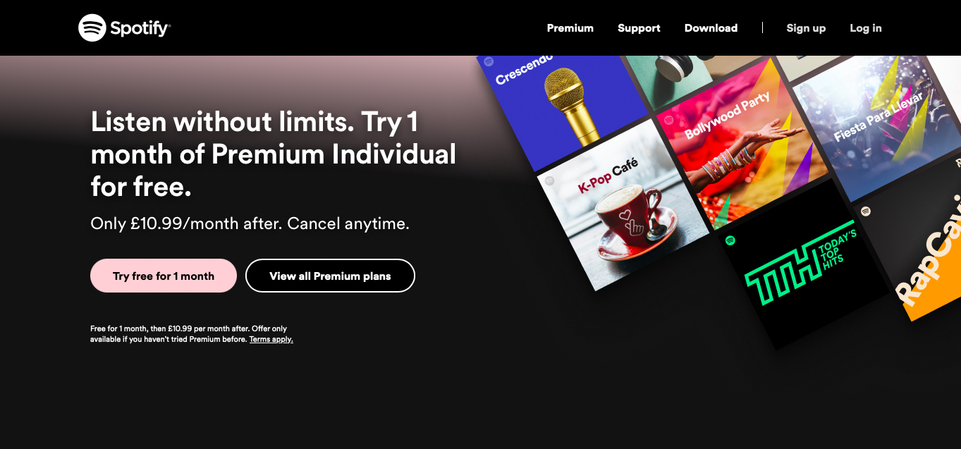
Source: Spotify
Common website landing page mistakes
These mistakes can negatively impact the effectiveness of a website landing page. By addressing these common mistakes, you can enhance the performance of your website landing page and improve its ability to convert visitors into leads or customers.
Unclear call-to-action (CTA)
One common mistake we often see with call-to-action (CTA) is the tendency to have too many of them. Additionally placing the CTA at the end of the page or using the same colour for the CTA as the website background can create confusion. CTA should be clear and easily visible to visitors. Use strong action words (download, try, sign up, buy, upgrade, boost, transform, etc.) that encourage the user to take action.
Cluttered format
A cluttered format is yet another website landing page mistake many people commit during the design phase of a landing page. Too much text, images, form fields, misleading headlines, advertising banners and call-to-action buttons can distract visitors from the main message or offer of the website landing page.
Slow load time
Having too much content and adding too many visuals or high resolution imagery is one of the main reasons why a website landing page loads slowly. Consider reducing the size of large images and other media files, minimise the amount of text and code on the page and minimise redirects whenever possible.
Not optimised for mobile
With over half of users visiting the internet via mobile devices, your ability to optimise your website landing page for smaller screens is crucial. If not you will lose out on potential conversions, because your website landing page is hard to navigate and/or slower on cell phones and tablets. Mobile-friendly website landing pages that feature a single column are easier to navigate through, ultimately improving your user experience. Also, with a smaller screen, it is easier to overwhelm your audience with too many visuals and images. Make sure your website landing page is interesting but doesn’t take attention away from what you want people to do (your CTA).
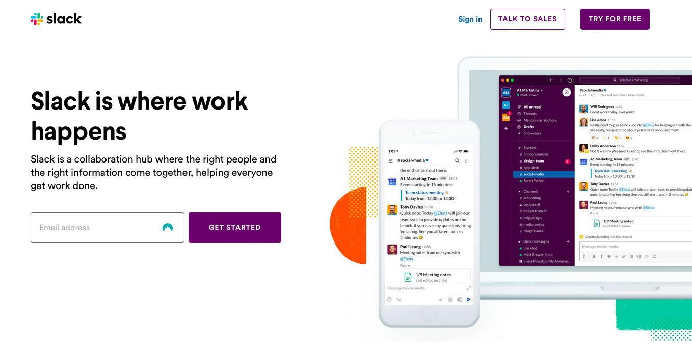
Source: Slack
No trust indicators
Visitors may hesitate to take action if they don’t trust the source. Don’t give visitors an opportunity to question your business. Include trust indicators such as testimonials, reviews, security badges and recognisable logos to build credibility and trust with them.
Too many form fields
If a user has already clicked on your ad and arrived at your website landing page, your job is to persuade them to take the next action in your conversion funnel. But if your form has too many fields or is too complicated, there is a good chance you will lose them. If you must have all the fields, break the process into multiple steps with easier-to-handle groups of fields to fill out.
Unappealing visuals
Low-quality images or irrelevant visuals can hurt the professionalism of your website landing page. When you use pictures or videos, make sure they are high quality. Showcasing your product or service through visuals is important. It helps the visitor connect emotionally and encourages them to take the action you want them to take.
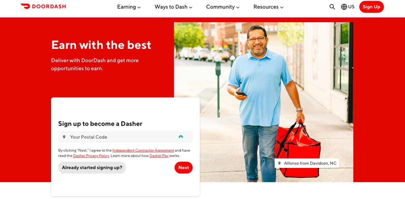
Source: DoorDash
Forgetting your thank you page
A thank you page is what your customers and leads are redirected to immediately after completing a form or making a purchase on your web page. It does a similar job as a confirmation email. Thank-you pages can also come with an automatic email response that sends the offer or next steps in an email activated when you fill out the website landing page form.
Forgetting A/B testing
A/B testing allows you to test two versions of a page at the same URL to see which one performs better. Sometimes what works will surprise you. Since consumer psychology can sometimes be unpredictable, it is always better to experiment with different versions of your website landing pages to see which has the highest conversion rate. Test the positioning of the offer, the kinds of CTAs or even the colour scheme.
Improving website landing pages can increase the chance of convincing visitors to take the desired action, whether filling out a form, subscribing or purchasing a product or service. In this article, we have focused on common mistakes when designing website landing pages. If you address these errors before launching your website landing page, you are on the right path to achieving success in terms of user experience, engagement, conversion rates and other important measures. If you need support, our web support services can help ensure your landing page is fully optimised.
Looking for a new website design?

Andrew began his career in web design and development in the late 1990s. His eagerness to embrace the medium saw Andrew setting up Reactive Graphics in 2004. With over 20 years plus working as a London web designer supporting a wide range of clients, Andrew’s experience in web design, web development and graphic design have helped him to build a growing business.