Web design and development trends are moving forward at such a rapid pace that it is important for you to take stock of what design and development innovations have worked for your company, what continues to work and what isn’t working at all. As a redesign of your website can be quite a time consuming project it is important to notice whether your interest in upgrading your site is in order to assist the growth of your business or simply to follow the latest trend.
Listen to your web designer
A web designer and web developer will have insider knowledge on what technological advances are worth taking advantage of and what designs are simply a fad; try not to ignore their advice as it could mean that six months down the line when no-one else has a ‘diagonally scrolling’ website, you are only standing out for negative reasons.
It seems that not only do techniques and designs come and go due to trends, but it is also apparent that because of developments in web capabilities some elements of the world wide web – that were once needed as a necessity – are now disappearing and making way for more user friendly, user experience orientated designs.

10 web design trends that are being fazed out
-
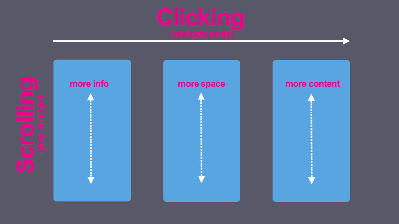
- Clicks
Navigation is often a talking point of web designers and web developers with many of us taking advantage of the expanding capabilities of the web and utilising more intuitive ways of browsing the web in our designs. This means that ‘clicking’ which was at first the primary source of navigation on websites is now being phased out and replaced with different ways to swipe, scroll, hover and slide between pages and chunks of information.
- Clicks
-
- Flash
Adobe Flash is a multimedia tool that is accessed through web browsers in order to create graphics and animation and also allows for streaming of audio and video. Flash is being phased out for a number of reasons including; closed-source development, lack of compatibility with varied browsers and devices and more recently for its lack of confidentiality and security.
- Flash
-
- Sprawling text
With animation, images, and video making up a large portion of the web at the moment, it is becoming more and more apparent that large bodies of text and downloadable text files are becoming less and less engaging to users. This is due to the time it takes to read them and the fact that people are wanting information to be readily available for them, quickly and efficiently. It appears that concise and informative text snippets are more what people engage with. Websites are now utilising design layouts that appear like information cards and text boxes that hold succinct information that you can then expand on if required.
- Sprawling text
-
- Desktop only websites
Desktop only sites will be a thing of the past very soon. With Google SEO rankings being affected greatly by the responsive design and mobile friendliness of your website it isn’t a wonder that desktop only sites are being phased out. In someways the need to design ‘responsively’ does apply limitations to your work, however with responsive design advancing rapidly, the design, layout and build of a website will eventually be based fully on an intuitive, interactive and individual user experience.
- Desktop only websites
-
- Menu only Navigation
Menu only navigation isn’t the only way to get around a website these days. This is why it is becoming less likely to have just a menu list placed horizontally across the top of the page. Web design has seen the introduction of hidden buttons, hover options and menu items that revealing as you scroll through the site. This could be seen as a positive as it means that navigation is more interactive however if you are wanting to source information quickly and efficiently then having to meander through a site to get from a-to-b is probably not the type of experience you are looking for.
- Menu only Navigation
-
- Standard web fonts
Gone are the days when Arial, Times New Roman and Verdana were the only font families that were used on the web. Standard web fonts are still widely used for their clarity, crisp edges and ease of reading but these days with typography being a major player in the art and design world, there are many innovative fonts emerging that are available to buy or for free online. Websites like Google Fonts allow you to purchase a licence to use the font or use it for free for personal use.
- Standard web fonts
-
- Stock photos
Over the past few years stock photos have been used and abused by designers and developers all over the world and thankfully they have improved significantly with the increase in demand. There are various stock photography companies who offer individual ‘staged’ images for a price that can be used commercially – usually along the lines of ‘people in an office smiling’ or ‘woman in an interview.’ Stock photos are phasing out, due to their unnatural and staged quality and with advancement in photography equipment it is becoming much easier for companies to take good quality images themselves. As images become a much more impactful source of information for businesses they are now more likely to hire a professional photographer to capture real images of their company. There are also amazing websites that showcase work of photographers and allow you to use images copyright free such as Unsplash.
- Stock photos
-
- Masses of pages
The past decade of web design has seen websites go from massively overloaded directories of repeated information to neat, minimalistic, one page website designs that contain only the bare essential information. This allows for a more streamlined search engine service and generally an better route of navigation for the user. The parallax scrolling web design technique offers more space for content and allows width and depth for exploration of alternative ways to display information.
-
- Irritating pop-ups
With most web designers adhering to quite strict standards of website usability it is becoming less and less likely to see irritating pop-ups stilting your navigation through a website. Some companies (regardless of what is best practice for the marketing of their business) still insist on having a pop up asking for a users email address before they can enter their site. These pop-ups have a tendency to look a lot like viruses or untrusted links and generally like something you do not want to interact with. It is understandable that some sites use this technique in order to collate a database of clients who are potentially interested in their product/services however it takes away the users freedom to browse the site and it is likely that the majority of visitors will not hand over their details before leaving.
-
- Fixed width layouts
A fixed width website layout is set in a container so that the content cannot move. No matter what screen resolution the user is using, the layout will always appear the same. As web design advances it is apparent that the need for fixed width layouts is changing as they are not supported within the frameworks of certain browsers. Using a fixed-width layout means that it is much easier to implement design changes within a website and also much simpler to adapt a template as there are specific boundaries you must adhere too, but also this meant that certain functionalities and in particular mobile/responsive capabilities would be impossible to design within such constraints.
5 web design trends that just keep coming back
-
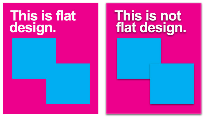
- Flat Design
Flat design is a technique whereby designers create images without drop shadows, gradients or textures. It is an interface style that doesn’t have any three dimensional properties and it has become extremely popular since the rise of infographics in 2014. The minimalistic, non fussy design technique has been popular with gig-posters for many years but also has a reoccurring presence in web design.
- Pre-loaders
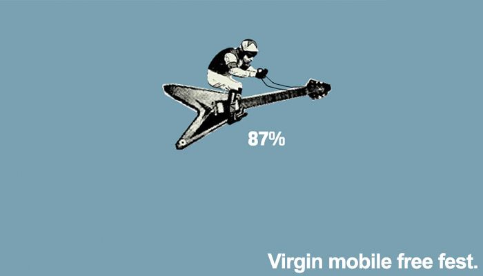
Pre-loaders are the small animations that appear on a web page to help distract the mind away from the time it is taking for the page to load. They are quite clever really and can offer a creative diversion that engages directly with the loading content. The Virgin mobile free fest (which sadly no longer exists) used a Jockey riding an electric guitar as their pre-loading mascot.
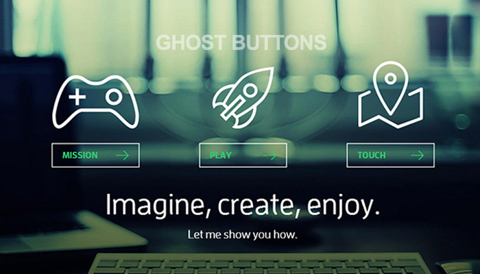
- Ghost buttons,
Ghost buttons are invisible navigational tools that appear once you either hover over them or once you scroll to a particular part of a page. They are supposed to stop the mind from detracting away from the information at hand.
- Unusual navigation
Following on from ghost buttons, is the trend where by navigation is a bit of a free for all. You have to guess how information is laid out and nothing really follows on from the next. It can be fun in some circumstances, however unless you are using unclear navigation for a story-telling/ keep me guessing sort of feel than this can be difficult for users to manage and move through.
- Scrolling/not scrolling
Much like the age old action of turning a page in a book, scrolling through a website is a web design technique that just works. The action can be mimicked on various different devices through swiping and even though it is a technique that developers keep trying to enhance/ alter/ remove, the mechanics of the website scroll might just be a case of ‘if it’s not broken, don’t try to fix it.’
How to know a craze from a necessity?
Web design trends are inevitably going to come, go and come back around at various different points but it is important not to latch onto a craze just because it is what everyone is doing.
Like fashion, web design techniques revolve around what is aesthetically popular at the time but alongside this they’re also developed within the constraints of technological capabilities. For example parallax design was utilised way back in the days of 2D computer gaming, think Mario and Luigi hitting boxes with their heads to collect mushrooms. Then fast-forward to 2015 and the implementation of HTML5 and CSS3 has further improved structural and spacial elements of web design far further than could have been originally imagined.
When an element of web design becomes popular due to its ease of usability and flexibility of user experience then you can be sure it is a trend you should get on board with. It seems that this year, web development more than ever is centred around a need to create a completely inclusive, intuitive and extremely efficient world wide web. With browsing becoming more about speed it seems that time on the internet will be much more direct and less about making a well rounded choice of where you want to navigate. This also means that SEO will only become more important in the future.
If you would like us to assist you with your next web design or development project then please, get in touch.
Or if you have any questions regarding our services, then we’d be more than happy to have a chat and a cup of tea at our onsite cafe.

Andrew began his career in web design and development in the late 1990s. His eagerness to embrace the medium saw Andrew setting up Reactive Graphics in 2004. With over 20 years plus working as a London web designer supporting a wide range of clients, Andrew’s experience in web design, web development and graphic design have helped him to build a growing business.