As of the 21st April 2015 Google are altered their mobile search algorithm in order to determine whether or not your site is mobile-friendly and responsive. If you don’t fall under these categories then you will likely see quite a drop in your search engine rankings.
So what is responsive web design?
Responsive web design is a multi-faceted design approach which allows your users to interact with your site across multiple platforms. A responsive designed site essentially reacts and responds to its environment, whether that be mobile, tablet or desktop. This means that each visitor – no matter which device they choose to browse on – will have the optimal viewing experience without glitches, missing images or unreadable copy. What a dream!
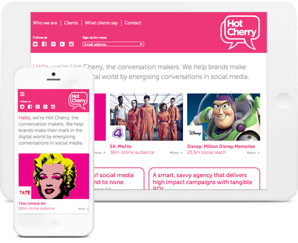
Reactive Graphics designed a responsive website for London PR company Hot Cherry.
In our 2012 post about responsive web design we mentioned that Google recommended using responsive web design where ever possible as about 50% of web browsing in the UK happened on mobile devices. Fast-forward a few years and Google are now saying that more people have access to smart phones than toothbrushes!
Tech crunch have reported that over 80% of adults worldwide now own smart phones and according to Google’s research 65% of people are purchasing smartphones ahead of desktops or PCs. So with the majority of the world browsing the web on their smart phones and going mobile, it is inevitable that responsive web design is a major force when preparing your business for the future. Your site must be multi-lingual, recognisable on different platforms and ready for anything when it comes to potential new technologies. Think holographic desktop on board a hovercraft. It could happen…
So how does a responsive site work?
Reactive Graphics work internationally with clients to design and build responsive websites and it is very common for clients to ask for a responsive website without actually knowing the basic anatomy of the design.
So firstly we would think about building fluid grids. This allows the layout of the website to be altered by percentages so that the design can respond differently to the dimensions of each device. This gives your users the option to view the web page in multiple browsers and across devices without any compromise of quality.
Here’s some of our work
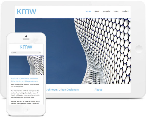
Reactive Graphics designed this contemporary bespoke responsive website for KMW Architects.
The structured, angled design of the site directly reflects the style of the company’s work. Their goal was to incorporate impressive images of their portfolio buildings throughout the site, and they chose a responsive design so that the fluid grid could transform the information accordingly.
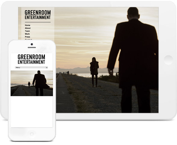
Reactive Graphics also designed this sleek new responsive website for Greenroom Entertainment.
The home page features a full width image slider that displays striking imagery taken from recent TV and Film productions. The website also incorporates movie clips from the latest episodes in a fully responsive design.
We designed this responsive site for Citibase which transforms size dependent on your desktop layout.
Whether you have multiple windows open in your browser and you want to minimise the screen or you want a fully widescreen experience. With responsive, the choice is yours.

So as well as changing grid sizes, responsive web design caters for images too. This means that each image need to be sized into specific units to prevent them from spilling out of their allotted space. Ensuring that they are beautifully displayed no matter what device you are using.
When designing responsive sites we also have to think of the science behind it, which involves managing media queries. According to MDN a media query consists of a media type and at least one expression that limits the websites format by using media features, such as width, height, and colour. This is basically a way to provide CSS rules – which is web talk for the look and format of a document – based on the size of the displaying browser. Pretty simple really!
Why wouldn’t you go responsive?
So I can imagine you are probably wondering why all sites aren’t completely responsive in this day and age.
Many businesses have spent a lot of their time updating their websites with new information through the years, and it has never occurred to them that it is also very important to update the format of the site. It is pretty vital to enable users/visitors to browse through your site with ease. Although this point leads me straight into a potential pesky pitfall of the great almighty responsive website. And we were so close…
Prior to responsive design, everyone knew the navigational rules of a website. With the three line tab at the top left of the page, you always knew how to go somewhere, but more importantly you knew how to get home. Back in the day most websites were best viewed in Internet Explorer at 640x480px because designers back then didn’t know any different to print. Then screen resolutions started to get higher and higher and the web design world was suddenly full of potential. Yet still for quite some time, single layered, one-size-fits-all designs were all that people knew. Those were the days when an apple was mostly recognised for being a fruit and a ‘device’ was something from a spy movie.
Now with web design being dominated by parallax sites and responsive sites the whole concept of web design has changed. The concept of navigation has changed. Browsing the web has become much more of a full bodied experience, which can sometimes lead to a lack of clarity in design.
Another thing with responsive web design is the dreaded loading time. There’s nothing quite as frustrating as the spinning ball of doom or even worse, a web browser buckling under the weight of a fancy site. With statistics saying that a high percentage of (impatient) mobile users will only wait 5 seconds for a site to load before shopping elsewhere, it is important to make sure your responsive site isn’t carrying any extra baggage.
My third and final responsive web design slating is a bit of a cop-out. Basically I was going to lay into the fact that responsive web design takes a little longer to develop, involves a few more days testing and is therefore a tad more expensive than your bog standard non-responsive site. But the counteraction to this point is a valuable thought. If all businesses invested a little bit more time and money into establishing a responsive site that could adapt to evolving and innovative technologies, in the long run they would be much better off.
Just say yes…
It’s 2015, the year of the sheep. So what I suggest you to do is follow the flock. Follow those tech savvy bleaters and get yourself a responsive website that makes whatever you are offering as accessible as possible. Web design author Andrew Clarke says that in today’s society anything that’s fixed and unresponsive isn’t web design, it’s something else. He believes that web design is responsive design and that responsive web design is web design, done right. Reactive Graphics do it right.
We can migrate an existing site into a responsive design format, available across all platforms. We can assist you in the maintenance of your current responsive site, with our team of specialist designers and programmers. We can build a responsive site from scratch that is completely bespoke and tailor made to your requirements that will enhance your business.
Reactive Graphics believe in investing for the future, and the future is responsive.
Please contact us for more information, we’d be happy to help.
#wearereactive

Andrew began his career in web design and development in the late 1990s. His eagerness to embrace the medium saw Andrew setting up Reactive Graphics in 2004. With over 20 years plus working as a London web designer supporting a wide range of clients, Andrew’s experience in web design, web development and graphic design have helped him to build a growing business.