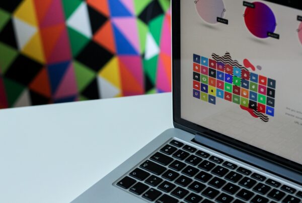
As you might have seen by now, collaboration platform Slack has changed their logo design. The tool, first launched in 2013, decided to give itself a fresh look, and not everyone approves of it. Let’s have a look at what changed, and what this means for the brand.
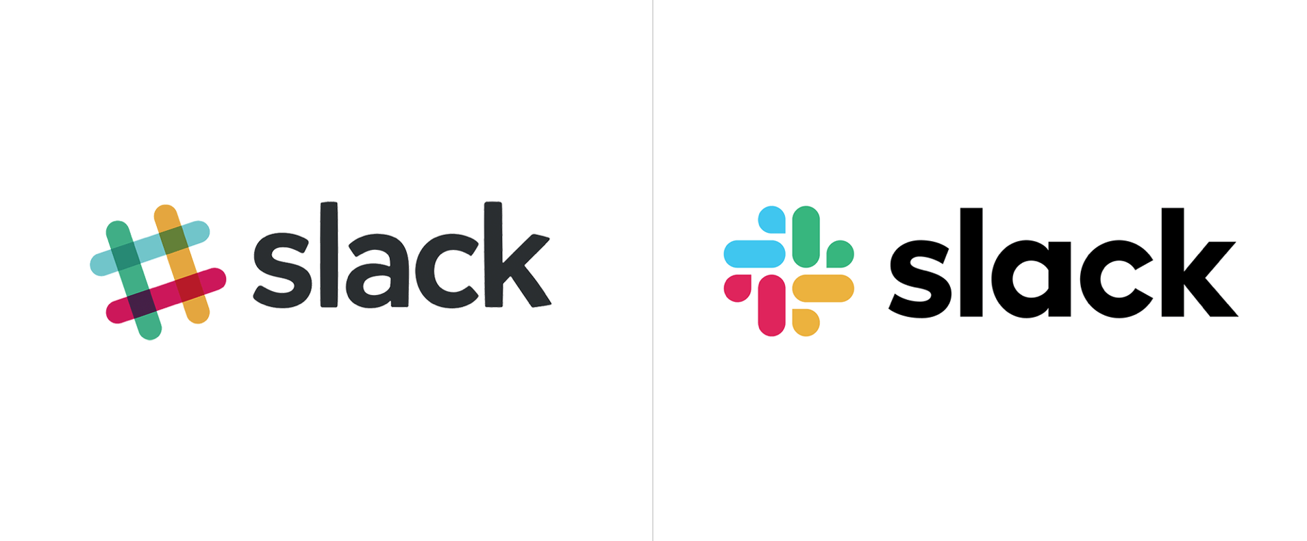
Slack has been known for their charming, yet slightly amateurish logo resembling a hash tag (or an octothorpe, as they call it). With a total of 11 different colours and an uncohesive visual language, slack struggled to communicate a clear and structured branding strategy. Yes, most of their users liked the unpretentious design. But as the business grows, so does the level of professionalism and to underline this, a mature and modern logo is essential. The new logo is neat, flat and easy to recognise. It looks intentional and well thought through. And in our eyes, it doesn’t lack character.
For the re-branding, Slack chose London based design agency Pentagram. Known for their minimalist style and structured branding, they seem to have been the perfect choice.
“In the course of lots of conversation, I learned that their original branding elements were never quite thought through as a system,” Pentagram’s Michael Bierut told design magazine Dezeen. “And although in the aggregate they created a general feel of ‘Slackness’, in the details there was a huge amount of consistency.”
“And this was only going to get worse as the company continued to expand,” he added.
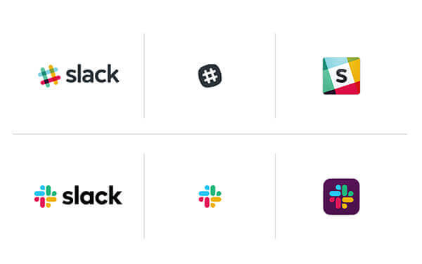
The new logo, however, is not meant to be a completely new design, but a new version of the old hash tag. In fact, the colours are similar and the shape could be interpreted as an abstract, artsy hash tag. This deconstruction of the original logo was intentional, says Bierut. “The pieces of the symbol are separate but come together, very much the way we do when we collaborate and communicate on the Slack platform: the forms are meant to look as if they’re at once woven together, and bursting open.“
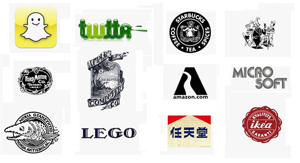
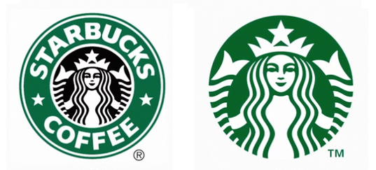
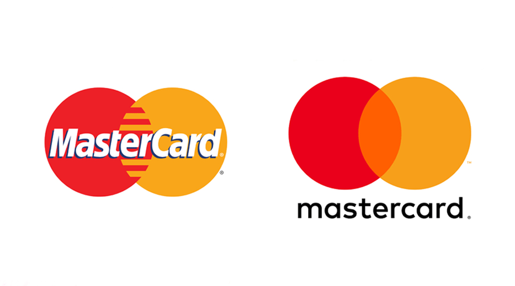
It is not uncommon for brands to re-design their visual identity. Especially with growth of success and business expansion, a logo that sufficed in the beginning might not match the seriousness and sophistication of the business anymore. Twitter, for example, started with a horrendous logo. Google’s logo used to have an exclamation mark and drop shadow. Microsoft, MasterCard, Starbucks, Airbnb, Adidas – most companies go over their logo at some point and decide it is time for change, even if that only means making the logo flat or changing the font slightly. And it makes sense. Sure, character and originality can be charming, and makes sense for a brand existing in a niche market. But as soon as your brand wants to communicate a certain standard, a professional logo and overall branding structure is necessary.
Re-branding is often not as hard as it might seem. Usually, the old visual language is used as a basis to develop the new one, allowing the designers to keep certain values or strategies while improving them. Taking a logo and making it flat, for instance, can change the perception of a brand entirely. Flat logos are often associated with modern and innovative, fresh approaches, whereas multidimensional designs tend to seem old fashioned or traditional – connotations not every brand wants to create.
Another aspect designers often try to tackle when re-designing a brand is untidy colour systems. Logos play a huge role not only in the initial perception of the brand, but can define how easily a brand is recognised. Having an aesthetic logo is important, and the better the colours work together and the smoother the overall finish seems, the higher is the likelihood of approval by potential consumers. Finding a brand to be aesthetically pleasing might weigh into the decision to choose this brand instead of other brands.
Generally speaking, the design of a brand depends what the business wants to communicate. In Slack’s case, the brand is likely to have gotten tired of their slightly chaotic design and inconsistent brand identity. The decision to change that was the right one.
What are your thoughts on re-branding? Leave a comment below!
Read more about branding here.