UI design best practices
We use UI design best practices to build websites that look great, feel easy to use and get real results.
When someone visits a website, they should understand how it works straight away. Buttons should be easy to find, text should be clear to read and the layout should guide visitors naturally through the page. When everything is simple and well organised, users don’t have to think too much about what to do next.
A clean and easy interface also makes a website feel more professional and trustworthy. If a site feels messy or difficult to use, people often leave. As a web design agency, we focus on creating user interfaces that are clear, simple and designed around how real people use websites.
What are UI design best practices?
UI design best practices are simple rules and principles that help make a website easy to use and enjoyable for visitors. They guide everything from how content is organised to how buttons, menus and forms work, making sure every element has a clear purpose.
When a site follows these principles, users can find what they need quickly and navigate without getting stuck. It is all about making the website feel natural and straightforward to use, so visitors can focus on what matters instead of figuring out how it works.
What best practices actually mean in real life
UI design best practices aren’t strict rules you have to follow every time. They come from watching how people actually use websites and noticing what works and what doesn’t. Over time, certain patterns repeat. People click the same types of elements, ignore others and get stuck in similar places.
These patterns turn into best practices because they solve common problems. For example, people don’t want to spend time figuring out where to click. If a layout is clear and familiar, they move faster. If something feels off, even in a small way, they slow down or hesitate. You want to make decisions feel obvious, so users don’t have to second guess anything. When a site follows these patterns, everything feels straightforward, even if the user doesn’t notice why.
Why UI design best practices matter
A website might look nice, but if people can’t figure out how to use it, they will leave, fast. UI best practices make sure visitors can get around easily, understand what is important and know what to do next without thinking twice.
Following these principles also helps your business. When a site is clear and easy to use, people trust it more, spend more time exploring and are more likely to take action. Like buying a product or getting in touch. A UI designer makes sure a website looks good and works well for visitors.
The most important UI design best practices
Some UI decisions have a bigger impact than others. They change how quickly someone understands a page and how easily they move around it.
Clear navigation
One of the most important is navigation. People shouldn’t have to search for where to go next. Menus need to be easy to find, labels need to make sense and the structure should feel familiar. If someone has to stop and think about where something is, the flow is already broken.
Visual hierarchy
Not everything on a page has the same importance and the design should reflect that. Bigger elements, stronger contrast and better spacing help people see what matters first. Without that, everything competes for attention and the page feels harder to scan.
Consistency
Consistency is what makes a site feel predictable. If buttons, links or layouts change from one page to another, people slow down. They start questioning what will happen when they click. Keeping things consistent removes that hesitation and helps users build trust.
Feedback
When someone clicks clicks a button or link, types into a field, or submits a form, they need to see that something happened. Even small responses, like a button changing or a message appearing, make the interaction feel clear.
Simplicity
It is easy to add more content, more options, more features. But most of the time, that just makes decisions harder. Good UI design focuses on what matters and removes what doesn’t. The clearer the page, the easier it is for someone to move forward without getting distracted.
How people actually use websites
Most people don’t read a website carefully from top to bottom. They scan. They jump between sections. They look for something that stands out and seems relevant to what they want. This means the first few seconds matter more than most of the content on the page. If nothing stands out or everything looks the same, people slow down. They start searching instead of moving forward.
People also rely on shortcuts. They don’t want to read everything to understand what is going on. They look for signals like headings, buttons, or familiar layouts to guide them. If those signals are clear, they move quickly. If not, they hesitate or click around trying to figure things out.
Another thing to notice is how quickly people lose patience. If something feels unclear or takes too long to understand, they don’t try to solve it, they move on. You have probably experienced this yourself. That is why small details matter.
Common UI mistakes to avoid
- Too many buttons on a page, making it hard to know what to click first
- Unclear labels that don’t explain what will happen when clicked
- Cluttered layout with too much content placed close together
- Inconsistent design where styles, buttons or layouts change between pages
Tip: Look at each page as a whole, not just single elements. If a page doesn’t clearly show what is most important within a few seconds, it usually means too many things are competing for attention. In that case, remove or reduce less important elements and make the main action stand out more.
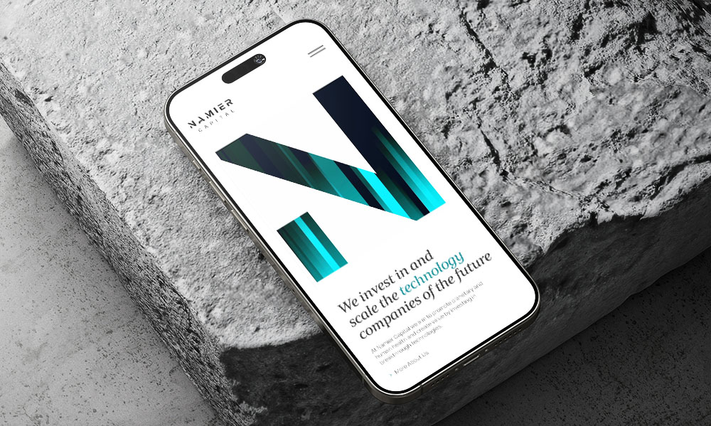
How we apply UI design best practices at Reactive?
Every website we create starts with understanding the people who will use it and what you want them to do. From there, we plan the layout, buttons, menus and other elements so everything is clear, consistent and easy to follow.
We focus on making the site simple to navigate while still looking great. That way, visitors can find what they need without thinking too much and your website actually helps them take the actions you want.
How do I know if my website follows best practices?
A simple way to start is by watching how real people use your site. If they pause, click around without finding what they need, or get confused, it is a sign that some parts could be improved. Even little problems can confuse visitors or make them leave without taking action.
Another way is to compare your site against common UI principles, like clear navigation, readable text and consistent web design. As part of our design process, we review your websites and give you a clear report on what is working well and what needs improvement, so you know exactly where your site stands.
Do UI design best practices include mobile design?
Yes, mobile design is very important. Most people visit websites on phones or tablets these days. People expect websites to work well instantly, without zooming or scrolling too much. We design every website to work well on all screen sizes. Mobile first thinking is part of our design process.
We also test every page on different devices to make sure nothing breaks or looks awkward. This way, people can use your site easily, no matter what device they are on.
UI design best practices aren’t about following trends or making a website look modern for the sake of it. What matters more is whether people can understand the page without effort and move through it without getting stuck.
Two more tips at the end. Before adding anything new to a page, check if it already serves a clear purpose. If an element doesnt help someone decide, understand, or move forward, it is usually adding noise rather than value. Also, try using your own site without thinking about it too much. If you have to pause, that moment usually shows where the design can be improved.