Designing for different devices and platforms
Your users are coming from all kinds of devices, so your website needs to work perfectly on all of them.
People access websites on desktops, laptops, tablets and phones, and each device has different screen sizes and ways of interacting. Designing for multiple devices means thinking about layouts, navigation and content so that your website looks good and works well everywhere.
It is not just about shrinking or stretching a page. We make sure your website is easy to use and feels natural on each platform. This way, visitors can find information, take action and enjoy the experience whether they are on a phone at home or a laptop at work.
How people use different devices
People don’t use all devices in the same way. The difference is not just screen size, it is how and when the device is used. On a phone, people are often looking for something quickly. They might be on the move, checking something fast, or trying to do a simple action without spending much time.
On desktops or laptops, it is different. People are more settled, they spend more time on a page, read more and explore in more detail. The same website is used in a different way, which changes what users expect and how they move through it. This is why designing for different devices is not just about resizing layouts. It is about understanding the situation the user is in.
What does designing for different devices mean?
Designing for different devices means making sure your website works well on all screen sizes. People may visit your site on a desktop, laptop, tablet or mobile phone, so the design needs to adjust to each one. The layout should stay clear and easy to read no matter which device someone is using.
It is not only about shrinking the layout to fit a smaller screen. Navigation, content and buttons should feel comfortable to use on every device. Visitors should be able to scroll, click and find information easily without zooming or struggling to move around the page.
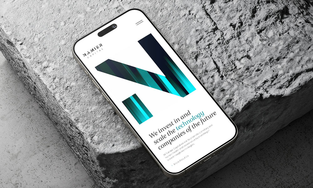
Why is mobile design so important?
A large part of website traffic now comes from mobile devices. Many people first visit a website on their phone while commuting, relaxing at home or quickly searching for something online. If a website is difficult to use on a phone, visitors often leave and look for another option.
Mobile design makes sure your website is easy to read, navigate and interact with on smaller screens. Buttons should be easy to tap, text should be clear and pages should load quickly.
How design changes across devices
Navigation
Navigation is one of the biggest differences. On larger screens, menus are usually visible and easy to access. On mobile, there is less space, so menus are often hidden behind an icon and need to be opened. This changes how quickly users can move around the site.
Interaction
Interaction is also different. On desktops, people use a mouse to click and hover over elements. On mobile, everything is based on touch. Buttons need to be bigger, spaced out properly and easy to tap without mistakes.
Layouts
Layouts also change. A layout that works well on a wide screen may need to stack into a single column on a phone. Content needs to be rearranged so it still makes sense and is easy to follow.
Content
Content priority becomes more important on smaller screens. There is less space, so the most important information should come first. Less important details can be placed further down the page.
Responsive vs adaptive design
Responsive web design means a website automatically adjusts to fit different screen sizes. The layout changes smoothly depending on the device, so the same website can work well on phones, tablets and desktops. For example, menus, images and content blocks can shift position to fit the screen better.
Adaptive design works a little differently. It uses several fixed layouts that are designed for specific screen sizes. At Reactive, we build responsive websites because they are more flexible and provide a consistent experience for visitors on any device.
Common mistakes when designing for multiple devices
- A common mistake is designing for desktop first and then simply shrinking everything to fit a smaller screen. This often leads to layouts that feel too busy or hard to use on mobile.
- Another issue is ignoring touch interaction. Buttons that are too small or placed too close together can be difficult to tap, which makes the experience frustrating on phones and tablets.
- Too much content on mobile is also a problem. What works on a large screen can feel overwhelming on a smaller one. Without clear priorities, users may struggle to find what they need.
- Layouts that are different across devices can also confuse users. If the structure or behaviour changes too much, people have to learn how the site works again instead of using it in the usual way.
Does designing for different devices affect website speed?
Yes, it can. Different devices have different screen sizes, internet speeds and processing power. If a website is not optimised properly, it may load slowly on phones, which can make visitors leave before the page fully loads. Most people have experienced this themselves and simply closed a website because it was taking too long.
Good UI designer takes performance into account from the beginning. This means images need to be properly sized and code should stay clean and efficient. Developers often compress files, reduce unnecessary scripts and organise content so pages do not become too heavy.
How designers test across devices
UI designers don’t rely on just one screen when checking a website. They test designs on different devices to see how layouts, buttons and content work in real situations. This includes checking different screen sizes, from small phones to large desktops, to make sure nothing breaks or looks out of place. Small issues like spacing, text size or button placement often become easier to notice when switching between devices.
Designers also check how the website works on different systems like Android and Apple devices to make sure everything behaves correctly across platforms.
Testing also helps see how people interact with the design. Something that works well with a mouse might feel awkward on touch and the other way around. By testing early, designers can fix these issues before the website is built and avoid problems later on.
How do you approach designing for different platforms at Reactive?
At Reactive, we design every website to work well on all devices, from phones and tablets to laptops and desktops. We make sure the layout, buttons and content are easy to use and read on any screen. Different platforms and devices can display things in slightly different ways. Fonts, images and buttons may appear differently and touch gestures can behave in unique ways on phones and tablets.
We also make sure the website works properly on different platforms, like Android and Apple devices, so visitors get a consistent experience no matter what they use.
Designing for different devices means understanding that people use a website in different ways depending on where and how they are using it. On a phone, people are often in a hurry, looking for quick information or doing something simple. On a larger screen, they usually have more time, read more and compare things in more detail. For example, when people are shopping or booking things like flight tickets, they often prefer using a desktop because it’s easier to see more information at once and compare choices. Good design takes these differences into account and shows information in a way that fits each situation.