Creating engaging and intuitive UI design
Creating engaging and intuitive UI design is about designing websites that feel natural to use and keep visitors interested.
The best UI often goes unnoticed. It quietly helps people move through a page and it feels natural and intuitive. Visitors don’t stop to think, they just do what they need to do, almost without realising it. They don’t think about colours, fonts, or button placement, they are focused on their goals. When a website works like this, using it feels effortless.
Watching how people use a page can tell you a lot. You notice where their eyes go first, which buttons they click immediately and where they hesitate. Small things, like where a button is, how a menu opens, or how an animation draws attention, can make a big difference. They might help someone find what they need quickly or make them pause and figure out the next step. Well-designed pages let people move naturally from one task to the next.
Understanding this is what separates a site that works from one that just looks good. It all comes down to what happens in the first few seconds.
What is UI design
UI design, or user interface design, is how designers decide how a website looks and works so people can understand it instantly. It covers buttons, menus, forms and the way information is shown, following rules that make the interface predictable and clear. The goal is that visitors can focus on what they came for: like reading, shopping or exploring, without stopping to figure out the site itself.
Why UI matters
When someone opens a page, they make decisions in seconds. Where to click first, which information to trust and how to move forward all happen almost automatically. UI design is what guides those decisions. If the layout is confusing, visitors waste time guessing and may leave. If the layout is clear, they understand what to do without thinking.
Even tiny details can change how people interact. A button that is slightly bigger or a menu that unfolds smoothly tells visitors where to go next. Grouping related information together helps them scan quickly instead of getting lost. These small choices make it faster for visitors to find what they need and feel confident while navigating the page.
How do you create UI designs that keep users engaged?
Understand how people actually use websites
Most visitors don’t read everything. They skim, scroll, and click the first thing that looks important. Think about yourself: when you open a new page, do you read every paragraph? Probably not. You glance at headlines, scan images and look for the fastest way to get what you came for.
Designing for this behaviour means putting the most important information where people expect it and avoiding anything that could slow them down. If visitors understand what to do in a few seconds, they are more likely to stay on the site.
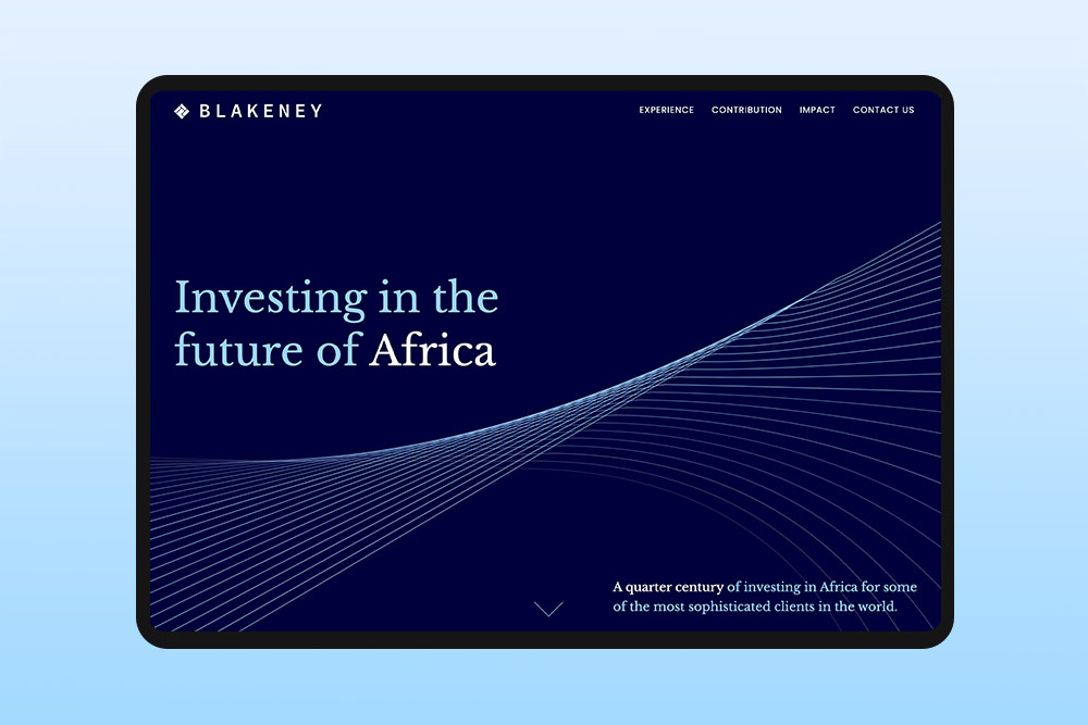
First impressions matter
When someone lands on a page, they decide almost immediately what seems important. If the main action isn’t clear, they might click the wrong thing or leave. The top section of a page carries a lot of weight. It should quickly show users where they are and what they can do next.
For example, if a page has three buttons that all look the same, people slow down. But if one button stands out, visitors know where to click without thinking. Small visual cues, like a colour change, size difference, or an arrow, can guide attention and reduce hesitation.
Find areas where users hesitate
Pauses are clues. If someone stops before clicking, scrolls up and down, or moves their cursor around, it usually means something isn’t clear. This often happens on forms, pricing pages, or anywhere a decision is required.
Most of the time, the fix is small. It could be clarifying a label, moving information closer to the action, or adding a tiny hint. Observing hesitation helps find friction points without guessing.
Organise your content
It is easy to overload a page, especially when there is a lot to say. Most visitors aren’t reading everything. They are trying to find one thing and move on. When too much appears at once, it slows them down.
Breaking content into clear sections helps. Proper spacing guides the eye and highlighting the most important information keeps focus. For example, instead of showing all product features at once, start with the three main benefits and let users explore more if they want. Organised pages let visitors move through the site confidently.
Small details matter
Tiny choices can change how a site feels. A menu that opens quickly feels responsive. A button that reacts right away feels reliable. Spacing matters too, crowded content feels confusing, while well-spaced elements feel calm and easy to read.
Even small micro-interactions, like highlighting a field when a user clicks or giving instant feedback when a form is submitted can make the experience feel smooth and trustworthy.
The role of memory in UI design
People don’t remember everything they see on a page. Good UI reduces the mental effort by keeping things consistent and familiar.
- Repeating patterns help visitors predict what will happen.
- Using familiar icons, layouts, and labels reduces confusion.
- Even small things, like keeping navigation in the same spot on every page, help users feel confident and focused.
This is why a site that looks different on every page can feel frustrating, because it forces users to relearn the interface each time.
Predictable patterns make navigation simple
UI that feels familiar reduces mental load. One of the most overlooked aspects of UI design is managing what people expect. Every visitor comes to a page with habits formed on other websites.
Some of the most familiar patterns include the main navigation at the top or on the left, logos that link back to the homepage and buttons that clearly look clickable. Forms usually follow a predictable layout with labels above fields and calls-to-action often appear at the bottom of a section or page.
Even smaller things, like using a shopping cart icon for purchases or a magnifying glass for search, feel familiar because people see them everywhere. These patterns don’t just look nice, they help visitors know what to do without guessing.
Test early and often
UI design isn’t finished when it looks nice. It is finished when people can use it without thinking. Even early prototypes can show where visitors get confused.
A simple test is to show someone a page and ask what they would click first. If they hesitate or guess wrong, that shows where the interface could be clearer. Small insights like this can be fixed early before they turn into bigger issues.
Mobile matters
UI isn’t just about desktop screens anymore. Most people interact with websites on phones or tablets, which makes designing for different devices critical. Buttons need to be easy to tap, menus should open smoothly and scrolling should feel natural. Pages that look and work well on phones, tablets, or computers make it easy for people to find what they need, no matter what device they are using.
Creating engaging and intuitive UI design is about making a website feel easy to use without thinking. Good UI feels natural because it fits how people think and behave, not because it is flashy. It is about making interactions predictable, reducing little moments of hesitation and letting users focus on what they came for.
Can an existing website be redesigned to be more engaging and intuitive?
At Reactive we often work with websites that feel outdated or confusing. We review how visitors interact and identify problem areas. For a website redesign, we reorganise content, adjust layouts and improve navigation to make it clearer. We add interactive elements, subtle animations and visual cues to guide users naturally. Redesigning focuses on making the site feel more intuitive and engaging.
How much time does a thoughtful UI design process usually take?
The time depends on the size and complexity of the project. Simple websites take less time than larger ones. Every element, from layout to interactions, is planned carefully to create a great experience. Rushing the process can make a site confusing or cluttered. We focus on thoughtful design so visitors understand the site easily and enjoy interacting with it.
A well planned UI web design saves time and frustration later by preventing mistakes before the website is built.