Introduction
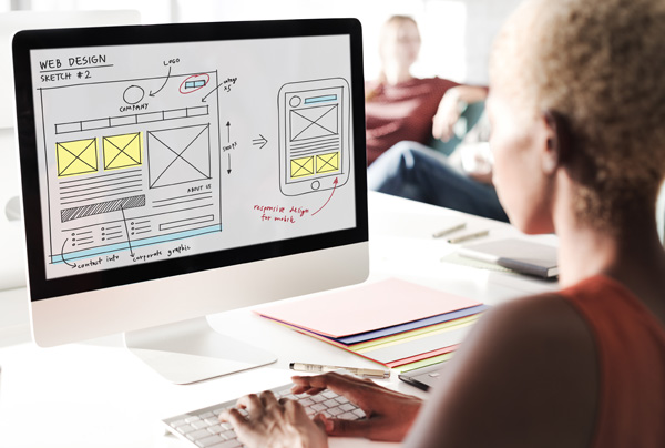
The use of illustration in web design is a growing trend, thanks to faster download speeds, ensuring large image files don’t slow down your user’s experience, and a push towards a more imaginative approach to web design, driven by the desire to stand out from the crowd and ensure that your website delivers on impact, branding, communication and usability.
The vast majority of websites do not use any illustration. If used well, this visual tool can help to make your site unique and stand out. There are a broad range of illustration approaches and styles, so you are sure to find something different and fitting for your company. A well chosen style also helps to communicate your brand and express your company’s personality, whilst engaging the user and making your site more memorable.
So what is illustration in web design and how is it used?
The definition of illustration is as follows: Visual matter that has the intention of clarifying, explaining or illuminating. To use illustration effectively it is key to first look at how it can be utilised, and consider the goal you wish to achieve.
Looking at the following examples we will explore these uses and what they bring to a website. We will examine the use of simple icon and diagrammatic imagery, the introduction of mascots and characters, and then illustration led websites to create a complete unique user environment. Finally, we will examine the use of illustrated text.
Info graphics and flat design
Flat design is spearheading the growing use of illustration in websites at the moment. It is a classically digital style, embracing the fact that your website is a piece of functional technology, whilst also creating a modern, crisp design. Instead of trying to represent real life tactile objects, this illustration style is born out of a desire to simplify right down to the basics, and thus communicate an idea in a fast and direct manner.
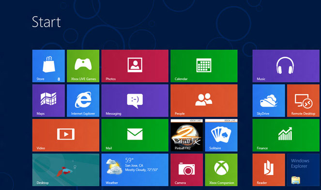
A popular way to use this style is to navigate throughout a web site. This kind of design is seen on the Windows 8 apps store navigation blocks and icons, and has gone on to be a popular design choice for many websites. The use of 2D minimal icons with crisp edges, along with a strong colour pallet, directs the user effectively with memorable colour coding. The navigation using large blocks as opposed to text buttons, also recognises the number of people accessing websites using tablets and smart phones.
Windows 8 dashboard navigation
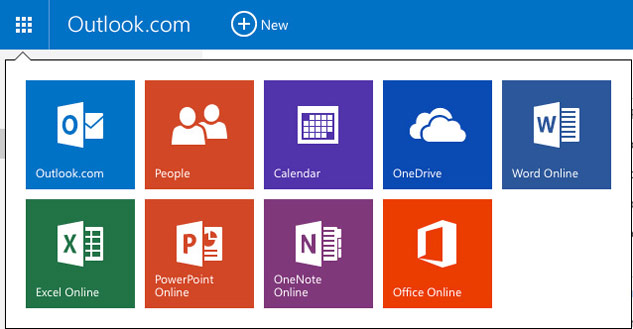
Use of flat design for navigation in MS Outlook
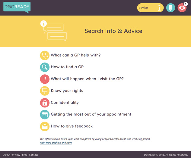
Use of flat design for navigation in Doc Ready website
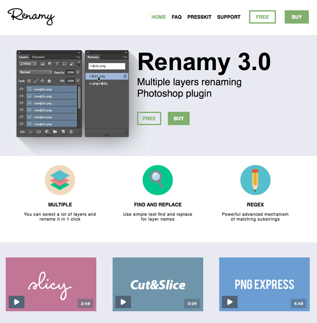
Use of flat design for navigation in Renamy website
This style is also ideal to communicate processes or ideas in a fun and efficient way. This also helps to reduce text heavy web pages and scale down excess copy, and it works especially well for service websites or those with instructions.
Use of flat design as an info graphic in Akita website
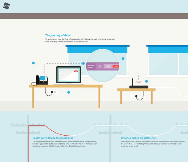
This website uses flat design to show the flow of data in an imaginative and diagrammatic way, following an email from sender to receiver.
Use of flat design in LinkedIn info graphics demonstrating different statistics
The flat design style of illustration has developed into a popular visual aesthetic currently popular across web design and advertising.
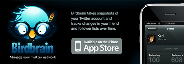
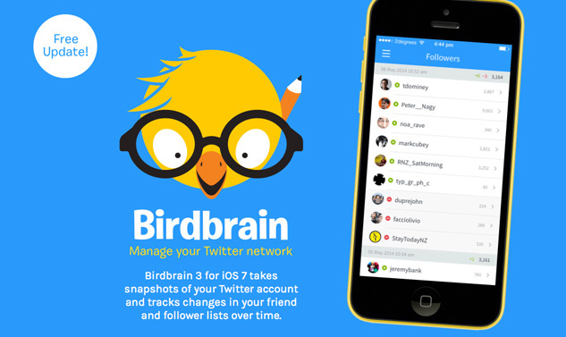
The Birdbrain website demonstrates how flat design has influenced illustration in the past few years.
Here is how the Birdbrain website looked in 2010
And now in 2014
TIP: This style of flat illustration looks good used with a sans-serif font for a cohesive aesthetic.
The use of Character or Mascots.
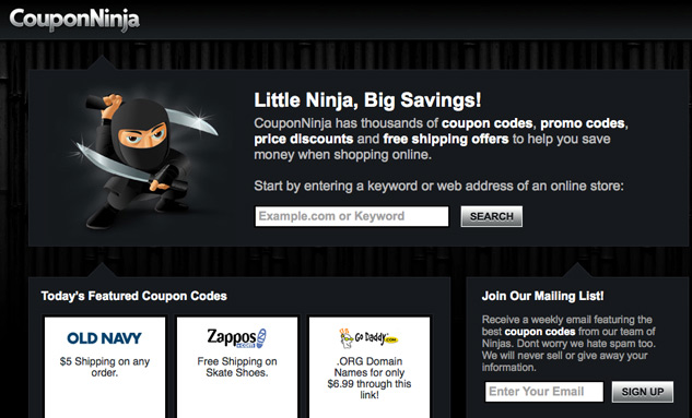
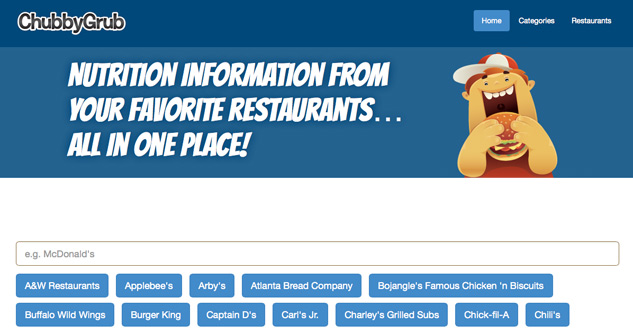
The illustrated character on the Birdbrain website leads us nicely onto the next use of illustration. The use of a character of mascot can really help to give your website personality, connect to your user on a more personal level and convey your company approach. This helps with customer relations as you can communicate warmth, trustworthy-ness, approachability and humour. A mascot also builds your brand and makes your website stand out. Imagine the Coupon Ninja site or the Chubby Grub site below without their mascots, they would be considerably more generic and plain.
Coupon Ninja website
Chubby Grub website
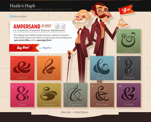
Haafe & Haph website
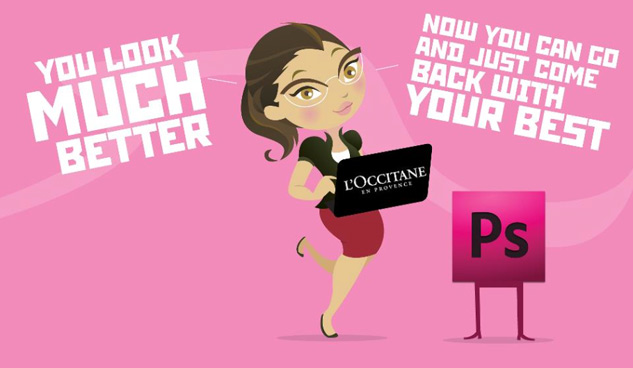
Photoshop Lady website
Mail Bakery website
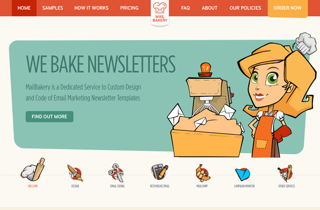
Be sure to choose your character well. If the Mail Bakery website wasn’t a well known brand it could, on initial viewing, confuse the user in to thinking they had stumbled across an actual baking site aimed at women. So it is important to consider your user. The use of a character on your site can also help attract in your target market by choosing a character who your target audience can readily identify with.
The fully illustrated site
In this instance illustration is used to drive the whole design of the website and the final result is often highly decorative, creating a unique virtual experience for the user. Fully illustrated websites are popular with companies trying to market an ‘experience’ in the real world, whether it be a shopping experience like the Hermes site, or a travel experience like the Flanders Tourism website (Kust Extra Deluxe). It is important that the site’s functionality is properly considered along with the aesthetics of the design, so that you are careful not to obscure or inhibit navigation on the website. The following examples show how a unique and beautiful environment is created using illustration as the most prominent design element. This use of illustration can quickly establish the nature of your business and the tone of your website.
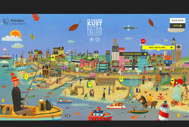
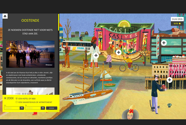
Use of illustration on the Kust Extra Deluxe website
An animated map of the Flemish coast reveals different areas to visit when you move your cursor across the sights, zooming in with a 3D effect when you click on a location.
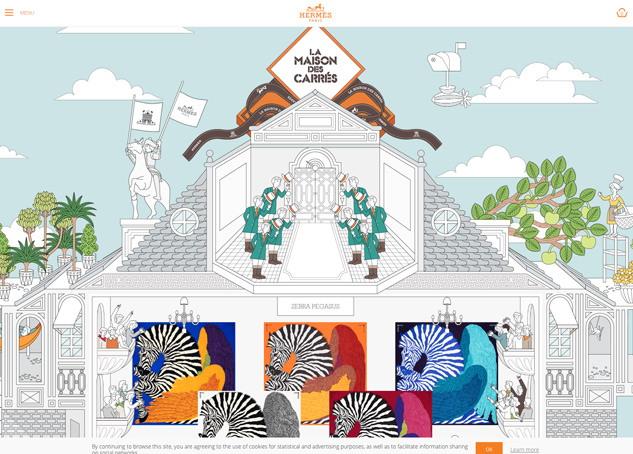
Use of illustration on the Hermes site, La Maison Des Carres
A fullscreen cut-away illustration of a shop’s interior, with footmen welcoming you, lets you click on each scarf design and display it as if it were hanging in a display room.
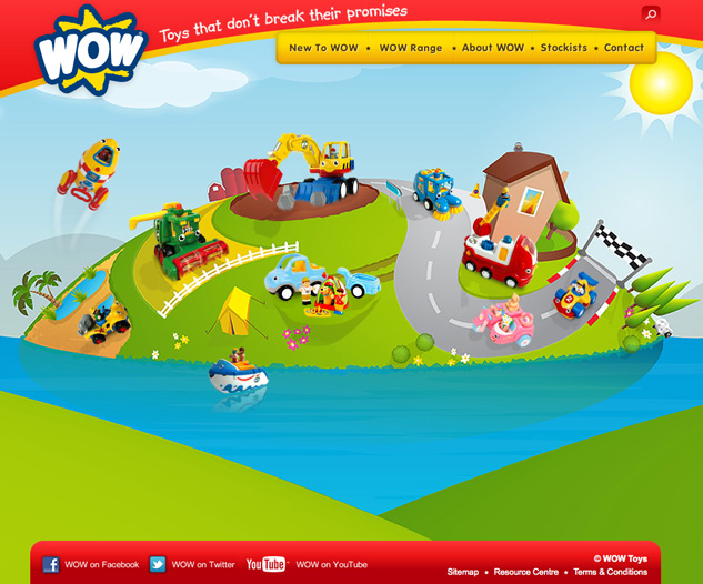
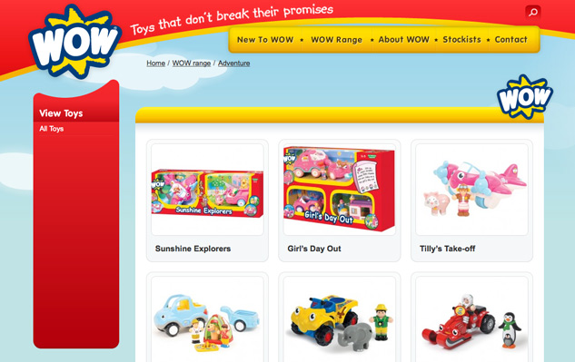
Use of illustration on the Wow toys website
An imaginary landscape populated with illustrated toys in a style that perfectly mimics the bright simple toys for sale on the site. The toys in the scene are animated when the cursor hovers over them in a fun way, then lead to the relevant online shop page when the user clicks on the toy.
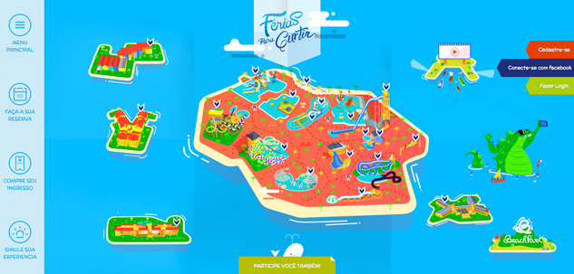
Use of illustration on the Ferias Para Curtir website
An illustrated map shows the features and layout of this Spanish holiday and activity resort.
The use of illustration in this way doesn’t always directly communicate the product being sold, but more provides a way to establish a brand name, even though what is being marketed may be unrelated.
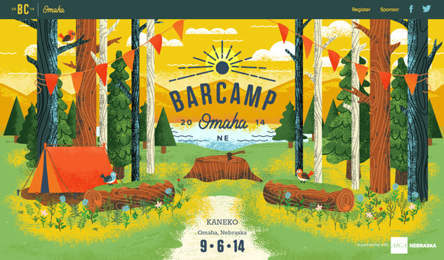
An example of this could be the BarCamp website. Whilst BarCamp is actually a network for conferences focusing and running workshops around technology, their website illustration doesn’t communicate this but instead focuses on the brand name ‘BarCamp’ showing a camping and forest scene. This can work well and add some fun if your brand is well known in the industry you work.
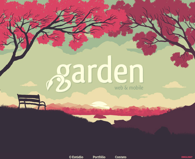
Another example of this is Garden Studio. A design company which shows off it’s design and illustration techniques using an image of a garden to interest the user and also restate the brand.
Illustrated text
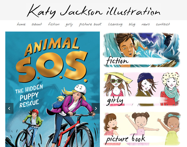
Hand rendered text is a fantastic way to add individuality to a design. Even hand tracing over a standard font instantly creates a totally unique look. It is particularly suitable when trying to convey a natural and organic brand, or for conveying metaphysical things like thoughts, creativity or imagination.
Use of hand rendered text on the Project 365 website
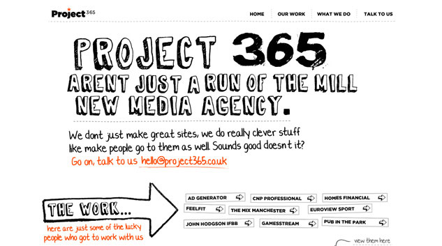
If you are incorporating illustrations on your website, hand rendered text can be used as a way of unifying your text copy with the artwork.
Use of hand rendered text on the Katy Jackson website
Summary
Illustration can give your website a real edge in many different ways. It is important to consider how and why you want to use it before deciding whether it is suitable for your site. However if you do choose to use illustrations it can really benefit your site’s functionality, brand identity and impact. If you require illustration for use on your next web project, please contact ReactiveGraphics
[box style=”1″]If you found this article useful or informative, please share it through Twitter, Reddit or whatever works for you. It really helps us out a lot and we thank you in advance. If you have any questions please feel free to leave them below or email info@reactivegraphics.co.uk[/box]

Andrew began his career in web design and development in the late 1990s. His eagerness to embrace the medium saw Andrew setting up Reactive Graphics in 2004. With over 20 years plus working as a London web designer supporting a wide range of clients, Andrew’s experience in web design, web development and graphic design have helped him to build a growing business.