Working with colour and imagery in graphic design
Colour and imagery are two of the most powerful tools in graphic design. They set the mood the moment someone lands on a page, even before they read a single word.
Colour and imagery help set the mood and highlight key points. The right colours can make a design feel energetic, calm or playful, while images tell stories and convey feelings without a single word.
But it goes beyond individual choices. The real skill is how colours and images work together across a design. When they are used in a thoughtful and balanced way, the design feels consistent and connected. This creates a clear and recognisable style that people can easily associate with the brand.
Why is colour so important in graphic design?
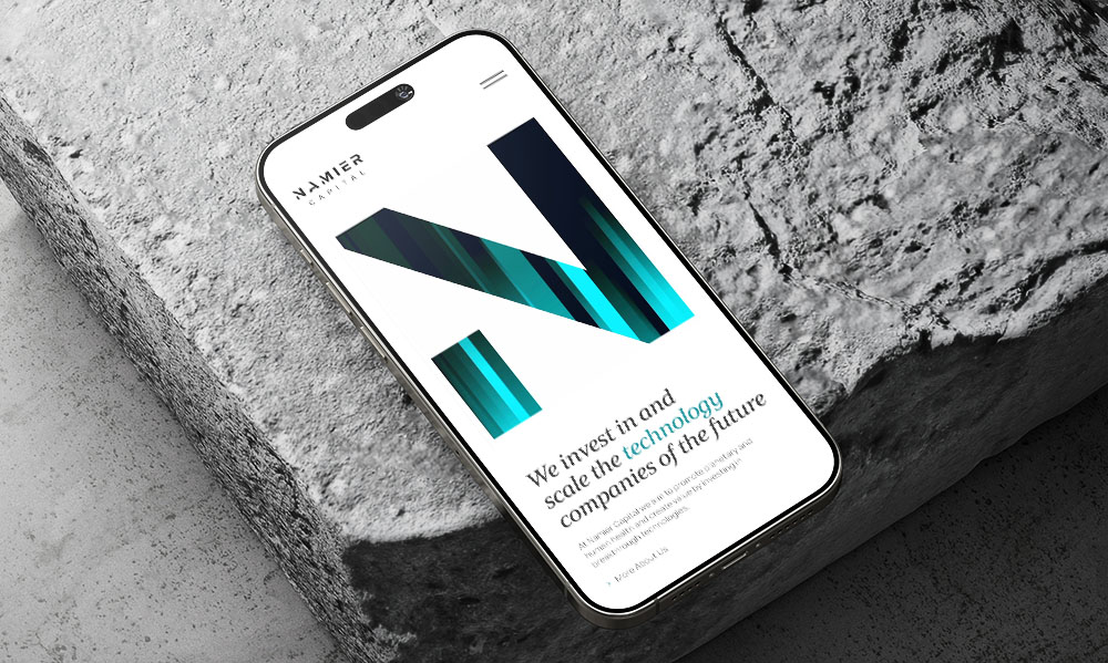
Colour helps people quickly understand information and notice what is important. Bright colours can highlight key details, while softer tones can separate sections and make a layout easier to follow. Colours also create relationships between elements, so viewers can see which parts belong together. Colour also sets tone and mood, influencing how users feel and interpret the content without needing to read a single word.
It is not just about picking colours that look nice. Professional designers working in graphic design and web development consider how colours work together, how easy they are to read and how accessible they are for everyone.
The role of colour and imagery in graphic design
They are often the first things people notice and the last things they remember. Before reading any words or clicking anything, people already get an idea of a design from the colours, pictures and overall look. They also help guide attention, organise information and show meaning. A well-chosen colour palette can make a layout feel instantly clear and easy to navigate, while the right imagery can stop someone scrolling and draw them into your content.
For businesses, this is very important. In a world where attention spans are short and competition is fierce, the visual identity of your brand is often your first and most important opportunity to make an impression. This is why the look of a brand matters so much.
How do you choose the right colours for a website?
Choosing the right colours starts with understanding the brand, the audience, and the purpose of the website. We look at your existing brand guidelines, your industry and your competitors before making any colour decisions. Designers consider what emotions the colours should evoke, which elements need emphasis and how colours work together to create hierarchy and readability.
The goal is always to create a palette that feels right for your business and works well across every page and device.
Why use colour psychology in graphic design?
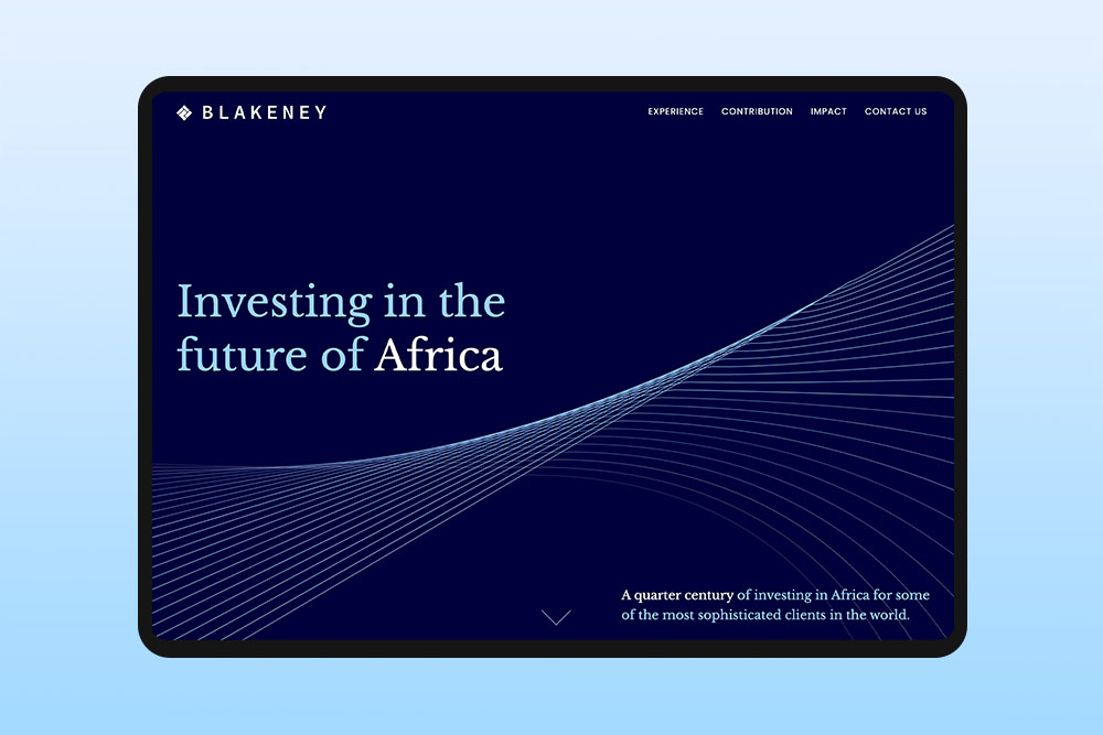
Colour psychology is an important tool in design. Knowing how colours affect people means design choices are not random. For example, muted greens and earth tones can make a site feel grounded and approachable, while brighter yellows or oranges can create energy and draw attention to specific areas. Every colour can support the message, draw attention to important parts, or create a feeling that keeps people interested in the content.
Blue is often used because it can feel calm and trustworthy, which is why it is common in finance and healthcare. Red can feel strong and urgent, so it is often used for buttons or offers that need attention. The important thing is to use colour with a clear reason, not randomly.
What role does imagery play in graphic design?
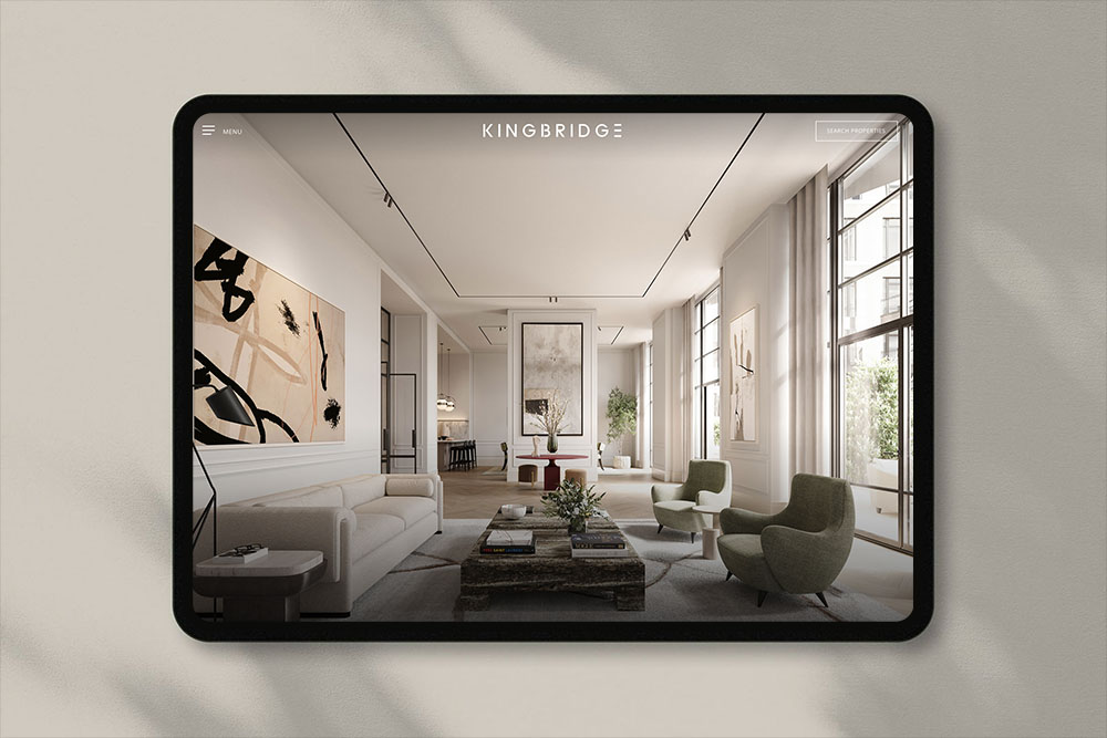
Imagery adds personality to a website and helps tell your brand story in ways words can’t. The right images build trust, connect with your audience and make content more interesting to explore. On the other hand, poorly chosen visuals can make even a well-designed site feel unprofessional.
As a web design agency, we also think about how images work with colours, spacing and text so everything feels connected and balanced.
What types of imagery work best for websites?
Real photos of people, places and products usually work better than generic stock images. People can often tell when an image is staged or used everywhere and this can make a brand feel less trustworthy. Custom photos, illustrations or lifestyle images that match your brand tend to work better. If a business cannot do a professional photoshoot, using carefully chosen images with the same editing style or filters can still keep everything consistent. Videos and simple animations are also becoming more common.
How to make colour and imagery work together
The easiest way to create harmony between colour and imagery is to pull colours directly from your images. If your photography has warm, earthy tones, your palette should reflect that. If your images are bright and high contrast, your colours should match that energy.
It also helps to be careful with background colours. If the background clashes with your images, even great photos can look a bit off. A simple or matching background lets the images stand out.
If you are using multiple images across a page or campaign, they should share a similar style, tone and colour temperature. Mixing moody dark photography with bright colourful images on the same page will make a design feel off.
When colour and images are chosen together from the start, everything fits together much more naturally.
How does consistency in colour and imagery build brand recognition?
Using the same colours, images, and style on your website, social media, and printed materials helps people recognise your brand quickly, even before they see your name. This makes your brand feel familiar, and familiar things feel more trustworthy. In competitive areas like finance or property, that trust can be what encourages someone to get in touch. That is why we always keep a guide for colour choices and image rules in our design process, so every part of the brand looks consistent.
Common colour mistakes to avoid in web design
- Using too many colours with no clear plan, which makes the design look unorganised
- Picking colours just because you like them, instead of thinking about the audience and the brand
- Not enough contrast between text and background, which makes reading difficult
- Forgetting that colours can look different on screens and in print
- Not thinking about accessibility: around 8% of men have some form of colour blindness, so colour alone shouldn’t be used to show important information