Visual content creation and design
Visual design decides whether someone trusts your website in the first three seconds.
Visual content is often what people notice first on a website. Long after they forget the words, they remember how the page looked, the image at the top, or a simple chart that made something clear. But many businesses still treat visuals like filler. A stock photo here, a generic image there, just something to fill space above the headline. The result is websites that all look the same and content that people don’t save, share or come back to.
Let’s look at what makes visual content work, where AI tools can help and where they don’t do so well and how visuals fit into content marketing as a whole.
Visuals should do a job, not fill space
The first rule is simple. Every image should help explain something or make a point. If you remove an image and nothing changes, then it is not doing much. A photo of a smiling team in a meeting room is just filler. A diagram that shows the steps of your onboarding process is useful. A stock photo of someone pointing at a laptop does not add much. A real screenshot of your product with a key part highlighted does.
That said, not every image has to do heavy work, especially in a blog. Some can just help break up the page and make it easier to read. That is fine. But it is always better when an image helps explain the text or makes something clearer.
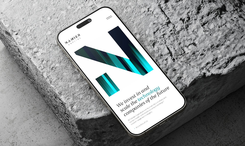
Match the visuals to your brand identity
Walk down any high street and you can spot brands you know without reading the signs. The colours, the fonts, the way they show their products all build their brand identity. The same applies to your website.
Two simple things help.
- First, set a few visual rules and stick to them. Pick a small set of brand colours, a couple of fonts and one style of images. Everything on your site should look like it comes from the same company. This is not about being strict, it is about being easy to recognise. If your blog looks very different from your homepage, it can feel confusing.
- Second, do not rely too much on stock photos. If your competitors use the same images, your site will look the same as theirs. Original photos, even simple ones taken on a phone and edited in the same way, are often more memorable.
What works for different types of visuals
Different types of visual content do different jobs. Here are a few simple ones to know.
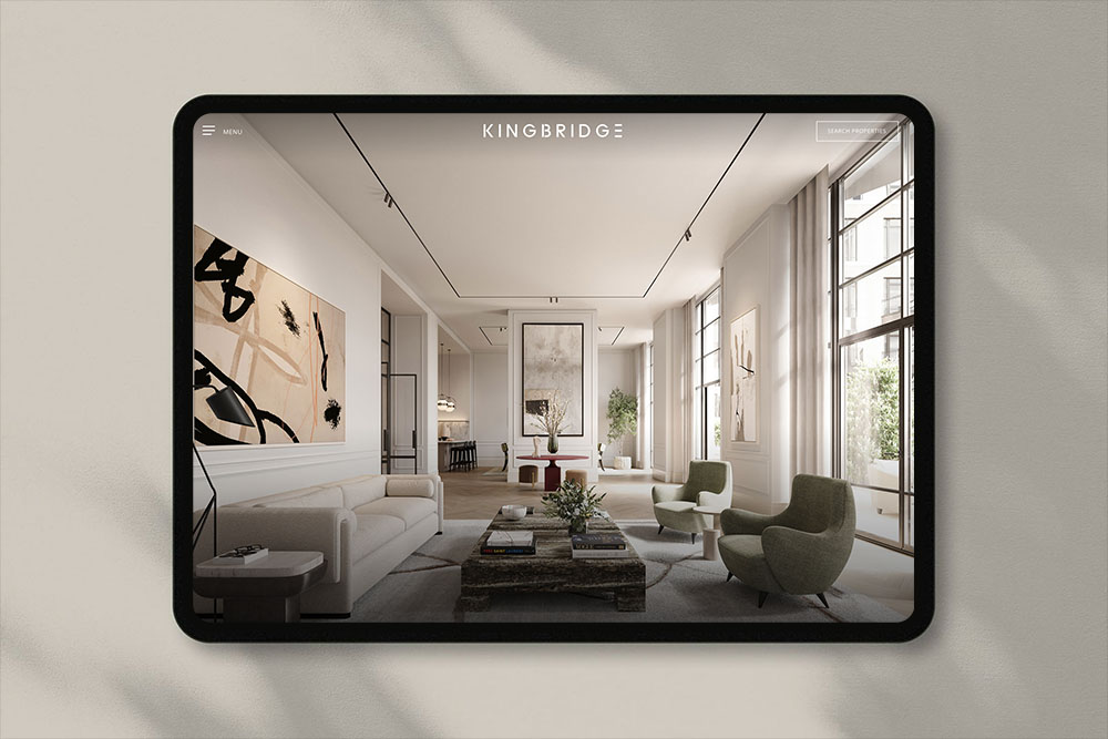
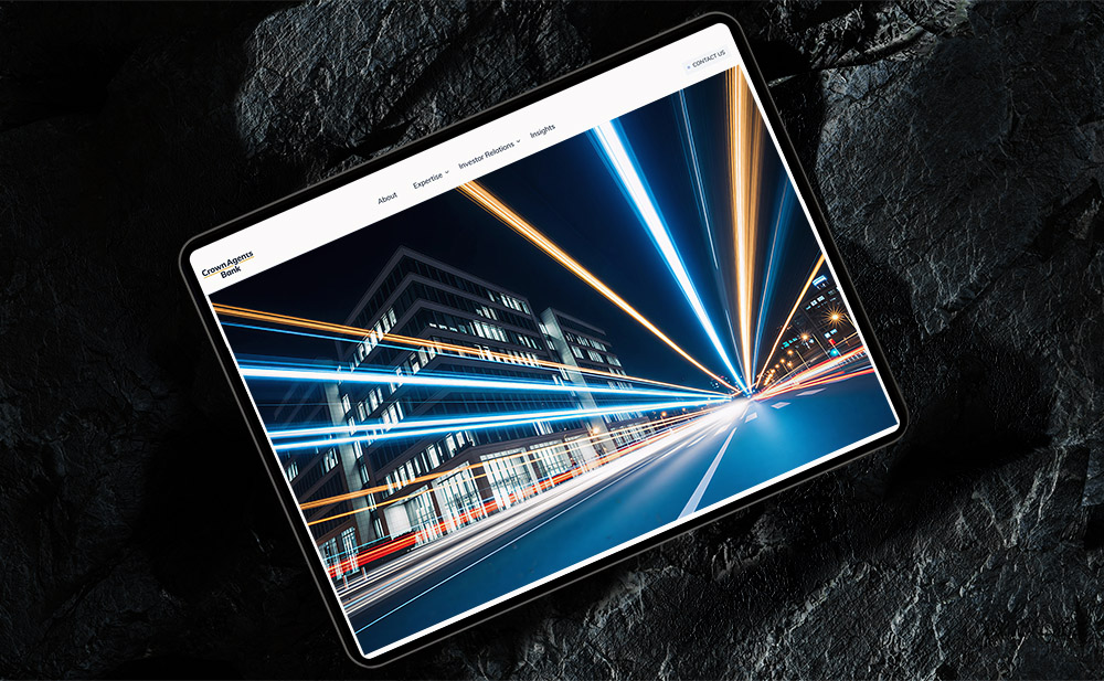
Photography
Real photos are usually better than stock photos, especially for service businesses. Showing your actual office, your team, or your work helps people see you are a real company. For online shops, product photos matter even more. They are not just there to look nice. They help people decide if they want to buy, since they cannot see the product in person. Poor photos can quickly put people off and reduce sales.
Illustrations and graphics
Custom illustrations work well when you need to explain something less concrete, like a process, a concept, or a comparison. They also help your site stand out, since no one else has the same ones. The downside is they take time to make and can cost money if you hire someone. But you can also use simple design tools or AI tools to create them faster.
Charts and diagrams
Charts and diagrams are one of the most underused types of visuals. A chart can explain a number in a couple of seconds. A diagram can show a process much more clearly than a long explanation. If your content has data, charts should do some of the heavy lifting. The common mistake is making them too complicated. A chart with one clear point is always better than one trying to show too much at once.
Screenshots
For any business with a digital product or process, screenshots are really useful. They show people what things actually look like. They also build trust because they are real, not staged. They fit naturally into blog posts too. A guide on how to use a feature makes much more sense when you can see it step by step with screenshots.
Where AI tools actually help with visual content
AI image and design tools have made things easier for small businesses. A few years ago, getting a custom illustration meant hiring a designer and waiting days. Now you can create one in minutes. But the quality is not always consistent, so it is important to know where these tools are useful and where they are not.
Where AI image tools work well right now:
- Quick mockups and concepts: If you need a quick visual to talk through an idea before getting a proper design made, tools like Midjourney or DALL·E can save a lot of time. The result is just a starting point, not a final image.
- Background and texture generation: Need a textured background for a hero section? AI can usually create something usable after a couple of tries.
- Image editing and cleanup: Tools like Photoshop’s generative fill or free tools like Canva’s background remover can handle small tasks that used to take a designer about half an hour.
Where they still struggle:
- Anything specific to your business: AI does not know what your team looks like, what your office looks like, or how your products actually work. For that, you still need real photos.
- Attention to detail: AI images often look fine at first, but feel wrong when you look closer. Hands with extra fingers, text that doesn’t mean anything, or objects that don’t quite make sense. If customers are going to look at it properly, AI images usually need heavy editing or replacing.
- Brand consistency:Each AI image is created on its own, meaning the tool starts from scratch every time. It does not automatically keep the same style or details from the previous image. Because of that, getting a set of images that all match your brand style is harder than it sounds. You can end up spending more time adjusting prompts than it would take to just get it done by a designer.
- Diagrams and information design: AI image tools are not great for clear, accurate diagrams. For charts, process maps, or anything where details need to be exact, it is better to use tools like Figma or Canva.
The simple truth is this. AI tools are useful for some parts of visual content, but they are not a replacement for good design. They make the easy parts faster, but they still struggle with the harder, more detailed work.
How visual content supports SEO and content marketing
Visuals are not separate from your SEO and content marketing strategy. They are part of it and help it work better. Pages with relevant images keep people on the page longer, which Google sees as a good sign. Custom images also get shared more on social media. A blog post with a strong header image is more likely to be clicked when someone shares the link.
Image search is also a real source of traffic, but most businesses ignore it. If your product photos and graphics are named properly and have clear alt text, they can bring in visitors that text only pages would miss.
A small note on alt text. This is the text that describes an image for screen readers and it also helps Google understand what the image shows. Write it in a simple, clear way that describes what is in the image. “Team of accountants reviewing a financial report in an office” is useful. While “financial services UK best accountants” is not helpful and is just keyword stuffing.
Five things we check before adding a visual
A short checklist we use ourselves.
Does it show something that words alone would not explain well?
If the image is just there to fill space, the paragraph probably does not need it. Use images where they actually help explain something.
Is it the right file size?
A 4MB hero image is a 4MB problem. Always compress images before uploading them to your site. There are plenty of free tools you can find with a quick Google search, and it makes a real difference to how fast the page loads.
Does it match the rest of the site?
Take a quick look at the other visuals on the page. Does this new one fit in, or does it feel like it belongs somewhere else? Keeping things consistent is more important than trying to be different.
Is the alt text useful?
Write one simple line that says what the image shows. If you cannot describe it clearly, it is usually too generic and not doing much for the page.
Does it still work when it is made smaller?
Most people see images on their phone, often as small previews in social media. If the image only makes sense when it is big, it does not really work. Check it when it is small.
Final thoughts on visual content creation and design
Visual content is an important part of a website, but it is often ignored. The businesses that do it well do not always spend more money, they just think more carefully about it. They use real photos where it matters, charts and diagrams when they explain things better than words and AI tools where they actually help.