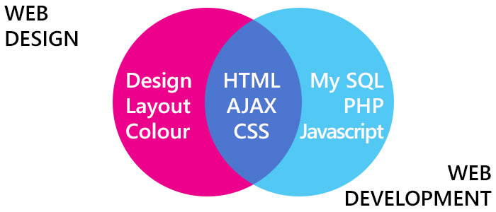
Web Design vs Web Development
There are a lot of opinions about the difference between web design and web development and what each role entails. For many companies offering web services, they have people that specialise in one area however also have the knowledge to understand the other. As time has gone on, the role of both web designer and web developer have become increasingly complex but it is definitely apparent that in order for the world wide web to continue evolving, it is important to have the influence of both sets of professionals.
What is web design?
Web design is a term describing the creative process of implementing a design that will eventually become accessible on the world wide web for use and viewing by the end-user.
What is web development?
Web development is a broad term describing the work that goes into development and innovation surrounding the programming of the world wide web.
Evolution of Web Development & Web Design over the last 10 years
Web design and web development is rapidly advancing, changing and growing far beyond the means anyone thought possible 10 years ago. It would be impossible to list every single one of these developments over the years and as most things have happened over a period of refining and reworking it is also difficult to define when exactly these innovations came into play. See our timeline below for notable things that have surfaced over the past 10 Years!
2005 – Flash
Adobe Flash, originally Macromedia flash player, was acquired by Adobe in 2005. It is used as a multi-media platform for mainly creating animations, vector graphics and mobile apps. Once under the development of Adobe, Flash was able to be integrated more freely with web browsers allowing the streaming of audio and video with the ability to capture input from external computer devices such as camera, mouse and keyboard. The development of Flash was to support modern programming techniques, to further understand object – orientated programming, enabling business applications to be developed with the use of ActionScript 2.0. This is rather complex stuff and (un)fortunately, it seems that Flash has been phased out over the last couple of years.

2006 – 3D Effects
Before 2006 we saw web development in its simplest form being executed with extremely complex web design and lots of ‘clutter’ displayed on a page. Many designers were keen to see how far they could go with the web templates that existed, however it was unclear how each section of a web page could have its own function. In 2006 we saw the rise of 3D effects being used in websites. This meant that text, objects and icons were able to exist seemingly in front of other information, allowing them to stand out on screen. Along with 3D effects came mirror images, reflective surfaces and other rather garish design attributes that made websites pop-out of 2D design.
2007 – Grid based design
With the development of cleaner navigation systems and more adventurous website layouts came the very sleek and quite regimented page layout that is Grid based design. This type of design allowed for multiple categories and sections of information to be displayed in a very neat and tidy way. The grid-based trend has managed to stand its ground and is still seen on a lot of websites today.
2008 – Visual Web Developer
2008 saw the release of Visual Web Developer programmes, allowing anyone from beginner to professional programmer to learn code and build web pages. Along with this came a lot of ‘at home’ developers who were able to learn web development skills and build their own media galleries, blogs and full websites. This paved the way for an influx of new developers meaning that advances began to happen quicker and people became more aware of the power of the web.
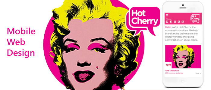
2009 – Mobile Web Design
In 2009 we saw an advance in web development specifically for mobile devices. Necessary advancements in web development and website capabilities came with the advancement of mobile technology. As the web has become more accessible from different devices, developers have had to adapt and consider various different screen sizes and begin to centre their work on the possibility of future innovation about the refinement of user experience.
2010- Large Scale Typography
Typography is a top player in web design. For years large typographical designs have formed the basis of brands and word-marks for all kinds of companies and it never seems to go out of fashion. You see typography in company names, logos, call-to-action, titles and in fun infographics. It seems that large scale typography is something that will stick around and as web designs become more minimalistic it means that typography can become more experimental and designers can continue to think outside the box.

2011- Full Screen Photography
As we all know, large imagery (if shot well) is one of the most powerful advertising tools in the world. On the web if you come across a website which incorporates beautiful photography that can convey emotion or describe the company in one single shot then you are sure to be visual stimulated and engaged. Many websites use full screen background images to grab attention and with HTML5 and CSS3 capabilities it means there aren’t any issues with page loading, site functionality or with the layering of information, meaning full screen photography can really shine.

2012- Responsive Design
One of the initial ideas behind responsive design was the creation of ‘mobile-first’ web development. In 2009 we saw the beginning of the web made for mobile devices and since then the development has been rapid. 2012 was a year when responsive design was becoming a necessity rather a desire and the idea of websites being able to respond to all screen sizes was also something that was predicted to happen. With focus being more on ‘user experience’ now then ever before, developers are refining fluid/liquid layouts and advanced media queries to try and make the whole of the web accessible anywhere by anyone. Responsive Web Design is the future.
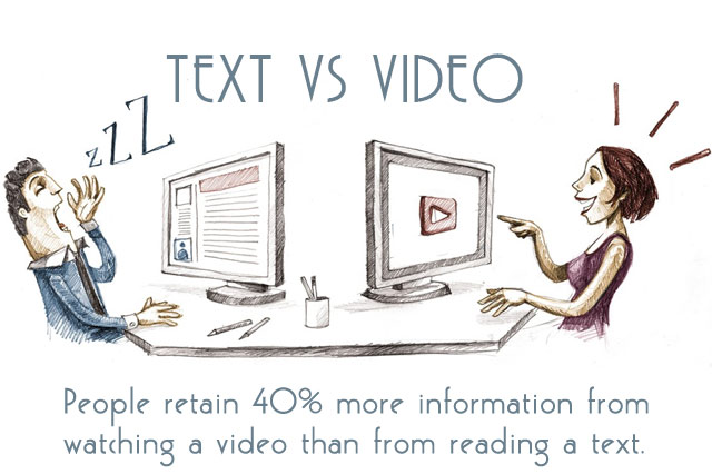
2013- Online Video Content
Motion on websites has been a conversation starter amongst web developers for years. Many consider moving images to be quite disorientating when layered with text, however with advances in technology and with access to more powerful video recording equipment, it has become easier to achieve high quality results that provide engaging hints of motion within a website. Research has stated that now over 60% of web users would rather watch a short video then read 200 words of text! The use of video has almost doubled since 2013 and gone are the days where you could only embed a video into a website, in some cases video IS the website.
2014 – Parallax Web Design
Parallax web design is a technique that allows the background to move at a different rate to the foreground creating a 3D space that has great depth if used correctly. This trend has been very popular for the last couple of years and for what started out as a technique used in 2D video games, parallax is becoming easier to develop and much more usable across platforms.
2015 – Microinteractions
It is 2015 and Micro-interactions are the new thing on the block. By bringing user-experience to the forefront of development and creating interactive elements that answer to the needs of each individual user we are beginning to build a world wide web that is
not only built for all, but it is tailored for you. Things like pop-up newsletter sign ups that are initiated once you have shown interest in an article for example will be something that will become more intuitive and inclusive of information that is based on previous searches you have done on the site. There are also other options to add unique experiences for each user such as fluid/flexible navigation and the ability to reveal/hide what information they do and don’t want to see. The possibilities are endless….
2016 and beyond…
To read our web design and web development trends for 2016 please click here.
We offer a full web service at Reactive Graphics and we would be happy to meet up to discuss your next project. Please get in touch for more information. We’d be happy to offer a free consultation.

Andrew began his career in web design and development in the late 1990s. His eagerness to embrace the medium saw Andrew setting up Reactive Graphics in 2004. With over 20 years plus working as a London web designer supporting a wide range of clients, Andrew’s experience in web design, web development and graphic design have helped him to build a growing business.