
What is Visual Hierarchy?
Visual hierarchy is the order in which humans process information on a page. It’s a system to prioritise elements so that they are easily understood. Without a visual hierarchy or design structure, users can be overwhelmed and as a result, fail to take anything in. Design is all about visual communication. Once you understand how the human eye processes these, you’ll find yourself better able to arrange your elements more effectively.

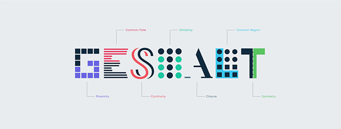
Gestalt principles
Most rules of visual hierarchy in web design come from the Gestalt principles. Gestalt Psychology was first proposed by Austrian and German psychologists Max Wertheimer, Wolfgang Köhler, and Kurt Koffka. Gestalt is a German word. The closest translation is ‘whole’, ‘pattern’ or ‘form’. This psychological theory explains how people perceive design elements. The most important take out from Gestalt principles, is that you should organise your page as a whole and not in separate pieces.
This does not mean you should not pay attention to details. Just keep in mind that even if you have the most attractive CTA, but your whole page is a mess and does not have a well established visual hierarchy, you probably will not get a lot of clicks and conversions.
Some of these principles include:
Proximity – Proximity is a fundamental principle of composition. It states that closely placed elements appear related. When we place some elements together, we give viewers a clear signal that the objects are related. The principle of proximity helps designers make content more suitable for quick scanning and comprehension.
Similarity – The law of similarity states that elements with a similar visual appearance seem to be related. At the same time, because our brain tends to group similar things together, we also notice things that are dissimilar to the group (such dissimilarities are called “anomalies”). An anomaly naturally draws the viewer’s attention because it’s different from the rest of the group.
The Human Eye and Scanning Patterns
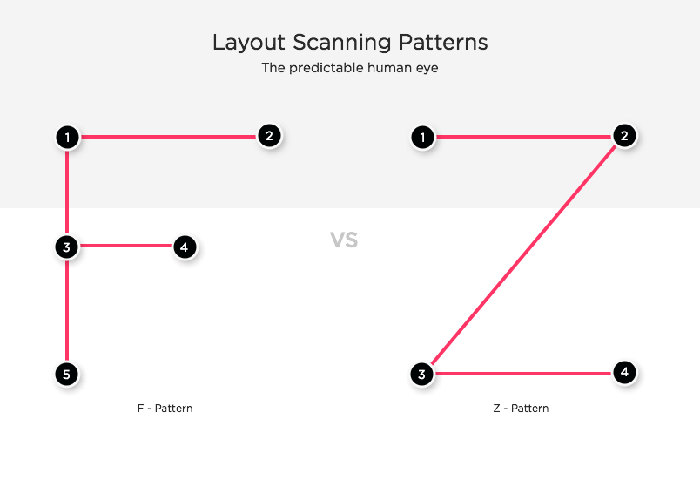
The human eye works in predictable ways. It is automatically drawn to certain points of interest. Some of this does depend on the individual person, but most people follow predictable trends with how they view just about everything, including websites.
There are common patterns for hierarchy both on the printed page and for the digital page. These patterns are based on the movements that our eyes tend to make when presented with a fresh page.
There are two different types of scanning patterns that people usually follow, which you can also take advantage of in your own designs: “F,” which is mainly used for blog pages and articles that are heavy on text, and “Z,” which applies to websites or advertisements that do not present information in block paragraph form.
F Pattern – In designs with more text, we scan across the top, from left to right, then down the left, searching for clues to what we want to know. On finding one, we’ll scan across to the right.
Z Pattern – In designs without much text, our eye starts scanning from top left to top right, then diagonally down to bottom left, stopping at the bottom right.
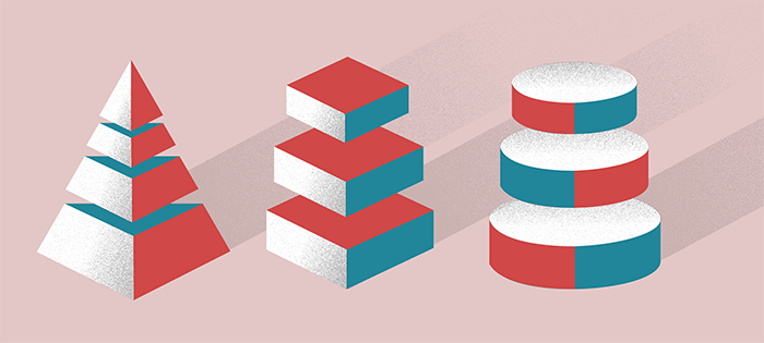
Size or Scale Hierarchy
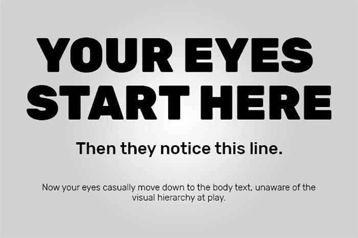
This one is simple enough: people read bigger things first.
Size establishes a hierarchy where bigger items draw more attention and thus appear to be the most important. Sizing is a very basic but crucial principle that can give elements more importance than others and help draw the viewer’s eye towards a certain area. By increasing the scale of an element, you can immediately attract the viewer’s attention. You want to be careful, however, not to enlarge too many elements or increase the size in a way that might decrease the importance of other elements on the screen.
Size is often used in bodies of text to identify meaningful subjects, headlines, or important quotes, making the most important the largest and scaling down from there. Keep in mind that too many sets of sizes can be confusing, so establishing a basic size structure is a good idea. Secondary content, like labels, should be smaller, so they don’t compete with the more important information.
Typographic hierarchy
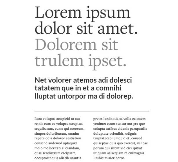
Typographic hierarchy is a system for organising type that establishes an order of importance within the data, allowing the reader to easily find what they are looking for and navigate the content. It helps guide the reader’s eye to where a section begins and ends, whilst enabling the user to isolate certain information based on the consistent use of style throughout a body of text.
So how do we incorporate typographic hierarchy into our website design? The easiest way to do this is to sort your typography into three separate levels:
Level 1 (Headlines) – Your level one typography is the most important content on the page. What do you want your reader to see first? It’s usually the big, bold font that first grabs your attention.
Level 2 (Sub Headings) – Level two typography doesn’t stand out as much as level one, but it helps to visually sort the content into different sections. Think of level two typography as the subheaders; the items that give the reader clues about what they are about to read.
Level 3 (Body of text) – This is where you want your readers to end up. If they were interested in your level one and level two typography, they will likely arrive at level three. Think of level three as the core of your message. This is where you can go into more detail about your product, service, or topic and it’s typically in a smaller font. The most important thing to remember about level three typography is that it must be in a font that’s easy to read since it’s typically much smaller than level one or level two type.
Visual Hierarchy using Colour & Contrast
Colour is the spectrum of light. The density of a colour is determined by the wavelength of the light.
Colours can be used similarly to size and weight to give importance to elements in your design. Brighter colours are typically going to grab the viewer’s attention much more than dull, non-saturated colours.
Colour is of particular importance in mobile app design, where a small screen size limits your ability to use other strategies like size differentiation and broad spacing.
A successful design relies on contrast in order to bring forth visual interest. Contrast can take many forms: through colour choice, typeface style, pattern, temperature, saturation, and value. It also keeps the design from appearing monotonous and flat.
To build visual hierarchy with contrast, let the focal points stand out by contrasting its appearance from the other portions of the design.
Hierarchy with Texture
When people talk about “texture” with respect to visual hierarchy, they are not referring to pictorial texture effects. Rather, this kind of “texture” refers to the overall arrangement or pattern of space, text and other detail on a page.
Textures are different—they are decorative properties. But despite the fact that textures primarily affect aesthetics, adding texture to your design can influence hierarchy. Texture can create visual interest and draw the user’s attention to certain parts of your layout.

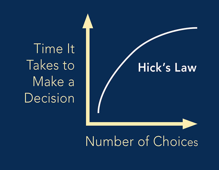
Hick’s law and white space
Another way of drawing attention is to give content ample room to breathe. Negative space is an important part of the visual design, defining it just as much as a positive use of space.
One of the principles of Hick’s Law applies to web design. It says that when we increase the number of choices, the time required to make a decision increases as well. In addition to that, the more choices you have, the easier it is to choose nothing.
Simply put, by understanding Hick’s law, you can arrange your page with enough white space and avoid creating cognitive overload. It will decrease the time your users will have to spend on figuring out your website, direct them straight to your CTA, and therefore increase conversions.
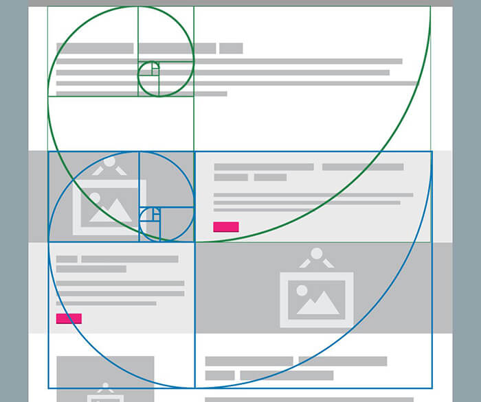
The Golden Ratio and web design
The Golden Ratio is a mathematical ratio that roughly equals to 1.6180. It can be commonly found in nature and used in classical design theory to create balanced compositions. You can also apply the Golden Ratio to web design. Easily grab attention with more structurally dynamic layouts.
Ancient Greeks were the first ones to discover a beautiful asymmetry found in nature. They expressed this phenomenon with the Greek letter phi, but today we call it the golden ratio.
Golden Ratio in Web Design London is also used to balance content that is text heavy, create hierarchy and draw users’ eyes to specific areas.
Conclusion
Hierarchy is an important part of the website design process but it is also important to know the subject matter of the content and what you are trying to communicate before making decisions on hierarchy and style.
In some cases, you may have the freedom to employ any of the hierarchy methods listed above, but in other scenarios you may be limited to a certain spaces or contrast of type on a background.
The best plan of action is to evaluate which methods work for the situation, and employ the ones that make sense. The end goal is to present the content in an organised way that is easy to process with the human eye.
If you require a website for your business then Reactive Graphics can help.
Get in touch with us today to see how we can get your project off the ground!
To take a look at how Reactive Graphics have applied visual hierarchy within their web designs, please take a look at our portfolio of work here.
Looking for a new website design?

Andrew began his career in web design and development in the late 1990s. His eagerness to embrace the medium saw Andrew setting up Reactive Graphics in 2004. With over 20 years plus working as a London web designer supporting a wide range of clients, Andrew’s experience in web design, web development and graphic design have helped him to build a growing business.