Google’s new design language, Material You, was announced at its I/O conference on May 18th, with the aim to “transform design for Android, for Google, and for the entire tech industry.” It will first be arriving as part of Android 12 on Pixel phones and Google applications, with later rollouts planned for WearOS and other platforms.
Matías Duarte, Google’s Vice President of Design revealed that Material You had been in development for several years. The new initiative comes seven years after Google launched Material Design in 2014 and will succeed 2018’s Material Theming, which was released with the aim of giving users “the ability to systematically customize Material Design to better reflect [their] product’s brand.”
With Material You set to thrust Google’s application design into a new era, there is plenty to unpack at such an early stage. Without further ado, let’s delve into the key themes and features already announced.
Customisable Colours
For years, Google has aimed to make technology “simple and beautiful for everyone” and although it has made significant progress in this regard, plenty of new challenges have come to the forefront. In addition to a fulfilling user experience, the present-day consumer wishes for more control and customisation over their personal devices.
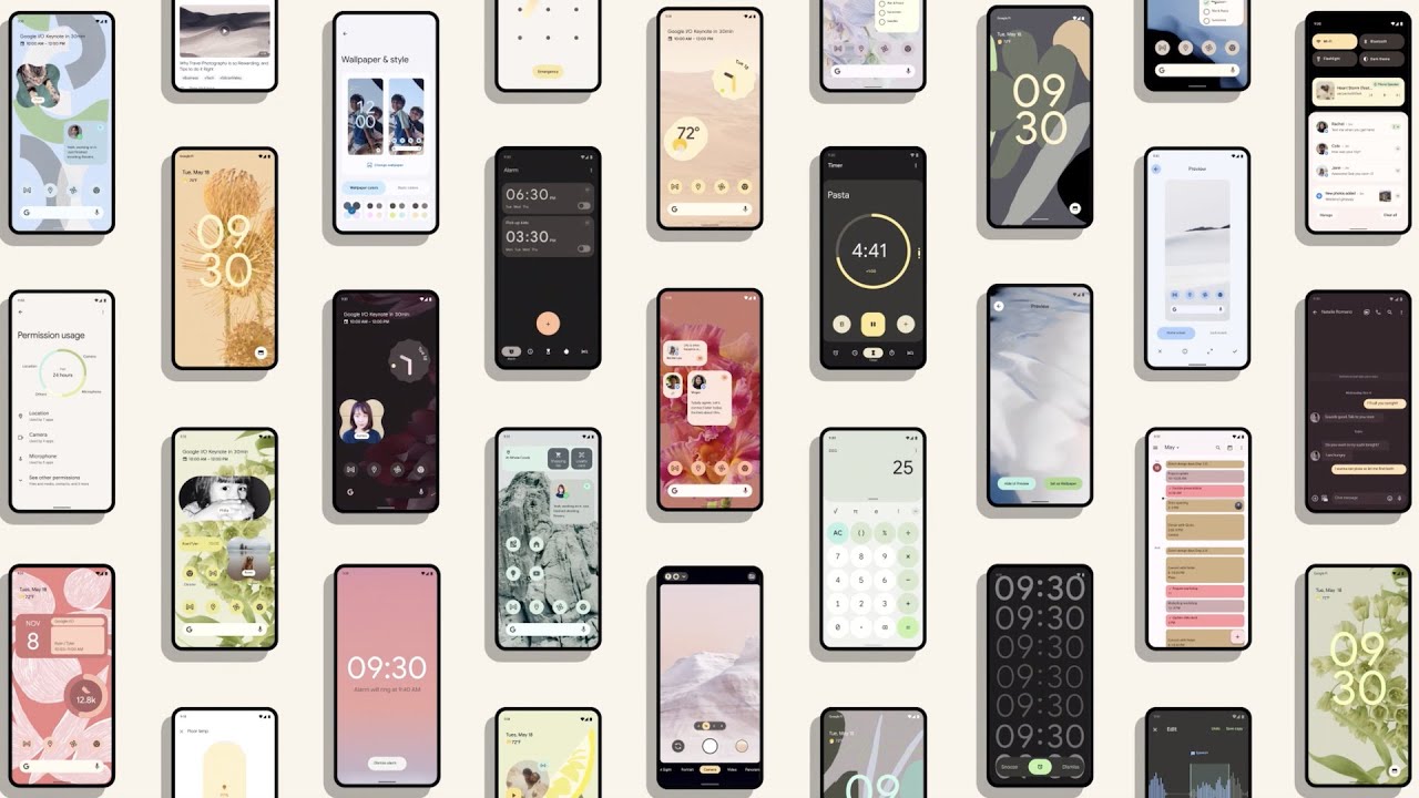
Material You aims to “create designs that are personal for every style, accessible for every need, alive and adaptive for every screen”, going above and beyond basic functionality to bring a fully-personalised user experience.
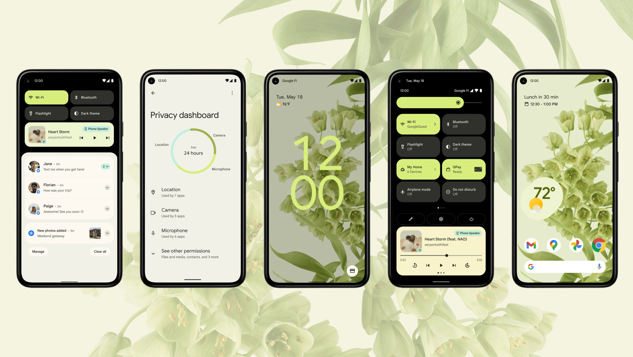
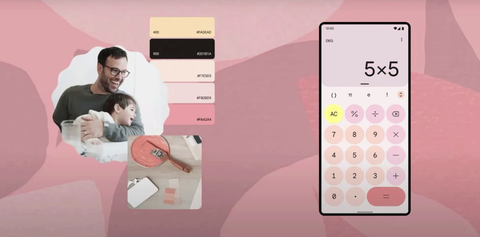
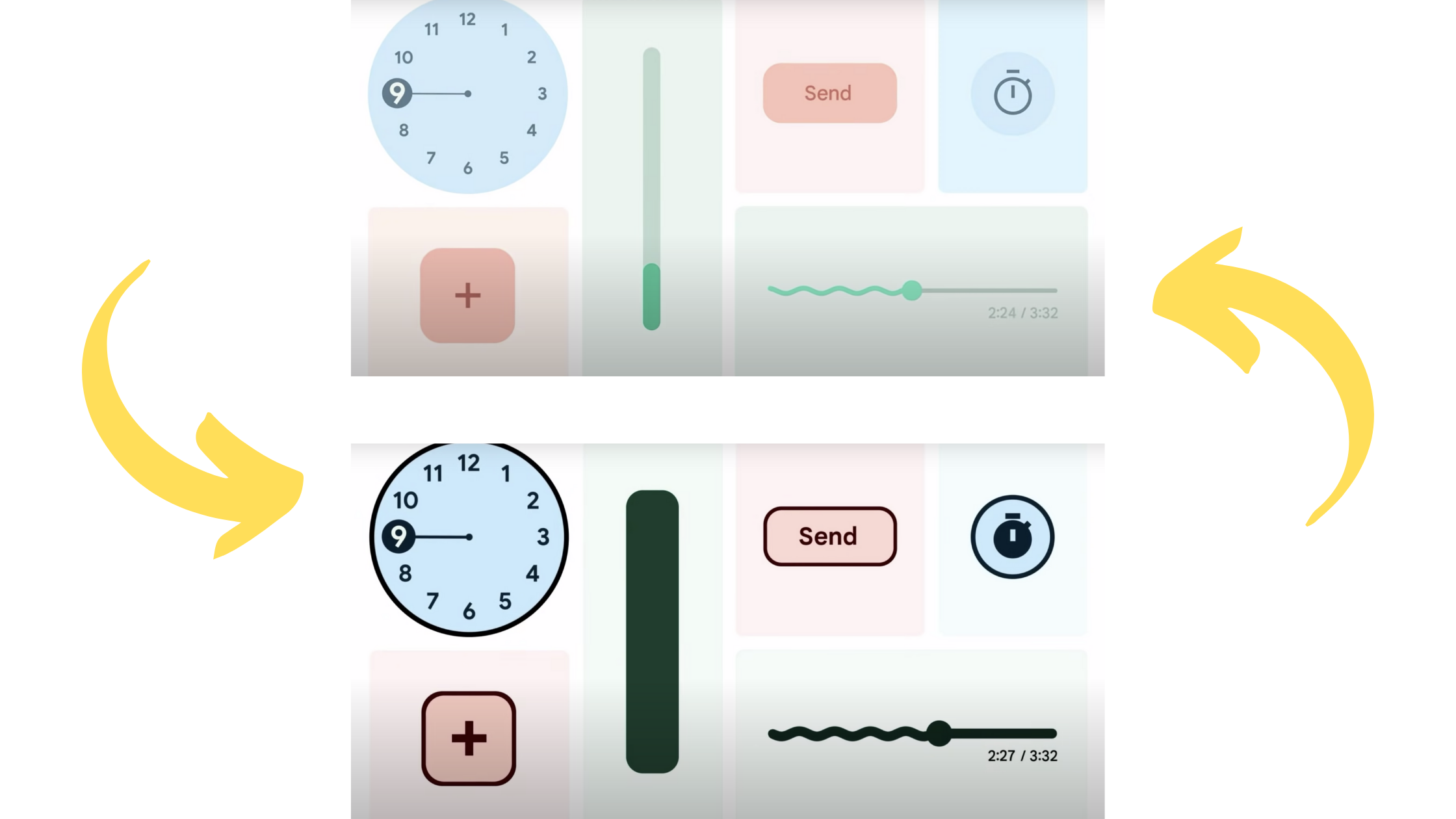
Material Palettes are a brand new feature that allow users to customise their entire device experience with a single, consistent colour palette. When a user changes their wallpaper image, the device interface will switch to a colour palette based on the colours in the image, and application colours will update in real time to reflect this – this applies to all apps, not just Google’s, which makes this feature all the more exciting.
Colour palettes have been designed in compliance with Google’s industrial design team, so that there is no conflict between Google’s hardware and the user interface.
Alive and Adaptive
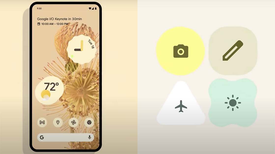
As technology evolves, apps are required to adapt to an increasingly large number of needs – more screen sizes, more device types, etc. Material You utilises the power of animation to provide a fully-fluid answer to this challenge – changes in app size and orientation are smoothly adapted to through the use of playful movements and transformations.
Shapes expand and shift into space-efficient layouts, whilst icons shift about and change shape depending on the user’s interaction. Transition animations are applied almost universally to make even the simplest action (such as opening an app) far easier on the eyes. This extensive use of animation gives apps the fluidity needed to deliver on user experience, in addition to a charming quirkiness that helps it relate more to the user.
Shapes, Shapes, Shapes!
Utilising a wide variety of shapes has become an increasingly popular design trend throughout the early 2020s, and this has evidently made its way into Google’s design process. An abundance of ovals, rectangles, rounded stars and more have been showcased as part of Material You, with unique sizes and orientations to give even the smallest widget the chance to stand out on the screen.
Rounded corners are commonplace on the mobile layout, with several buttons and icons making the switch from hard rectangular edges to a smoother, more circular design. The ‘roundedness’ of app elements may well adapt depending on device, but there is little doubt it integrates nicely with modern mobile devices, most of which have rounded edges.
Cross-Platform Consistency
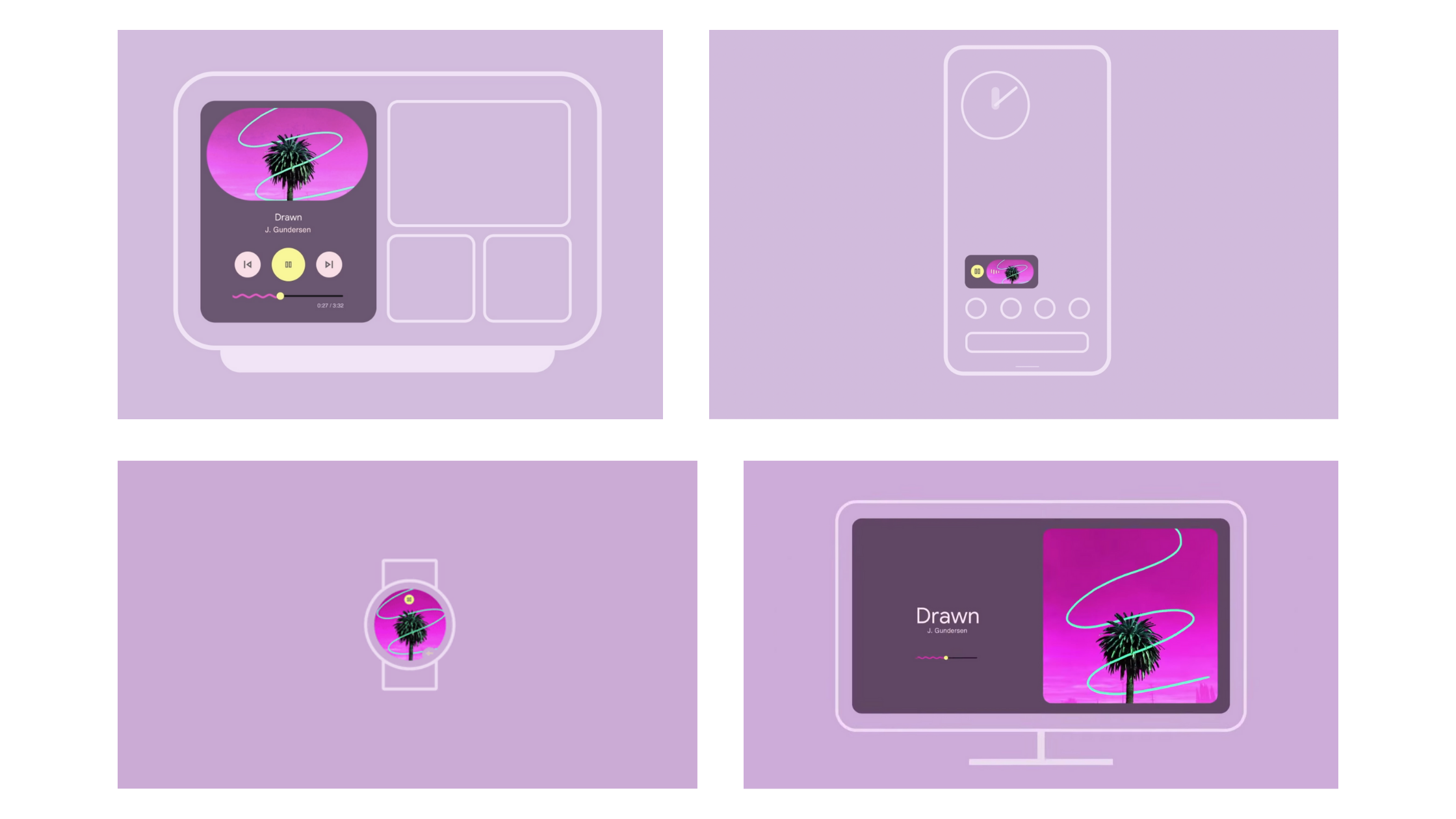
The principle of ‘one size fits all’ has been commonplace in application design for years, and Material You looks to take this familiar concept to the next level. Currently, it is not uncommon for an app’s elements to differ in appearance depending on the device they are viewed on, and some elements may not be viewable at all on smaller devices.
For Material You, the goal can be put simply: each and every element should fit onto each and every device. Whether it be on a television or a watch, app elements such as cards, menus and sliders will appear aesthetically similar, and will be scaled to fit the device. This consistency across platforms allows users to identify easier with app brand designs and reduces time needed to ‘learn’ the app.
Accessibility For All
Millions of people with accessibility needs use Google products every day, and so it comes as no surprise that Material You aims to solve this universally, so that everyone can comfortably enjoy their user experience.
The new system allows users to extensively customise their accessibility settings, giving control over colour contrast, icon size, line width and more. Buttons, widgets and icons are heavily padded by default, giving users plenty of room to tap and interact with the UI – although this has received a mixed response from an aesthetics point of view, it will no doubt provide a valuable upside to users who need greater accessibility.
Material You: Conclusions
In the early 2010s Google made a huge commitment to revamp its once-dated UI, and 2014’s Material Design brought in a new era of clean-cut, minimalist interface design. This was a huge success, but was also very rigid and did not provide users with a lot of space to express themselves.
Seven years on, Google may well have found its answer to this problem with Material You – it maintains the flat, geometric design of its predecessor, whilst giving users the power to create and customise their own interfaces almost effortlessly.
Recent design trends such as animations and flat shapes come to the forefront to give Material You a contemporary edge going into 2022 and beyond. Will it catch on for years to come? Here at Reactive, we’re optimistic that it will.
Material You arrives to Google Pixel devices in the autumn, whilst developers can get an early preview now through Android 12.
If you want to build a brand for your business then Reactive Graphics can help.
Get in touch with us today to see how we can get your project off the ground!
To take a look at how Reactive Graphics have transformed clients brand intensities, please take a look at our portfolio of work here.

Andrew began his career in web design and development in the late 1990s. His eagerness to embrace the medium saw Andrew setting up Reactive Graphics in 2004. With over 20 years plus working as a London web designer supporting a wide range of clients, Andrew’s experience in web design, web development and graphic design have helped him to build a growing business.