Way back in 2005 the nationwide web usability report stated that you should NEVER use horizontal scrolling web design for your websites. Why? Because apparently the whole UX of sideways scrolling was confusing to the user and it just doesn’t comply to conventional web design standards.
However there has been a great shift in recent years with the creation of new technologies such as iPads and smartphones, where sideways scrolling is intuitive and a whole site’s information can be available to the user at the swipe of a fingertip. We recently discussed single-page websites and how engineers and developers are spending more time on creating technologies that allow the user to browse the web with maximum ease. For example ‘The One Hand Wonder‘ is an easily-adaptable cross-platform JavaScript framework that was developed in 2014 as a framework that enhances usability without the need to redesign an existing website or to overwrite any CSS styles. This means that the once frowned upon lesser used horizontal scrolling web design technique, is quickly becoming more desirable and more focused on usability.
What are the positives of horizontal scrolling web design?
Horizontal web design is one of those things that comes in and out of fashion quite quickly. It is like any web design trend, it is either picked up from an innovation in technology or used by a massive corporate brand, then filtered down into the masses. But what is it that makes the horizontally scrolling web design (despite the bad name) bounce back time and time again.
- It is a design that is almost 100% consistent across all devices. ‘Swiping’ the screen is something that is used on all responsive and mobile sites however it is not an action that can be physically applied to a desktop screen (unless touchscreen.) It is important to consider that users interact differently with different devices, however with desktops allowing for mouse movements that mimic ‘swiping’ to aid website navigation it is becoming equally as intuitive as a vertical scroll.
- It is designed to allow space for secondary information, that doesn’t hog page space. For example when displaying images in a photo gallery, horizontal scrolling lets users see a small sample of the content and gives them the option to quickly ‘swipe’ or click for more. For a lot of content, it’s fine that customers won’t scroll through an entire website and horizontal scrolling allows you to display your work as you want it to be seen (unless a user stops scrolling).
- Horizontal scrolling saves a lot of vertical screen space. Rather than displaying all the content at once on a very long page, horizontal layouts introduce users to smaller chunks of information. The layout is flexible and extensible, because content can be added both vertically and horizontally.
- Horizontal scrolling allows users to see options within a category by swiping to the side, or scrolling down to see different categories. This use of two dimensions helps users by showing a variety of options without making them visit separate category pages.
Examples of well designed Horizontal Scrolling Sites
G&T London
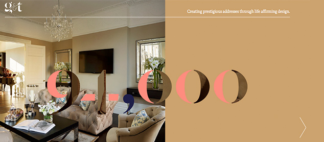
The G&T London website by Reactive Graphics displays beautiful large imagery and you are guided through snippets of information before concluding with the contact page. With side arrows for navigation you are led through a very crisp, clean and elegant design.
Alex Flueras Photography Portfolio

Alex Flueras’ Photography Portfolio is shared in a series of easy navigable horizontal sliders. The images are cleverly placed half way between one horizontal frame and the next meaning you are enticed to scroll through and see the full image.
Gudang Damansara Furniture Showcase
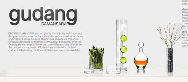
The Gudang Damansara website is a beautiful scrolling view across a single shelf. The shelf holds sections of information and the eye is naturally drawn to what other items you might encounter.
C L Holloway Artists Portfolio
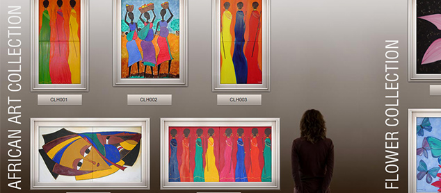
C L Holloway’s artists portfolio is clearly and distinctly displayed in a ‘walk through a gallery’ format. The navigation arrows can be clicked or you can simply scroll through the gallery. There is also a handy scroll bar along the bottom that allows you to see how much more of the website is left to view.
The horizontal way: A Horizontally scrolling website showcasing other horizontally scrolling websites.
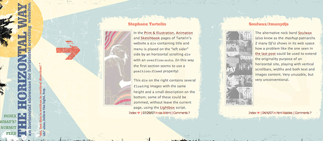
The horizontal way is a fun collection of other horizontally scrolling websites that uses a half screen display. The website says that horizontal is an original, but still rare, solution to display in one (or sometimes more) page a low quantity of text and big images.
The pitfalls of horizontally scrolling webdesign
There are many advantages to the horizontal scrolling site that include aspects like an enviably beautiful image display and fluid navigation system however these results are not so easily achieved meaning that there are many pitfalls and traps of a horizontally scrolling website.
Many users resist the horizontal scrolling technique as sites are often so focused on the overall aesthetic that they forget to include the most simple (but effective) navigational tools to assist the user.
Last year the Nielson Norman group submitted a research paper that analysed why users didn’t get the most from horizontally scrolling sites. The overall resounding message was that when using a horizontally scrolling site on desktop (in particular) users weren’t accustomed to sideways navigation thus meaning that following a failed attempt to scroll downwards they left the site after only engaging with the information on the homepage.
Apple product page visual analysis
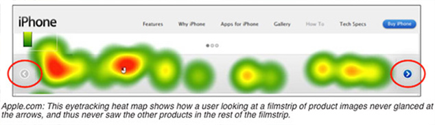
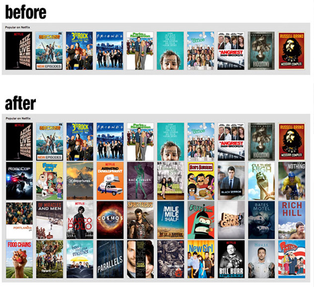
It seems that some designers under-estimate the power of UX. Netflix is a multi-national provider of on-demand Internet streamed media. Their original digital interface contains a horizontal scrolling slider to display their thousands of films. Developer Renan Cakirerk was getting sick of the continual scrolling through long lists of media so created what he calls “god mode.” God mode is what The verge described as “a bookmarklet for your browser that blows up all those menus into one simple, scrollable list. Netflix will no longer look so nice and pretty, but it actually ends up being a whole lot more usable. The handy tool will undoubtedly be disabled by Netflix at some point, but for now it’s a must-have.
Things to consider when designing a horizontally scrolling site
At the end of the day, there are many pros and cons to horizontally scrolling website design and only you can decide whether it is worth the risk of working with a technique that has got a bit of a bad rep.
If you are considering working with this technique (that can be completely brilliant and engaging if designed correctly) then try considering the following 3 points.
- Don’t make ‘swiping’ the primary navigation on your site.
Ensure you consider every device and understand that your users may not have the capabilities to swipe. Apply a click option to be accessible. Or apply a scroll that works horizontally with a vertical mouse scroll. - Tell the user how much content is left.
Add a scroll bar or a page number indicator so that your user isn’t just left to scroll into the abyss. - Create obvious, visible cues for horizontal swiping.
Think creatively about how to introduce cues for swiping, scrolling and clicking. Dependent on what your website is primarily for you can usually be very direct using arrows and “click here” tags to allow your user a stress free navigation.
Conclusion
Although the horizontal scrolling technique is somewhat of a taboo digital-first technique to many modern web designers it is important that we recognise it as a real contender with the other web design trends of 2015. There seems to be quite a stigma attached to why people opt for horizontal web design perhaps considering their cross-platform design ahead of their cross-platform functionality. However if you are considering working with this format to break convention and stand out from the crowd then do so with caution and awareness of the overall user experience.
If you would like to work with Reactive Graphics to create a horizontal scrolling site then please contact us.
If you need any web design or web development help then please call or email for a free quote.
T: 020 7471 8554
E: info@reactivegraphics.co.uk
Or visit our website: www.reactivegraphics.co.uk

Andrew began his career in web design and development in the late 1990s. His eagerness to embrace the medium saw Andrew setting up Reactive Graphics in 2004. With over 20 years plus working as a London web designer supporting a wide range of clients, Andrew’s experience in web design, web development and graphic design have helped him to build a growing business.