2019 has been an exciting year for web designs so far. New trends have emerged, new styles have been defined and web designers seem to be as creative as ever. Although there are many different designs out there, one more exciting and innovative than the other, some have caught our interest in particular. Read on for our 6 favourite web designs so far this year.
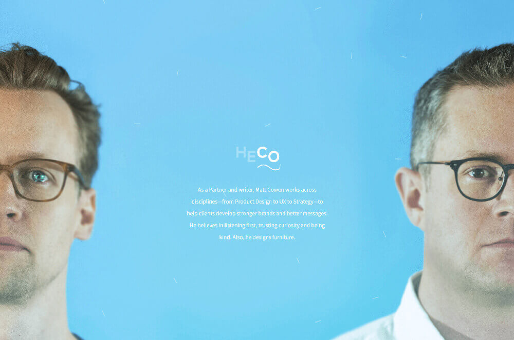
HECO
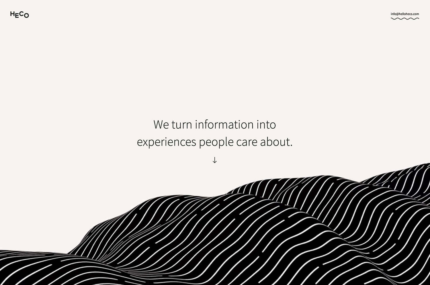
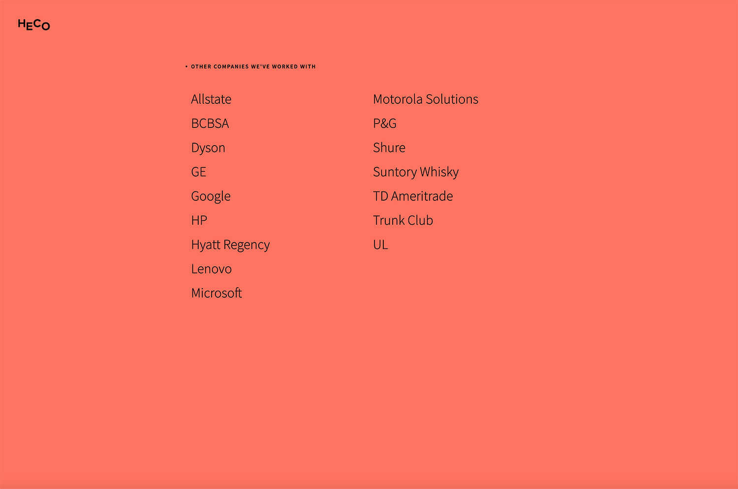
One of our favourite web designs is by Heco. Heco is a design study based in Chicago. As they state on their website:
“Heco creates better user experiences and more interesting brands. As a hands-on design studio, we’re big on prototyping and collaborating—two sure signs of our Chicago roots. We bring together experience from across disciplines to help our clients connect with people. It’s our aim to make things that earn their spot in people’s lives.”
Their website definitely does this promising introduction justice. Right from the beginning, the viewer is drawn into the agency’s design approach by an animated geometrical wave that spreads across the lower part of the screen. As there is no navigation option or menu, the viewer has to scroll down the site to get more information about the agency – a clever move. This way, the viewer will be presented all information and portfolio pieces the agency wants them to see, but it also enables the viewer to engage with the content more.
Although the site starts off with subtle colours like beige, white and black, towards the bottom there is a sudden change and contrasting, bold colours are used in the background. This underlines the liveliness of the entire website, and shows variety.
Seriously Unsweetened
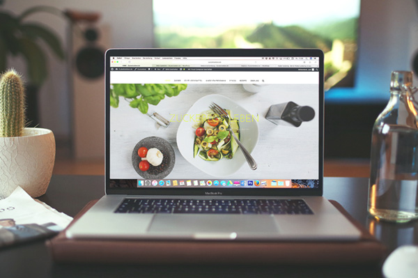
Another great example of well thought through web designs is Seriously Unsweetened’s web site. Seriously Unsweetened is an American brand that produces sparkling water which “offers the satisfaction of a bubbly refreshment, without the added chemicals and sugars typically found in sodas and other flavored drinks.”
Similar to their zero-calorie organic product, their website is probably as minimalistic and clean as possible. No eccentric fonts or viewer-controlled animations can be found on the site. No graphics morphing into each other or videos playing in the background. Instead, there is a simple menu centred at the top of the site, followed by their logo (a simple ‘X’) and occasional introductory sentences on some pages. Clean and bright images with a consistent colour system accompany short paragraphs about the company or the product, and instead of a long footer with email addresses or search fields, there are only two icons for the brand’s Instagram and Facebook links
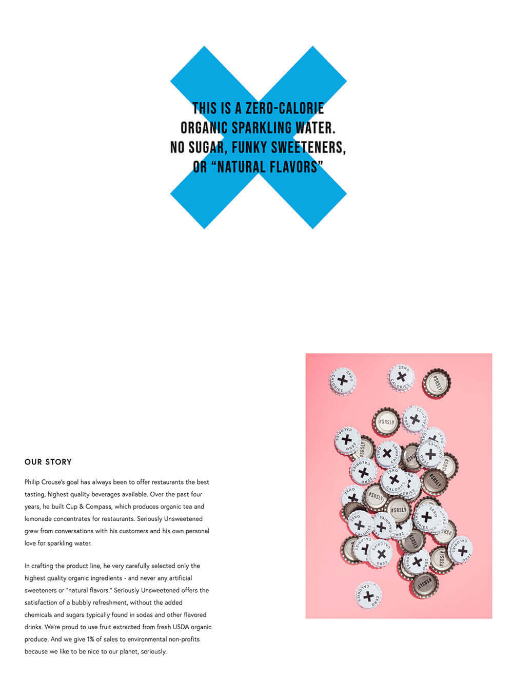
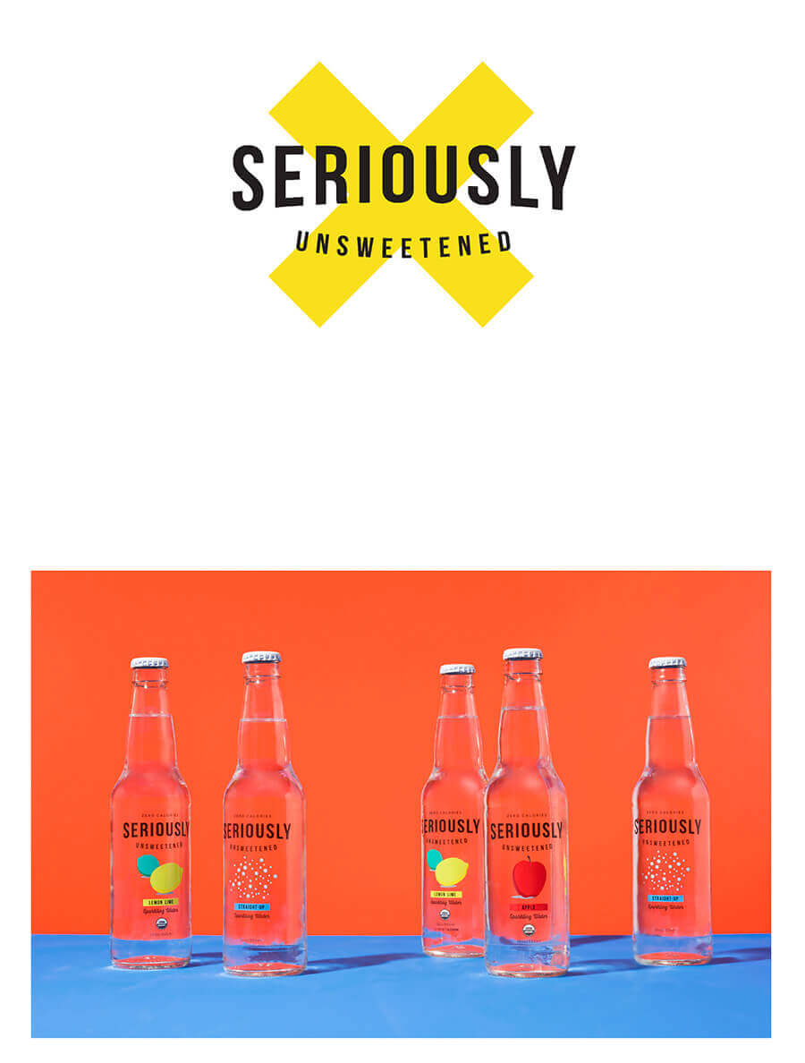
What we love about this web site is that firstly, the brand’s logo ‘X’ is repeated throughout the web site, assuring brand recognition in a subtle yet effective way. And secondly, the identity of the product – simple, organic, stylish, honest – is visualised through the web design, underlining the authenticity of the brand.
Rodolfo Sarno
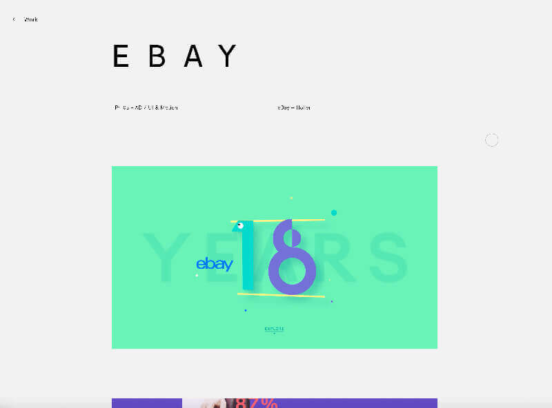
Rodolfo Sarno is a Brazilian user interface (UI) designer, based in Australia. He has worked with different well-known brands such as RLWC (Rugby League World Cup), Ebay and Beats, and has created unique and playful platform and product designs.
Although Rodolfo has got an impressive portfolio that speaks for itself, he has taken the time to build himself a fantastic website, which could easily be treated as another piece of professional work.
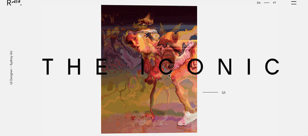
On the first glance, Rodolfo’s website seems to be a clean and modern site with a minimalist design. Aesthetic images of high quality and proportionate sizing are presented to the viewer and give a basic but professional impression of the site. However, as soon as the viewer moves the cursor over the image, the site comes to life: the images start moving and shaking and the viewer can now actively distort them. The effect looks as if the image was made out of water and the cursor would disrupt the surface. In addition, a large title of the project and the category of work appear, giving more information. The viewer can click on the title and will be redirected to the project page.
As each project has individual images and graphics, the effect used throughout this animated portfolio does not get boring. Each new image behaves according to the cursor, and the viewer has a new experience each time. What a playful and original idea!
PART Architects
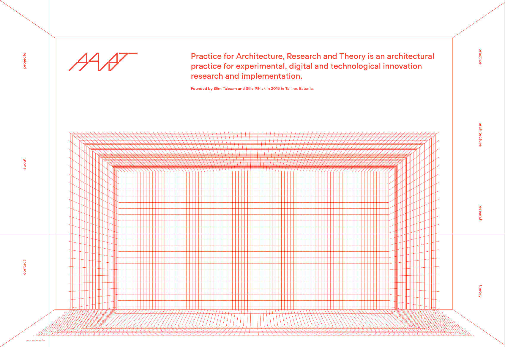
Another one of our favourite web designs is by PART. As they state on their website, “PART architects are PART – Practice for Architecture, Research and Theory is an architectural practice for experimental, digital and technological innovation research and implementation. Founded by Siim Tuksam and Sille Pihlak in 2015.”
The Tallinn, Estonia based architectural practice has a website that is definitely one of a kind. The first page the viewer sees is designed like a 3D box in which information is projected onto the back wall. As the viewer scrolls, the ‘projections’ move along the walls, whereas the page itself seems to stay still. With only red writing on a plain white background, this reminds the viewer of an architectural sketch – a fun and smart way of presenting PART. Towards the bottom of the page, as the viewer scrolls down, the page suddenly becomes flat, giving more details and background information on the company.
The cursor are two guide-lines crossed over each other and spread out to the end of the window, making it seem as if the viewer was part of the design process.
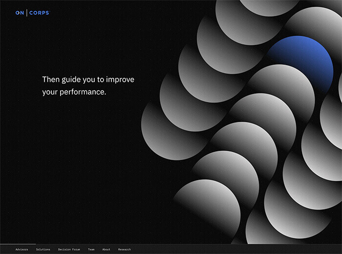
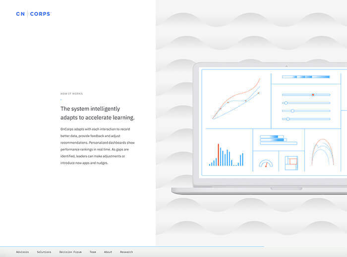
OnCorps
Moving on to more web designs we think have hit the nail on the head: software developer OnCorps. OnCorps use “machine learning, behavioural science, and user-centred design, (to) help organisations collect better data & make better decisions.”
Although the service OnCorps offers could be perceived as unexciting by a creative mind, their website easily evens that out. The site has an infinity scroll, and as the viewer scrolls down, shapes and patterns displayed next to small paragraphs start moving and morphing. Apart from this being an unusual and exciting side effect, OnCorps also indirectly visualise their business concept of creating patterns and highlighting different aspects without much explanation. This reinforces their brand identity without writing long paragraphs, making the user experience convenient and easy.
Interestingly, the agency that built this website was Heco (we discussed their website at the beginning of this article).
Eclipse
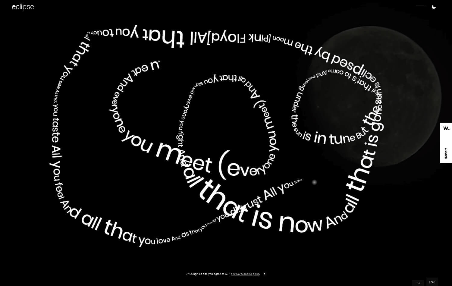
Eclipse are an Italian design agency, and their website is definitely one of the most creative ones we have seen so far. As the viewer enters the site, they are asked to “draw”, using the cursor. As they press down the mouse and move it across the screen, a line made of words is drawn on the screen (see above).
Once the viewer has finished drawing, they can then click on a little moon symbol, and are directed to a new page on which different stars and planets are displayed. When hovering over them, the planets and stars turn into random symbols – a diamond, Super Mario, a moonwalking Michael Jackson or a moving eye – or display links to new pages, such as the projects page.
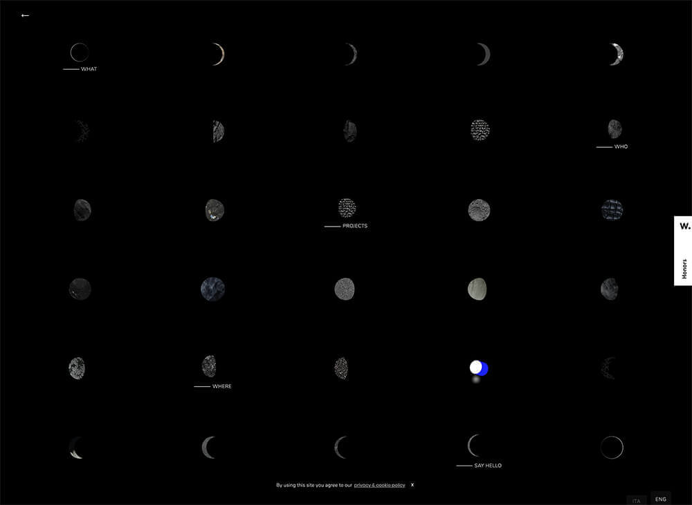
Eclipse have created a playful and original online presence, and their eclipse theme is present throughout the site. Although the website can be tricky to understand right from the start due to the unconventional way it was built, it is ideal for a creative agency. Simply by having people explore their website, the agency can showcase their original approach and individuality. Even though the website is complex in the way it is built, it works well on different devices and doesn’t respond slowly.
Web designs: in conclusion
There’s something the web designs mentioned above all have in common: they visualise the brand strategies without being very obvious. For instance, PART designed their website to behave like a 3D architectural sketch, OnCorps showed how patterns are created by scrolling through their website and HECO and Eclipse built websites showcasing their creativity and unconventional approaches (which is especially important in the creative industry). Although some websites could be seen more as a piece of art rather than a practical website, they all definitely stick out for being individual and sophisticated. It takes courage to try something new and unique, which could be appreciated by the websites’ visitors, and by potential clients.
Andrew began his career in web design and development in the late 1990s. His eagerness to embrace the medium saw Andrew setting up Reactive Graphics in 2004. With over 20 years plus working as a London web designer supporting a wide range of clients, Andrew’s experience in web design, web development and graphic design have helped him to build a growing business.