TLDR
A financial services website feels trustworthy when the design, regulatory details, and writing all work together. Keep the design simple. Show your FCA registration and risk warnings clearly. Be open about fees. Use real team pages with real photos. Trust third party reviews more than award badges. Fix small things like HTTPS, page speed and old copyright years. Trust is built from lots of small honest choices, not one big change.
Most people will judge a financial firm by its website first. If it is confusing, trust drops immediately.
A financial services website feels trustworthy when design, compliance signals, and content all work together instead of being treated as separate parts. The firms that do it well keep the design simple and easy to follow. They explain things in a clear way and avoid vague statements. The firms that get it wrong usually fall into two groups. Some look nice at first but don’t really say much. Others clearly know their work but their website is messy and hard to understand.
Related Articles:

Why trust on a financial website is a design problem first?
Before a visitor reads anything, they have already made a judgement. Research shows that people form an opinion in less than a second, long before they read about your services or qualifications. In financial services, where trust matters a lot, design is not decoration. It affects whether people trust the firm or not.
What a trustworthy layout looks like
The way trust looks in this industry is quite specific. Simple design signals confidence. A layout with plenty of space, a small and controlled colour set, and clear fonts that are easy to read all send the same message. It is like wearing a well-fitted suit in a meeting. You are not trying to stand out, you are trying to make people feel comfortable with you.
How colour affects trust
Colour is often not given enough thought. Dark blue, charcoal, dark green and soft off whites tend to work well in financial services because they feel stable and calm. But the main point is consistency. When a website uses too many different colours, it starts to feel disorganised, as if there is no clear design direction. We have seen this even on websites of large firms and it makes people trust them less, even if they cannot always explain why.
Why looking modern is not always better
One thing we have learned from our experience: firms should resist the urge to look modern at the expense of looking permanent. Some design trends like very large text, dark backgrounds and lots of animation can work for new fintech companies that want to look different. But for established wealth managers, private equity firms, or insurance providers, these choices can have the opposite effect. Clients in this space want to feel that the company has been around for a long time and will stay for a long time. A simple, timeless design often builds more trust than the latest trends.
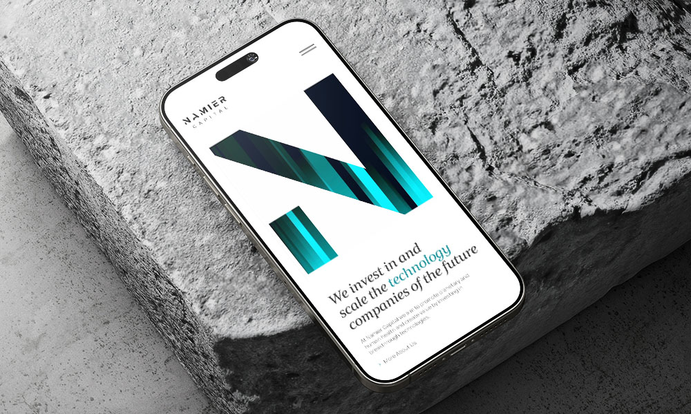
That is what we did for Namier Capital, a venture capital firm. They had no photos to use, so we didn’t add stock images. Instead, we kept the design clean and used a small set of colours. We also animated their logo into a simple N on the homepage. The result looks modern but still solid and reliable.
Why do regulatory details matter on financial websites?
Showing your FCA registration details is a legal requirement for regulated firms in the UK. But most firms treat this information as something they only include because they have to, rather than something that can help build trust.
How FCA details are usually shown
The usual approach is to hide regulatory information in the footer in small grey text next to the copyright line. This is a missed opportunity. A simple statement like: Authorised and regulated by the Financial Conduct Authority (FCA Reg. 123456), placed where people can see it such as the homepage or main navigation, builds trust much faster than long brand text that most people will not read.
How investors see risk warnings
Risk warnings matter in the same way. Statements like Your capital is at risk or Past performance is not a reliable indicator of future results, are seen by more experienced visitors as a sign that a firm is honest and follows the rules. If these warnings are missing, it can raise concerns. We have reviewed competitor websites for clients over the years and often found that sites without clear risk disclosures are either new firms that do not yet fully understand the rules, or businesses that are better avoided. Experienced investors tend to notice this quickly.
Legal documents on a website
One point that is often overlooked is that your legal documents also affect trust. A privacy policy that is clearly written for your business and explains how you actually handle data in plain English shows that you take your responsibilities seriously. A privacy policy that looks like a copied template, with placeholder text or the wrong details, sends the opposite message. Most clients do not read these documents in detail, but they often look at them briefly, and they can tell the difference between something that feels carefully written and something that feels copied.

What does transparency look like on a financial services website?
How should a financial services website explain its fees?
The most important thing a financial services website can do to build trust, and the thing many firms still avoid, is to clearly explain their fees. The hesitation makes sense. Firms worry about competitors seeing their pricing, or clients focusing only on cost, or fees being too complex to explain simply. But from a visitor’s point of view, a website that does not mention fees can feel like something is being hidden.
You do not need to publish a full fee list. A clear explanation of your fees is enough, for example: “We charge an annual management fee of X% with no hidden transaction costs” or “Our fees depend on the complexity of each case, and here is how we calculate them“. The point is to show that you have thought about it, that you are open to talking about it and that clients will not get any surprises later.
How important are team pages on a financial services website?
Real team pages are also often not used properly to build trust. In financial services, firms often try to look like one organisation rather than showing the people behind it. This does not work well for most firms. Clients who are thinking about trusting you with their money want to know who they are dealing with. A team page with real photos, simple background details, qualifications and any required regulatory information helps build trust in a way that marketing text cannot.

Do reviews and testimonials build trust on financial websites?
Not all social proof is equal, and some of it can actually reduce trust.
Third party reviews
Third-party review platforms like Trustpilot, Google Reviews, and Feefo are often seen as more trustworthy because they are independent. A live rating such as 4.7 stars from hundreds of reviews is usually stronger than a set of testimonials on your own website. In many cases, a score that is not perfect, like 4.6 or 4.7, feels more believable than a perfect 5.0, which can make people question whether the reviews are real or filtered.
Client testimonials
Named client testimonials work when they are specific, show who said them, and explain a real result. Working with this firm gave us clarity on our retirement planning that we had been missing for years, especially around how our pension works with our rental income is convincing. Great team, very professional from A.T., London is not.
Awards and badges
The type of social proof that often backfires is award badges. Many financial services websites show rows of logos like Best Adviser Firm 2023, Five Star Service Award, or Highly Commended. These often come from awards that are self-nominated, widely given out, from names most clients do not recognise or can even be paid for. When a website shows too many awards that people do not recognise, they start to question them or feel the firm is trying too hard to impress. It is better to show fewer awards from names people know.
A good example is Crown Agents Bank, a client we worked with. They are B Corp certified, which is a certificate for companies that meet high standards for social and environmental impact. It has to be renewed every three years. Because it is checked by an outside organisation and is hard to get, it actually means something.
On their homepage, we placed the B Corp badge in the main hero area instead of hiding it in the footer, so visitors see it straight away. That is the right way to use a certification. One real, well-known badge in a clear place builds more trust than many random award logos.

What technical details do visitors notice without realising it?
SSL is basic. Any financial services website without HTTPS will be marked as not secure by browsers, and that warning is enough to make people leave. For firms that handle sensitive data or transactions, a higher level certificate can add an extra layer of trust and is worth considering.
Page speed also affects trust, even if people do not think about it directly. A site that loads quickly feels smooth and easy to use. If it takes too long, people start to lose patience. It is the same feeling as calling a firm and waiting a long time before someone answers.
The small details
Small details can show when a website is not being looked after. A copyright notice that still says ©2022 in 2026. Team pages with people who no longer work there. Blog posts that have not been updated for over a year. Links that do not work. News sections showing events from years ago. These are not small issues. They suggest the website is not being maintained, which makes people wonder what else is not being kept up to date. We have seen this even at successful firms and it can still make them lose clients without realising it.

What is the most common trust mistake financial firms make on their websites?
After years of working on financial services websites, the same practical mistakes come up again and again.
Writing in vague, generic language
Many financial firms rely on broad statements like “we provide tailored solutions” or “we deliver expert advice.” These phrases sound professional but say nothing specific. Visitors cannot tell what the firm actually thinks or how it works, so the content does not build trust.
Writing about themselves instead of the client
Most financial websites focus on themselves: we do this, our approach is this, our philosophy is this. It sounds professional, but it often makes the site feel self-focused. It gives visitors the impression that the firm is more interested in talking about itself than understanding the client.
Writing service pages that all sound the same
Bespoke financial planning tailored to your needs is used by almost every firm. It does not say anything specific. If you remove the logo from your service page and your own clients would not recognise it, then new visitors will not recognise it either.
Why outdated footers reduce trust
Old social media links, old office addresses, team members who left years ago and old regulatory text after a merger. The footer is often where this kind of information is left to rot, even though it is one of the few places people still check for basic trust signals like FCA or SEC registration.
Final thought on what makes a financial services website look trustworthy and professional
A trustworthy financial services website is not built from one big change. It comes from lots of small, honest decisions across every page. That is what makes a financial services website feel professional and reliable.

Andrew began his career in web design and development in the late 1990s. His eagerness to embrace the medium saw Andrew setting up Reactive Graphics in 2004. With over 20 years plus working as a London web designer supporting a wide range of clients, Andrew’s experience in web design, web development and graphic design have helped him to build a growing business.