Happy New Year to you all.. we hope you had a great festive period!
Lets take a look back at what we achieved in 2015, and what we predict for 2016.
It was definitely another year of wonderful work with brilliant clients and another year of amazing advancements in web design and development.
Here’s our top 5 of 2015:
1. Visual-Storytelling
As we know visual-storytelling has been one of the buzz trends of web design this year, with many huge brands cottoning on to the power of fusing website design and human emotion. As we mentioned in our blog post earlier on in the year ‘Visual story-telling can simplify complex concepts and open engagement across all languages, cultures and societies. If you use powerful visual elements, within your website content you are offering viewers the opportunity to engage deeply with the information you are sharing, provoking emotional connections that can only be established through seeing.’
2. Parallax Scrolling
Parallax-scrolling has had a bit of a bad reputation in the media in 2015, with many web designers going wild and getting a little bit ‘continuous-scroll’ happy. When used correctly, parallax design can offer an experience that is both engaging and informative and this is shown by the calibre and nature of companies choosing this format as the basis of their website design. Reactive Graphics have recently launched a parallax web design for Liberty Comms, a PR company in Chelsea.
Other more corporate/mainstream websites also utilise Parallax Scrolling as a way to incorporate a lot of information within a dynamic space that doesn’t cause the user to feel overloaded by information. See below an image taken from the Rimmel website, which seems to show make-up items floating in thin air as you scroll.
3. User-centric design and tailored content
User-centric design in website development means allowing the user to browse the product intuitively, without forcing them to navigate in a way that is disorganised or unhelpfully complex. This design technique utilises a great understanding of the user experience and also develops in synchronisation with advancing techniques and methods thus allowing the user to feel both in control and supported in their web experience.
4. Split Content
It seems that in today’s economy more and more businesses are developing second branches of their company in a bid to offer more options for their companies to succeed, this is primarily why the split content website has been popular in 2015. With businesses wanting to segregate their stands of work however under one overall brand, with split content they are able to clearly define the two sides of their ‘personalities.’ Split content can be managed in many ways, whether this will be as a simple vertical split or utilising a modular layout to define separate strands of the business.
5. Hand-drawn illustration
With the web becoming extremely saturated in recent years, illustration is becoming more and more popular, as a way to give your website (particularly if you are addressing a dry subject) that extra bit of pizzazz. Some designers have started to take illustration to the next level using animation as another way to enhance a web experience and further engage the user. See below our very own illustrator Katy Jackson’s very beautiful and very festive hand-drawn and digital rendered illustration. Katy often adds illustration to websites for case-studies or to further explain what a business does, this allows a user a different way to engage with the content other than simply reading it.
The controversial new(ish) kids on the block for 2016
Cinemagraphs
Nicknamed the living photograph the cinemagraph is a fusion of video and photography, allowing animation within a particular portion of a photograph to bring the subject to life. This technique has been doing the rounds since late 2011 and we expect to see more of it next year. What is essentially a high end animated gif in terms of format type however, instead of looking a whole scene over and over, it looks just a fragment of the frame.
Hamburger icon
The icon that has been around for a while and is still causing controversy today is the hamburger icon or the ‘air-vent’ as was originally known. Usually a button which reveals a hidden menu the icon is both loved and hated across the design and development world for a number of obvious reasons.
Love
1. It frees the page of clutter
2. It takes up minimal space and is recognised as a revealing icon across mobile devices
3. It is a universal design that requires no language
Hate
1. It adds another stage to website navigation
2. It hides relevant information from the user
3. It is a universal design that requires no language and therefore if it is not recognised the user will be alienated
Either way it seems the hamburger icon is probably here to stay as it promotes a streamlined experience for those users who know what it does and as the web expands it will become more and more recognised as a hidden menu.
Slow-load animations
Slow-load animations are the bain of a users experience. (In MY user experience.) They basically indicate that you have to wait a little longer for the website you are trying to access to load and in the meantime you can occupy your mind with a sometimes cliched and rather naff loading animation. Some designers have embraced the slow-load animations and made it in to a feature all on its own, and that’s fine – but why would you add a complex slow-load animation to a site which is already too heavy to load?
Some animation types include; spinners, hover tools and loading bars, faceless clocks all stark reminders that you are waiting and sometimes they offer no indication of how long you will be waiting.
Other types of slow-load animation include large flat design, minimal style pop-ups, which allow the user to sign-up to a service or gives a taste of the website to come.
In all cases, these animations should always show the progress of the load and allow users the comfort that what they are trying to navigate to, is on its way. Imagine being on hold on a telephone call and having no response from the other end of the line – whether it’s terrible hold music or a pre-recorded robotic voice telling you, you’re 4th in line – that connection still indicates that you will get to another destination eventually.
For 2016 we expect even more dynamic and elaborate slow-load animations – I will probably just have to get used to it.
It’s time to finally say goodbye to POP-UPS
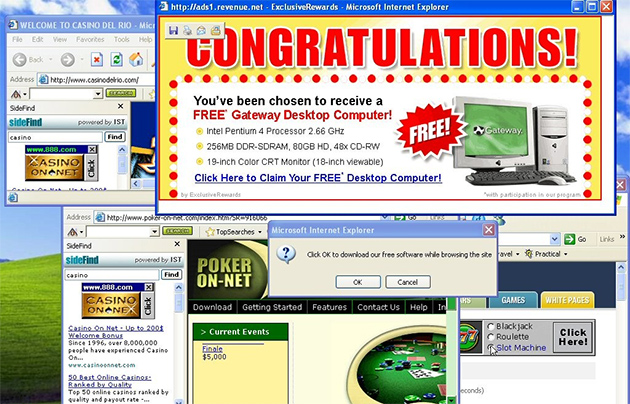
We all faced that daunting feeling, when our desktop would be faced with a variety of pop-ups and eventually we would be downloading a software or virus which you did not intend to. The good news is we predict that operating systems, websites and apps are definitely becoming more inter-connected and integrating. Enabling a more suitable experience browsing online, with no pop-ups distracting your journey online. 2016 has definitely got better already. Web developers are now creating simpler and cleaner pages, with the invention of media platforms such as Ipad/Tablet and mobile devices content and information needs to be easily readable, to keep user interactivity. It also helps those who are not immune to new technology and the internet to help navigate more efficiently.
Social Media becomes vital…
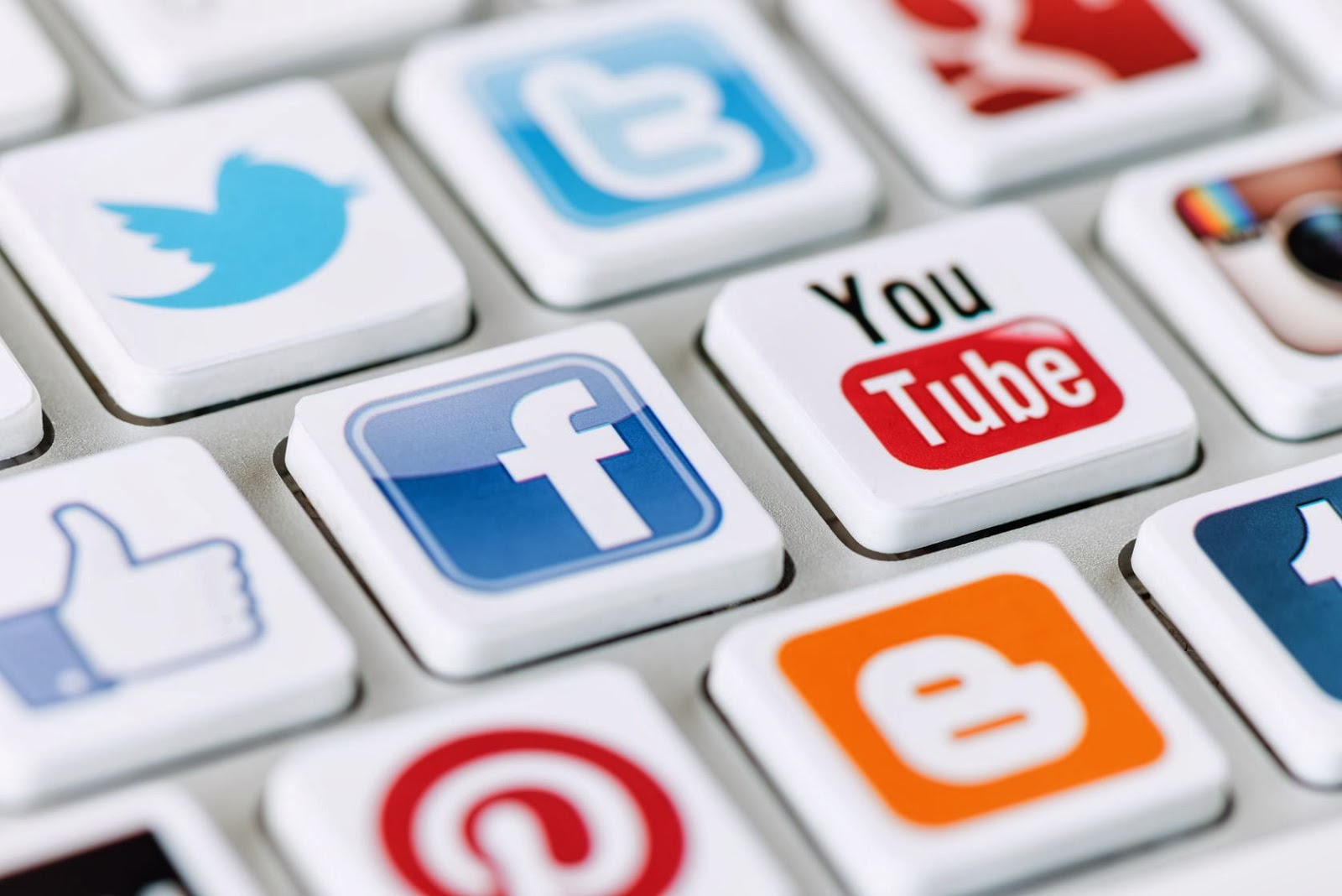
Social Media began as a platform where family or friends would communicate with one another, or share their current experiences, whether that be posting an image on Facebook or sending a status about their current thoughts. This all may seem quite informal and colloquial for business, however in 2015 “78% of companies now say they have dedicated social media teams”. We predict that 2016, more businesses will be using social media to interact with their clients or potential clients. Social media marketing has become a necessity just like paid ads, flyers and other “traditional” marketing efforts. In order to compete today, businesses can’t afford not to be active on social media. Customer Service was once a phone call away, now it is a click away, with the enhancement of online chat integrated into websites. Consumers would rather type and text than call, everyone wants instant access and help immediately. We have become impatient viewers online, it allows consumers to multi-task rather than go through the pain of navigating through a maze of numeric options will become non-existent.
Overall…
In conclusion we think that 2015 has been an exciting year for web design and development with many UX and UI improvements making our lives on the web much simpler to navigate. It seems that with technology advancing at such a rapid pace, web development is having to work hard to sustain these changes and support users through the change. As the internet and web development enhances minute by minute, and with a large audience of nearly 2.4 billion people using the internet everyday, businesses are missing out on a large potential audience, if they do not have a website. Visit the experts at Reactive for all the best advice and guidance when building the best website to symbolise your business aims, objectives and values.

Andrew began his career in web design and development in the late 1990s. His eagerness to embrace the medium saw Andrew setting up Reactive Graphics in 2004. With over 20 years plus working as a London web designer supporting a wide range of clients, Andrew’s experience in web design, web development and graphic design have helped him to build a growing business.