While being in Soho for quite a while already, we’ve spotted some cool and creative brands that definitely deserve attention. We’ve prepared for you 10+ companies that in our opinion are ruling the local, creative market in the Soho brand identity category. Check them out!
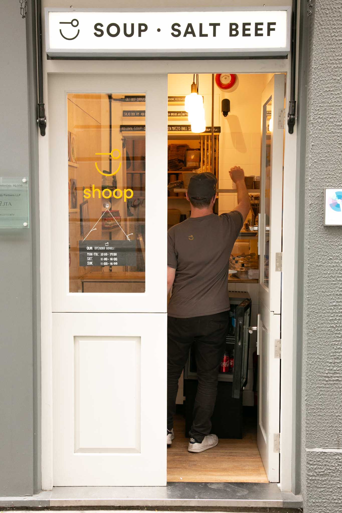
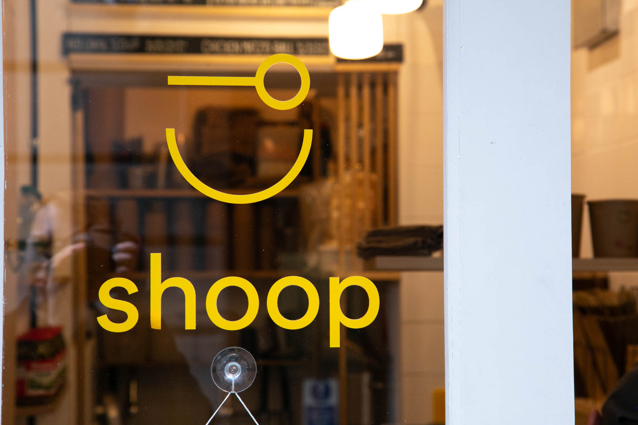
Shoop Soup attracted us by their design simplicity and the overall minimalistic style of their brand. Their logo definitely plays a huge role in their design game as it gives a hint of fun and positivity.
Their website and social media wasn’t left behind. The consistency of the look and feel of their brand is remained throughout all the channels which gives a perfect space for sharing their story.
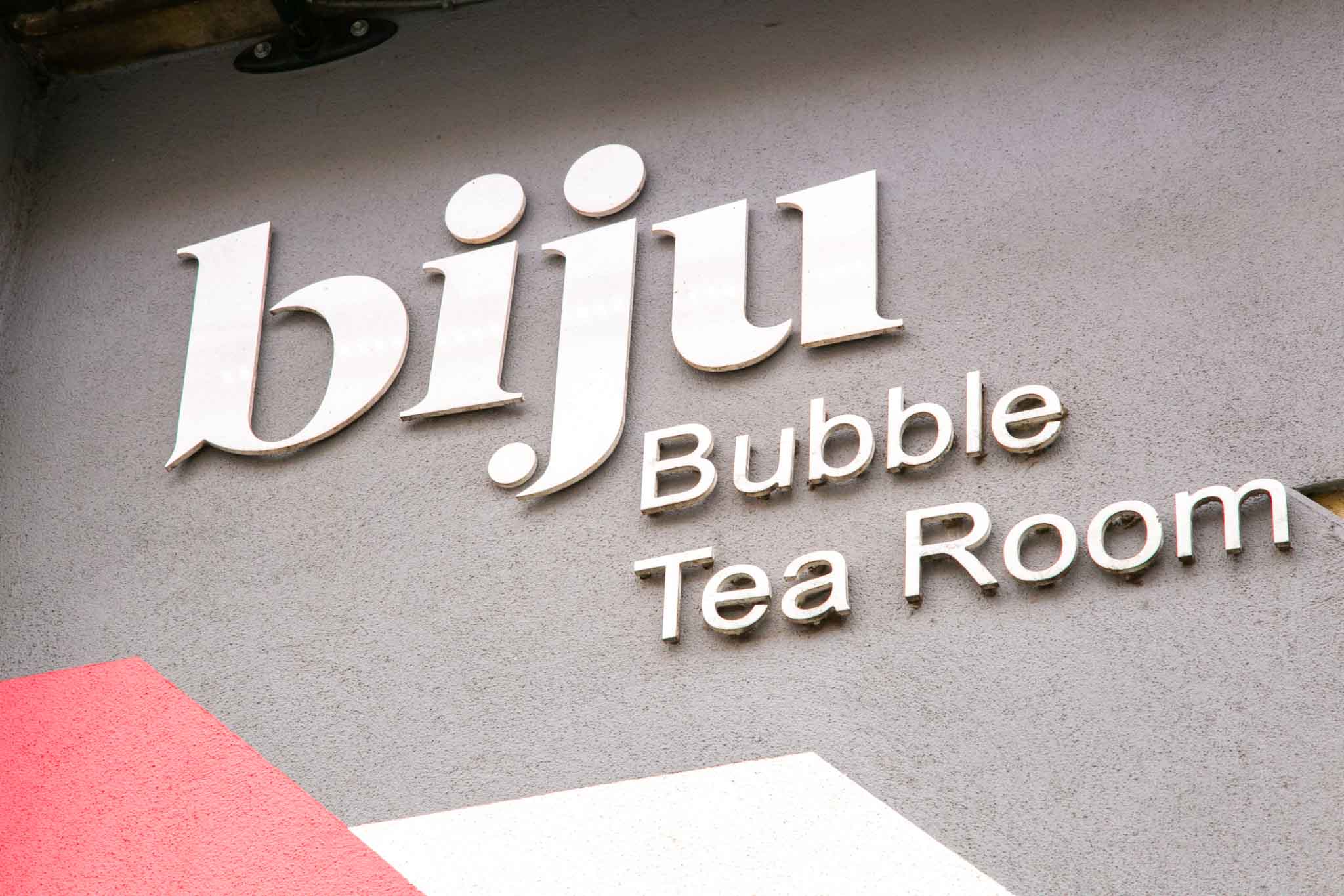
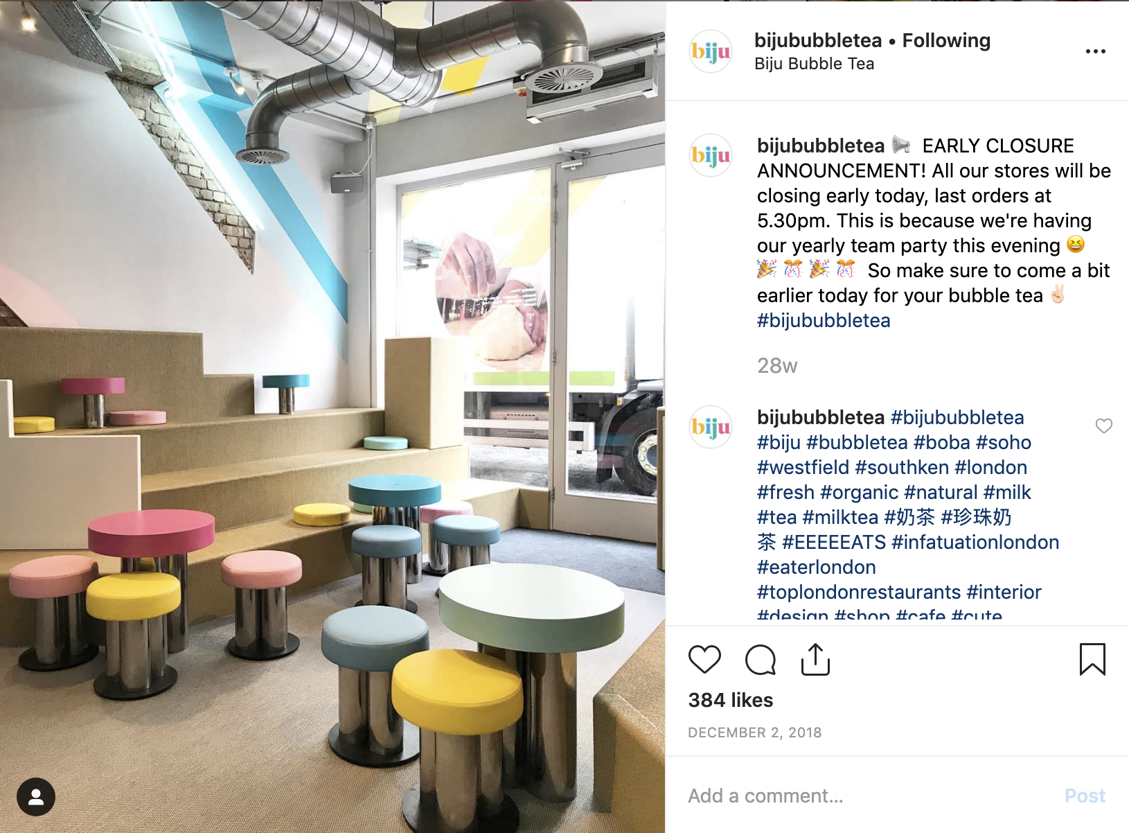
Biju definitely scored some points for their interior design. When entering one of their stores you can definitely feel playful and vibrant culture. The usage of many vivid colours across many brand elements such as logo, interior, cups and even drinks itself creates rich and memorable experiences for customers.
What also captured our attention is ‘The Biju Story’ page on their website. Integrating animation elements to their story creates fun experience for the user.
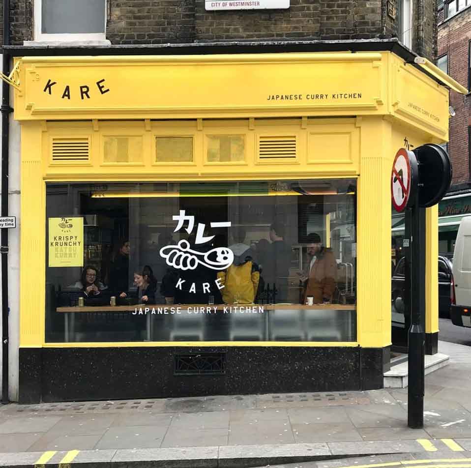
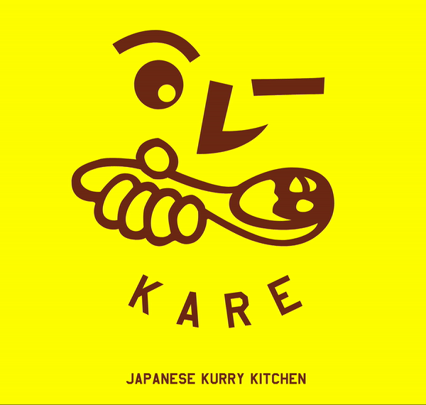
Incorporation of the Japanese symbols and graphics into Kare’s logo was a very strategic move. Adding cultural elements into any design adds authenticity and cultural relatedness. Integrating it with playful and positive style was a brilliant idea as for a hip Japanese restaurant.
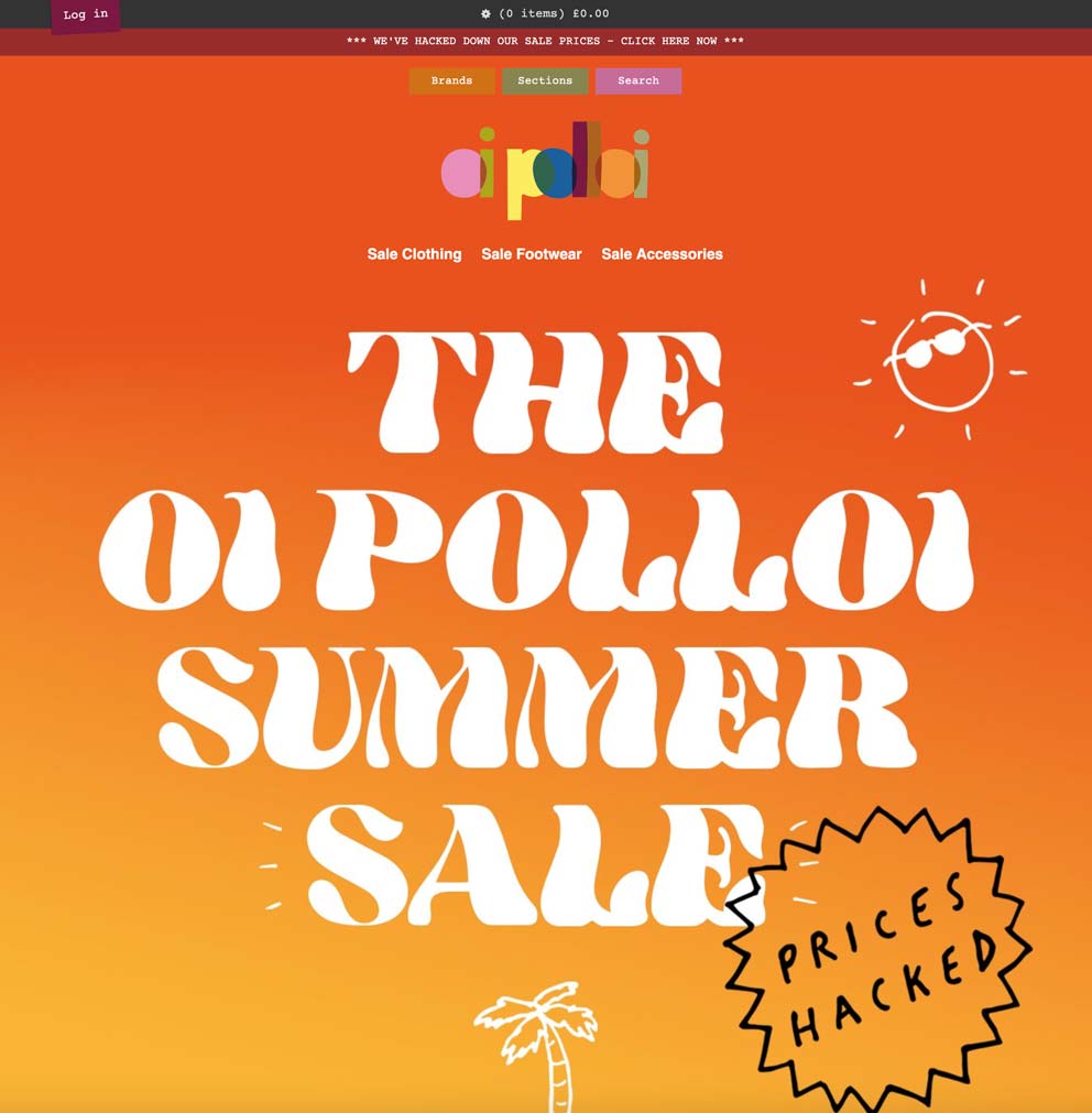
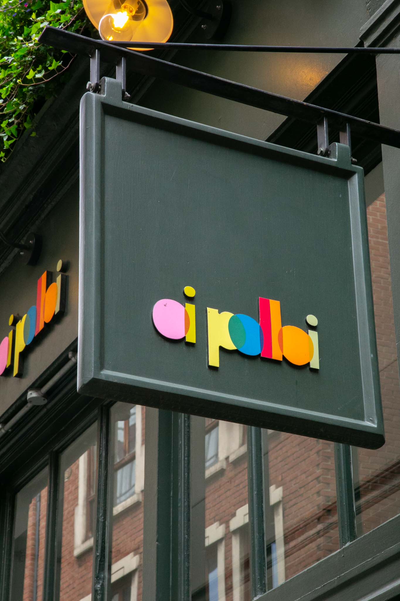
Pastel colours and asymmetric shapes makes oi polloi’s brand look playful, light and innocent. The character is accentuated on their website as well. We can see it with the use of different fonts and visuals. Wavy, colourful and matching their brand. Most of the clothes are also within the same colour palette, which makes up a perfect, consistent branding.
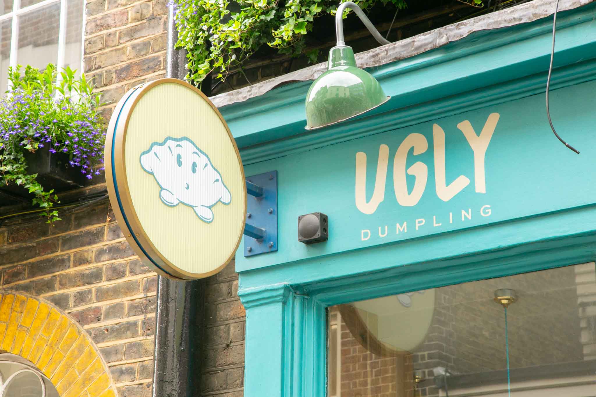
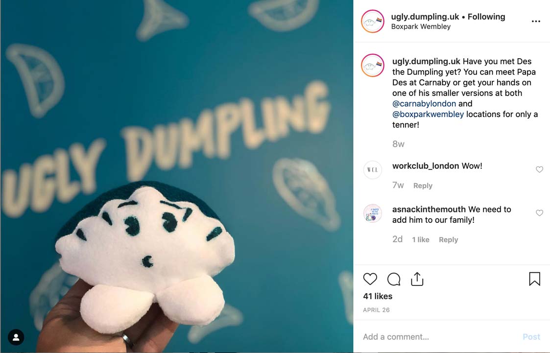
The Ugly Dumbling’s logo not only acts as a regular symbol but also as a mascot. We can see it’s appearing across many media channels (Social Media, website, even in the restaurant as a real mascot. It gives a bit of humour to the Soho brand identity and makes interaction with the brand more personal. Font used in the logo perfectly correlates with the graphic giving it more dumbling-like (and tasty) look :). Their website has what it needs. Creative style layout, consistent colours, and simplicity. We think however that incorporating some graphic and UI animation wouldn’t do any harm.
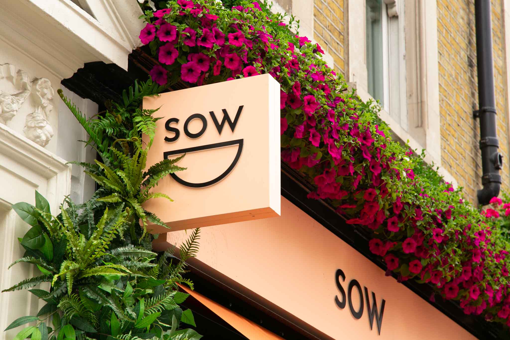
SOW brand has a beautiful design across all the media. Simple yet well thought out, responsive logo. The bowl shape can be also interpreted (consciously or not) as a happy face which is a great psychological play. The logo is prepared for the digital age as the round shape and text size can be easily adapted to any media. Also, if we strip down the logo to the bowl shape only (due to the lack of space), there is not a problem with recognising it on any medium.
Their website and social media also portrays a modern, stylish and vibrant vibe. Thanks to the great photography and beautiful web design the website looks fresh and smart. For their visuals we give them A+. 🙂
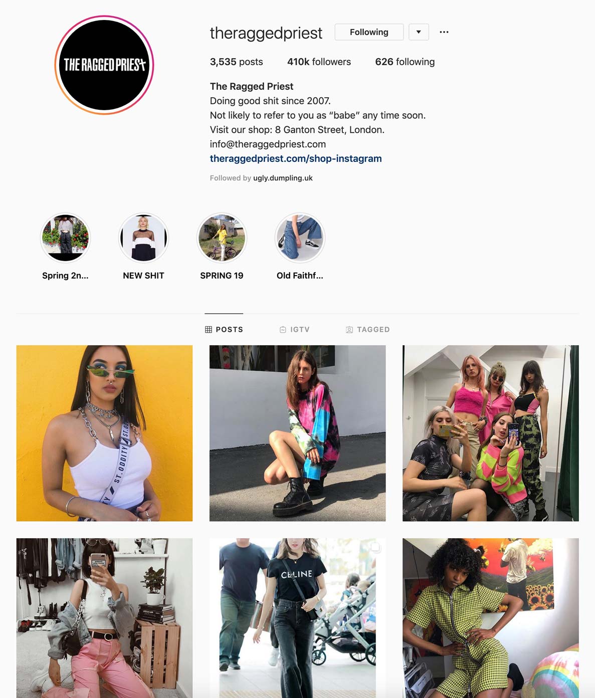
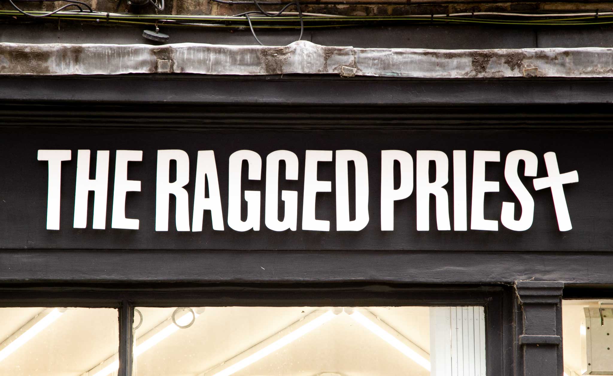
The Ragged Priest takes a bit rebellious approach to their Soho brand identity. They know their target audience very well which enables them to deliver the best possible brand experience. Although, as with most clothing brands, their focus is on photography and clothes we ranked them high because their branding is holistic. The logo corresponds very well with their brand voice on social media (e.g. Instagram biography), their clothing style and their audience.
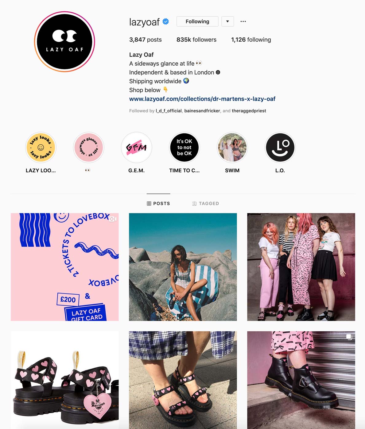
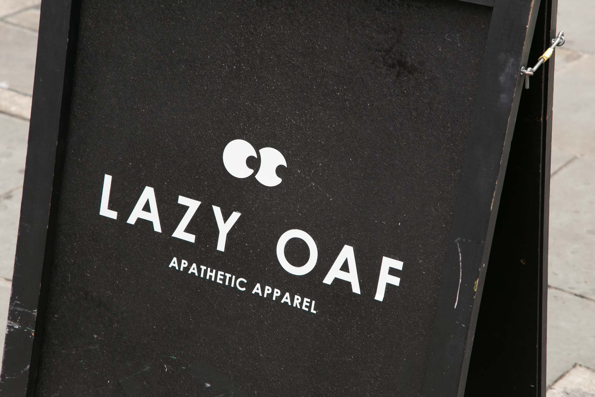
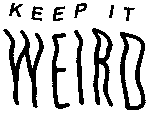
Lazy Oaf is a clothing brand that also knows their target audience very well. In contrast to The Ragged Priest their branding is rather cute than rebellious. Pink and weird are the words that describe them best.
Their logo is simple yet fun and can be easily placed in different media.
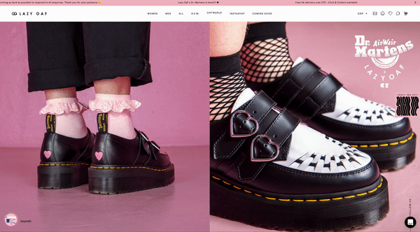
The website enhances their weirdness with many interesting microinteractions and animations. The eyes in the logo move with your cursor!
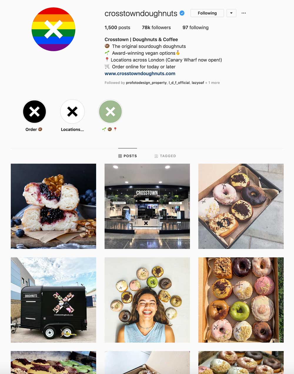
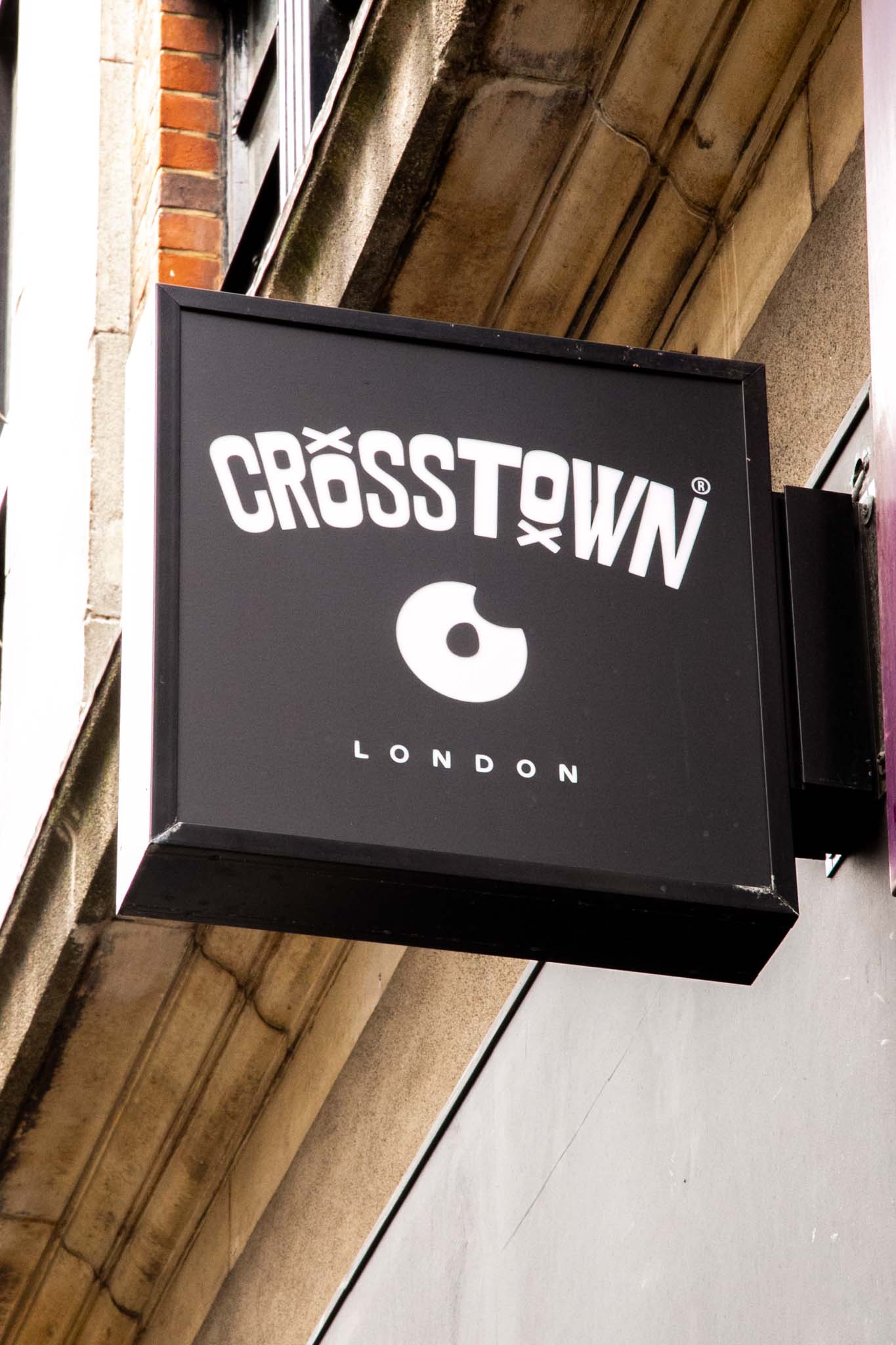
It’s not an accident that Crosstown made it to the top 3 on our list. Their logo is perfectly prepared for digital media as it’s designed with the best responsive design practices. Having the nibbled doughnut as a focus point and the X as a subsidiary mark makes it easy to use in different forms on digital and physical media.
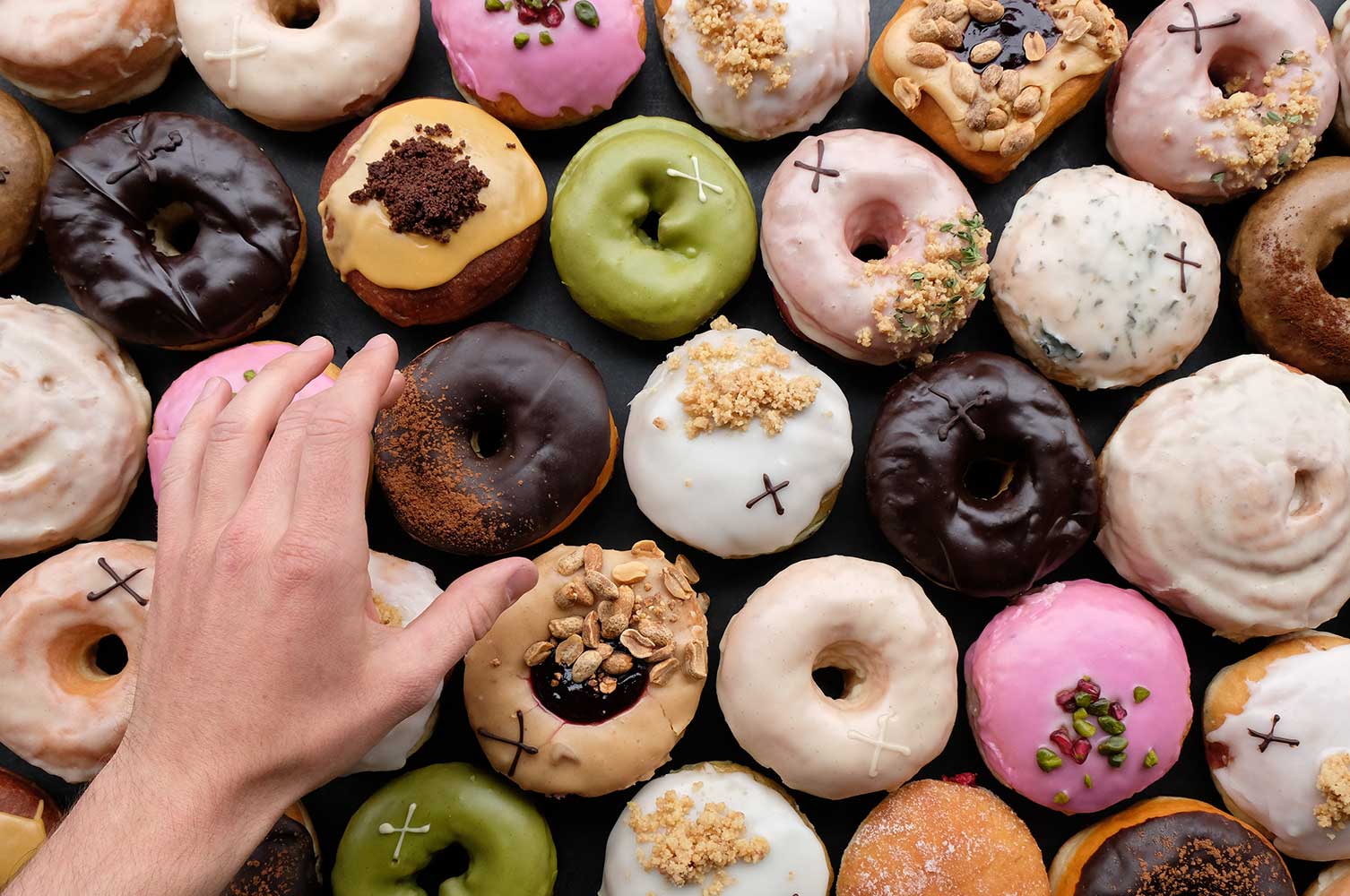
They’ve marked their doughnuts as well!
Responsive design
Nowadays, logo, as the key element of a brand, should adapt to different print materials, multiple devices, and screen resolutions. To meet this need, responsive design emerges and becomes one of the up-to-date trends for brand visual identity design. Graphics applied in traditional physical space, like prints, posters, stationery, internal/external space, fabrics, has long been and would still be important for brand identity. While at the same time today’s digital world asks for designs that can be used on screen in various sizes and shapes – especially logos that are not merely for scaling up or down. It is no longer the size that counts but also the form – how a logo generates various forms to fit different types of media in an elegant and efficient fashion.
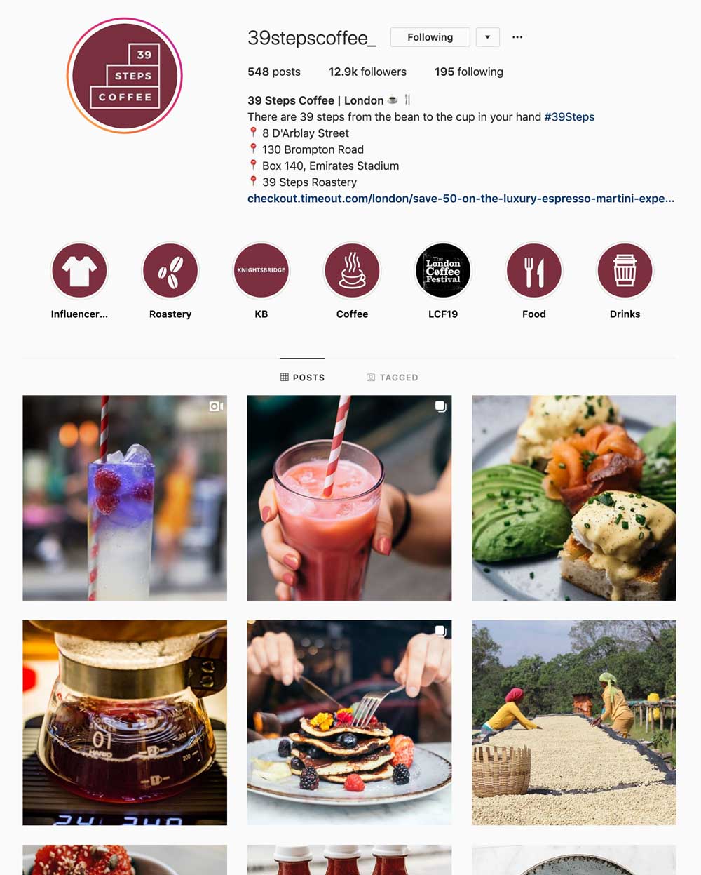
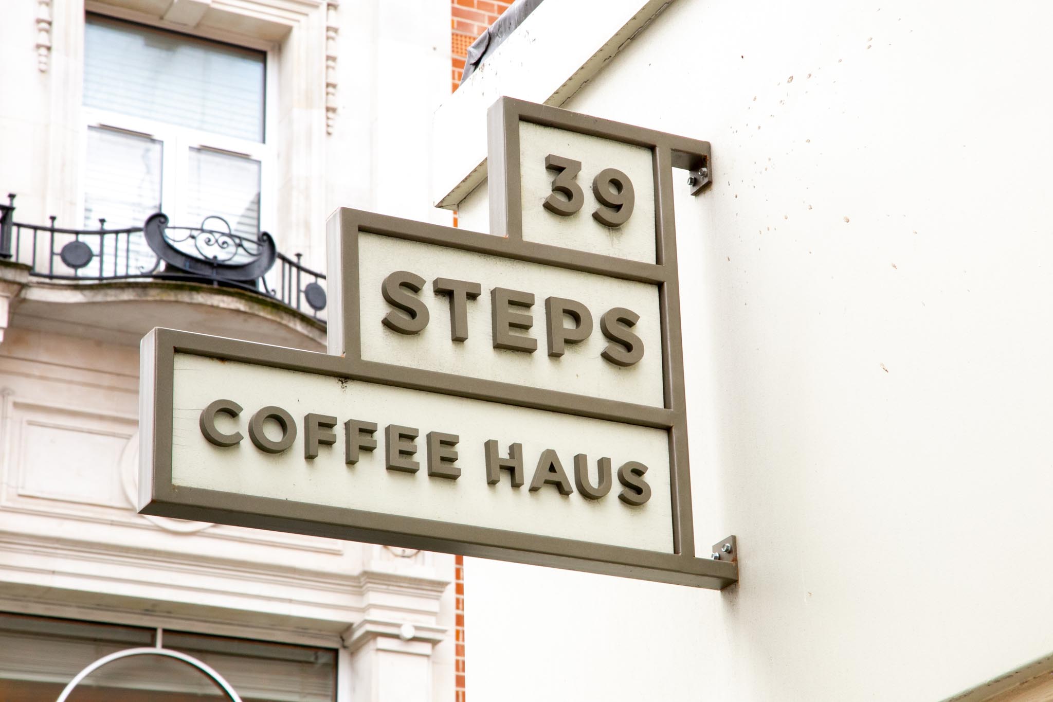
39 Steps Coffee has the most responsive logo on our list. It allows to brilliantly form it across different media channels.
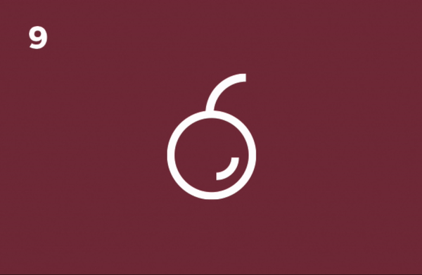

They created 39 individual icons to represent each step of the coffee making process, which also makes it a great brand story and packaging design element!
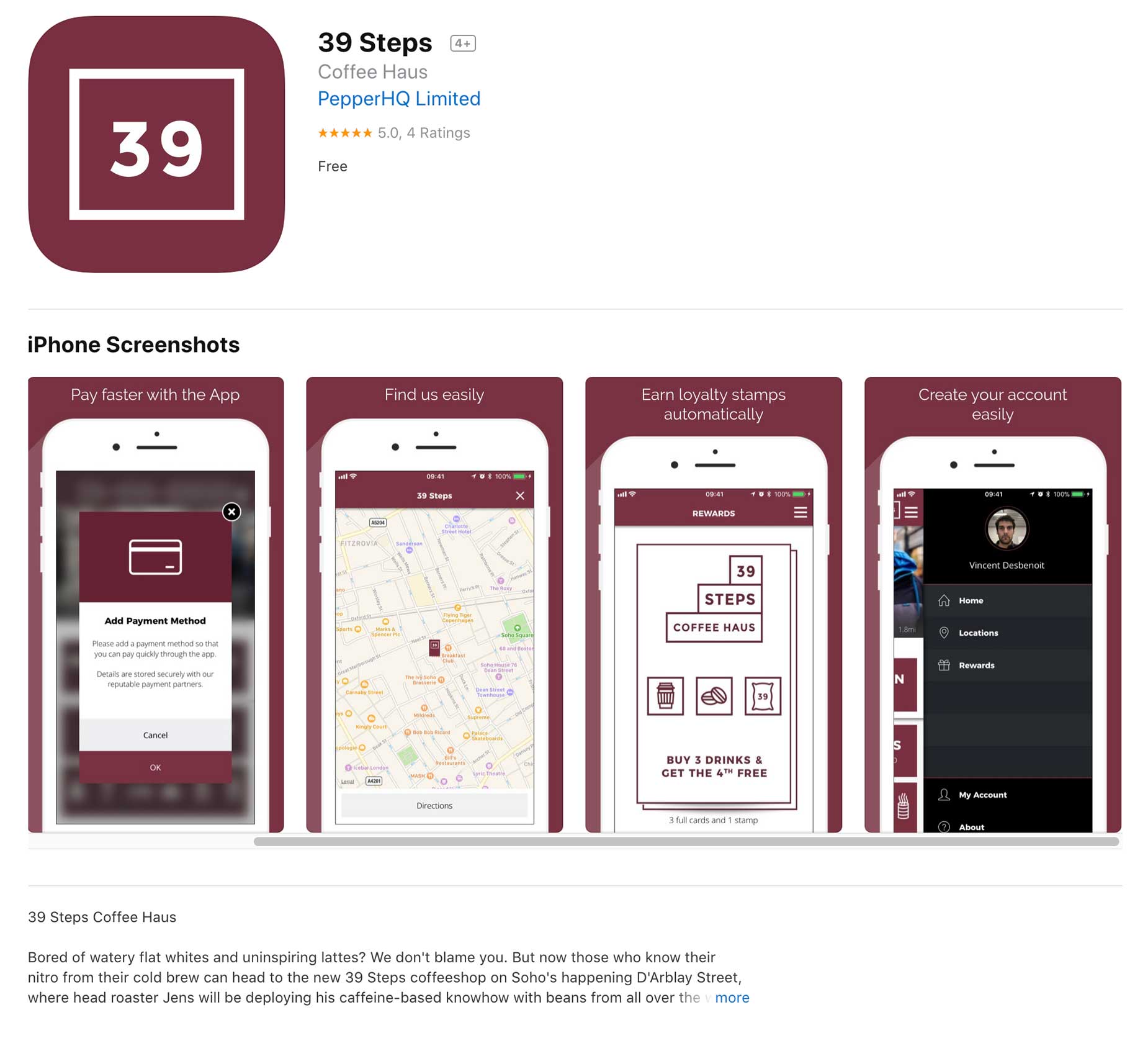
They used one of the elements of their logo for the mobile app icon. Being able to deconstruct or use different parts of the original logo elements gives us an insurance for compatibility with future media formats.
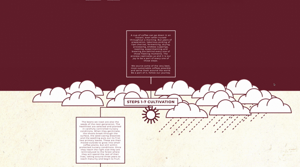
We also love how they’ve used the interactive web design to interact with their audience, share their story and show the 39-step process!
Overall 39 Steps Coffee makes up a holistic and consistent Soho brand identity.
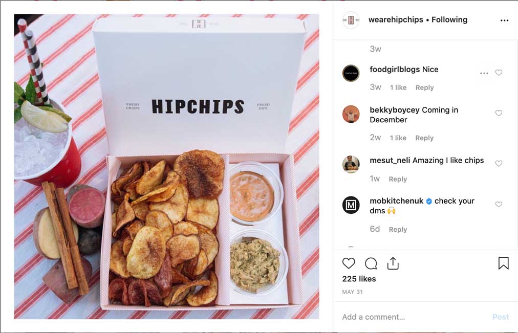
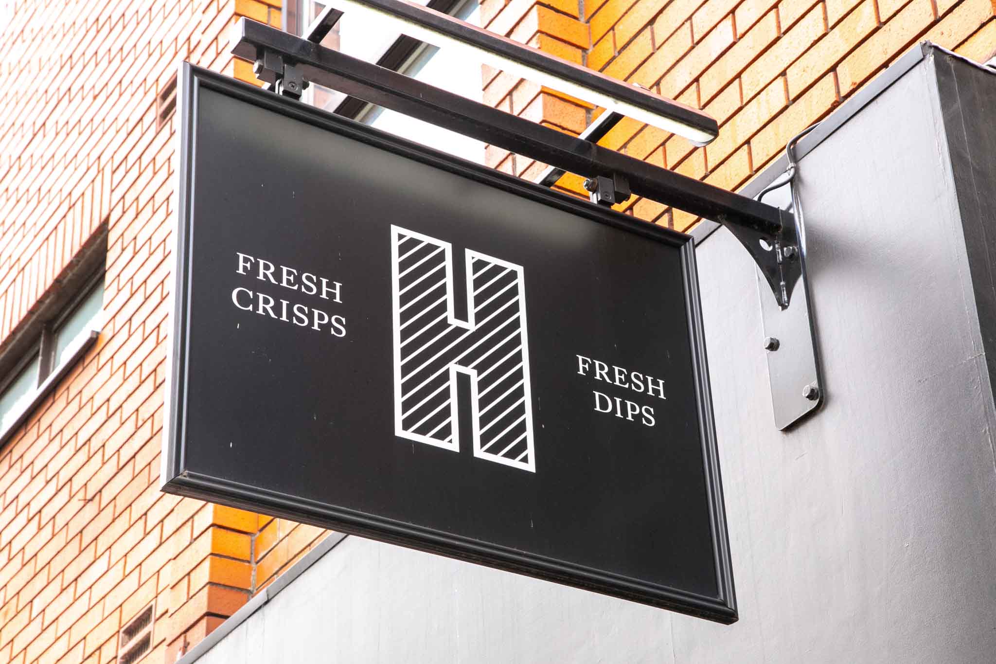
Hipchips are the champion in the Soho brand identity category. A strong brand stands out in a densely crowded marketplace and that’s what Hipchips do in Soho. 🙂 The use of all branding elements such as logo, colours, patterns, web design, photography or interior design is brilliant. Their voice and tone sets out a strong character for their brand. It makes up a perfect holistic branding which customers trust. It even allowed them to partner with Sainsbury’s!
”Design differentiates and embodies the intagibles - emotion, context, and essence - that matter most to consumers.
Moira CullenVP, Global Beverege Design, PepsiCo
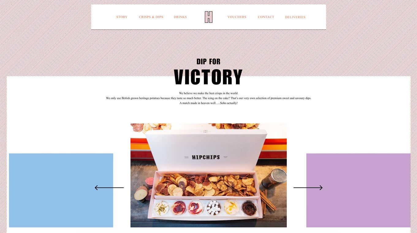
Their website also rocks! It gives a flare of modern, hip and fun look. The use of patterns, colours and overlapping text makes it a top of the line, creative web design.
Bravo!
So what do you think about those brands? Which is your favourite Soho brand identity? Have you spotted any other interesting brands in Soho?
If you are walking by, pop in to our office on Poland Street. You are more than welcome!

Andrew began his career in web design and development in the late 1990s. His eagerness to embrace the medium saw Andrew setting up Reactive Graphics in 2004. With over 20 years plus working as a London web designer supporting a wide range of clients, Andrew’s experience in web design, web development and graphic design have helped him to build a growing business.