What is material design?
Material design is a term that was originally derived by Google in order to collectively name the new visual language that they are adopting across the Google brand. Material design is a manipulation of ‘material’ elements that fuse together minimalistic classic design, intelligent micro interactions and tailored user experiences. It is a principle that allows website content to fluidly inhabit various digital spaces. With the ability to expand, contract, layer up and stack across various different screen sizes whilst incorporating fluid animation and seamlessly shifting typographical elements, material design seems to be a great way to guarantee and future-proof the success of the ever-evolving web.
The way material design works is that it allows website content to flow in synchronisation with various screen sizes offering a user experience that is free of clutter and a menu system that is versatile and easy to navigate. Material design can take many formats, it is cleverly structured and has simple functionalities that provide the optimum ease of use.
By simplifying the web, we are not completely ridding web design of its creativity or spontaneity, we are simply creating an accessible online community that can be sustained and evolve alongside technological advances. This means creating a product that can be utilised without sound, colour and all other eventualities covered so that it can be accessed by anyone, regardless of ability.
By cutting out the unnecessary we are mostly ensuring that web design as a whole will become more intuitive and simplistic. But despite that we are expecting websites to become even more intelligent with things like micro-interactions and user-orientated navigation becoming a standard requirement, particularly for the new ‘tech-savvy’ generation of web users.
What Google say…
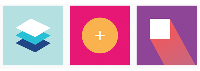
‘We challenged ourselves to create a visual language for our users that synthesizes the classic principles of good design with the innovation and possibility of technology and science.’ Here they show the positibilities of interactivity within the simplicity of material design
Some awesome examples of ‘material’ inspired web design
Google are the giants of innovation and as soon as they begin to run with idea, designers and developers are usually chasing after them to latch on for the ride.
When a design technique has been created by such a massive corporation like Google, it is likely that it has been tried, tested and put through the paces before even catch wind of it. Although material design (by Google’s own admission) is still evolving, it is clear that the roots are probably pretty solid and the idea seed that was planted earlier this year, is already beginning to blossom.
We have seen so many awesome designs all over the web that take inspiration from this design concept and here are some of our favourites.
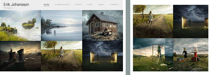
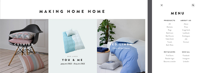
Erik Johansson – Photographer
This grid-based design template is perfect for displaying this artists eclectic portfolio. The images speak for themselves and the roll-over highlighting text doesn’t steal too much of the limelight.
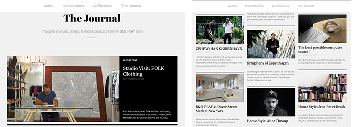
The Journal – Bang & Olufsen
This simple grid design incorporates sections of information clearly displayed in a structure that is very clean and stylish.
Compliments
This modular design, really ‘compliments’ the products that the company offer. With lots of white space and images filling each section, the products get to speak for themselves without too much distraction.
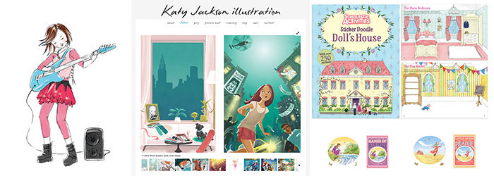
Katy Jackson – Illustration
For Katy Jacksons website we designed a very simple, grid style layout that would showcase her original illustrations beautifully. Her work is often used in children’s books, so therefore the portfolio page was designed to use a structure that had a ‘story book’ vibe.
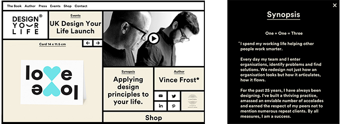
Design Your Life
This trendy layout appears very simple initially however the grid based design reveals hidden info when you click on one of the cards. Meaning that you have all of the things that you need pretty much in one page and it is quite fun trying to find it.
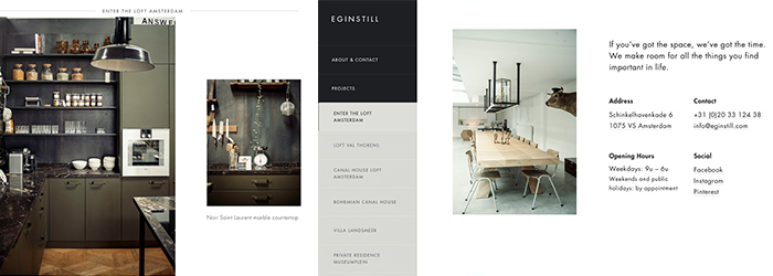
Eginstill
Eginstill display there work in quite a quirky manner, with the ‘modules’ appearing to be floating within a parallax environment. The structure provides clarity within the fluid space.
What are the components of material design?
The components of material design are rather simple. Inspired by the tangible qualities of using paper and pen, material design is technologically advanced with the simplicity and methodical thinking of writing words on a page. ‘Material’ has varying height and width dimensions and a consistent thickness of 1dp much like a piece of paper. Although ‘Material’ has a consistent depth at the moment Google are aware that it is a work in progress and subject to change over time as our knowledge of the format increases.
Other components of material design include:
Visual Cues
Material Design works with a series of different visual cues, for example a ‘dog-eared’ page corner signifies that you can flip/turn the page or rotate the current content to reveal something else. Other visual cues include life-life shadows and hover buttons to help you to navigate the page.
Flexibility
Material can morph into various different shapes and it can shrink and grow along its own plane. Material cannot however exist within a space where other material already exists. This is just one of the ‘realistic’ elements of material design and further proof that it has been built within the premise of tactile reality.
Interactivity
Users can move, re-order, manipulate and reveal content within material design. With multiple layers and objects within one place the design works intuitively allowing you to see what’s available and helps to narrow down your search requirements.
Bold Graphics
The bold graphics in material design, offer a direct sense of purpose and don’t allow much room for misinterpretation. The flexibility of the bold designs allow for greater quality across different screen resolutions, devices and platforms.
Movement and Direction
As mentioned material design can change shape and adapt to fit various screens. Material can also be manipulated in such a way where the users is allowed full control over the navigation and the way content is displayed.
The material design 3D Environment
The material design environment is a 3D space where by all objects within that space have width(x), height(y) and depth(z). The plane of the device that the material design occupies is perfectly aligned with the z-axis of the objects which is the plane that is visually extended towards the user. This z-axis in material web design allows things to be layered multiple times and can be emphasised by different uses of light and shade on objects. Light and shade is created naturally with material in material design. This is usually revealed when a user begins manipulating the information on screen.
The 3D environment associated with material design has specific guidelines to follow which ensure that the ‘material’ or ‘cards’ have a realistic quality within the screen. If buttons are floating above ‘material’ then they would cast realistic shadows within the 3D space to help the user to understand the parameters of each component that they are viewing. This is the ultimate in intuitive design by allowing the digital objects to be manipulated on the z-axis and therefore allowing a depth much greater than the device screen itself.
Grid-based/Modular design
Grid-based or modular design offers a strong structural and visual demonstration of the flexibility of material design. Think Instagram, google+ Linkedin all of these extremely popular social media sites. They all use grid-based designs that work extremely well for displaying images and content. This design technique is also used across many user interfaces such as
website admin areas, mail inboxes and movie listings.
Card Design
Over the last few years web design has had to mould and adapt to new technologies and the expectations of new very savvy web users – who expect to receive info quickly and with minimal effort required. Material design came in to play with the evolution of responsive website design and the popularity of app design. Card-based design fuses the two. The agility of responsive design paired with the simplicity and personalisation of app design. These structures lend themselves to ‘informative’ and ‘bitesize’ information cards that can be rearranged, re-ordered and viewed easily across multiple devices. Much like apps, the cards can be filtered as per the users interests and searches. Card design is proving very popular because of its simplicity, adaptability and because it is familiar to users due to is similarity to the most popular social networking website.
If you would like reactive to design a ‘Material’ based website for you, then please do get in touch. We are excited for the possibilities of this new structured way of working and believe that it will advance quite quickly. If you have any comments about this, or any of our other blogs then please let us know.

Andrew began his career in web design and development in the late 1990s. His eagerness to embrace the medium saw Andrew setting up Reactive Graphics in 2004. With over 20 years plus working as a London web designer supporting a wide range of clients, Andrew’s experience in web design, web development and graphic design have helped him to build a growing business.