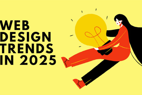
Web design trends are fickle things these days. With fads coming and going so quickly it is becoming increasingly difficult to keep up and even more difficult to get yourself ahead of the masses. Being unique is a fleeting thing, as once your web design idea is ‘live’ it is available for the whole world to view, copy, steal and sometimes violate for their own requirements and benefits.
It seems there is always a design originator, an innovator, someone who is brave enough to step out on a ledge. Then we have the design duplicators, who copy the originators work word for word and make no effort to disguise it. We then have the designers who are inspired by the originators, who mix it up and reimagine the design ideas and make them their own. Then the cycle begins again.
This is why more often than not the innovative design techniques that are adopted by every man and his dog are the ones that have been tried and tested and refined by the cyclical community vibe of web design.
But it is important to know that just coz it’s trendy, doesn’t mean it’s going to suit you.
The top 5 web design trends NOW
1. Hover States
Hover states are a clever navigational tool, which highlight areas on a webpage that have further functionality actions. This can be, for example, a button that clicks through to another page, or a slider that switches between images or select tool which reveals hidden information. The hover states can be used to create a surface of simplicity, that allows you to incorporate additional information without cluttering the website at first glance.
Hover states as a general idea, are currently one of the top trends of web design and can be seen across many existing websites. They are being implemented across all devices now, which means that the hover state is not only activated by the movement of a mouse, but as the integration of browsers on devices becomes increasingly intelligent and responsive, hover states are also able to be activated by pressure on touch screen devices. They are being cleverly implemented in new ways to enhance the user experience and make navigation simpler and more universal.
Hover states are one of the most simple, yet effect ways to streamline the amount of information that we see. For a once controversial and somewhat misleading navigational technique, the humble hover state is now universally recognised on the web and is implemented in websites, apps and across UI’s.
2. UI / UX Patterns
The thing with patterns is that we as humans are intrinsically drawn to them. People can seek out patterns everywhere and we will migrate towards them if they make us feel more comfortable.
UI and UX patterns are built around this same intuitive feeling of comfortableness and of course logical sense. The web relies on human interactivity in order to fuel it, nurture it and utilise its full potential, this is why one of the core strengths of a usable website is rooted primarily in user navigation.
Web design and development at present relies heavily on user experience heat maps in order to improve and advance their UI/UX layouts. By understanding how people recognise patterns, it seems we are coming up with a universal web, which is accessible by everyone. Although, UI/UX Patterns being listed as a ‘trend’ is quite a general point, it is still one that is causing interest and is being recognised as a fail-safe way to ensure users can find their way around your website.
3. Email Sign-up/ Account Registration Pop-Ups
As the web becomes more and more saturated it seems that one fashionable way for businesses to secure mailing lists, and get people to sign up to their promotions etc, is through pop-up email sign ups. Some of these pop-up are cleverly (and exceedingly annoyingly) designed so that the content you were browsing is no longer visible until you actively offer your info, or find a way to hide the lightbox (which is more often than not, easier said than done.)
The email sign-ups and account registration pop ups are always offering the user a positive slogan to draw them in. Like ‘Hey, you’re awesome – so let us be awesome together.’ Does this really make people want to sign up?
Let’s be honest, over the last decade, pop-ups have been the plague of the web design world – usually spammy, inappropriate and totally spoiling the design we have painstakingly developed. But as we have refined the web as a whole, pop-ups have become quite a good way of gaining traffic.
It seems to be all about the timing here. So if someone has navigated through a whole blog post then it could be appropriate to have a pop up saying ‘Sign up to read more posts like this…’ as you know they are genuinely interested. If you append the pop-up too early you risk alienating the user, and losing them forever.
It has also been proven that for websites that offer the opportunity to sign up, without a pop-up, although their mailing list is shorter, the engagement of these users is much higher. Despite all this, pop-ups are becoming more common, so expect to see them coming your way more often. Not only that, but these pop-ups are set to make reference to your most common search results and navigation habits – as a bid to create a bespoke user experience for all – either that or a complete invasion of privacy.
4. Long Parallax Scroll
Parallax web design is something that has been at the forefront of the design world throughout 2015. The fluidity, depth and space created within parallax design is well suited to most business websites and has the flexibility to be adapted to suit. The long scroll parallax sites are different in the way that they incorporate all of the sites material in one continuous flow.
This is a great technique to allow web designers and developers to experiment with new ways of navigating content and alternative ways to flow through information.
The long scroll has made space for technique collaborations like, modular card based design along with visual story telling which results in a professional, direct website with personality.
By incorporating all of the website content into one single scroll does however cause issues with load time and site speed in general, however this hasn’t stopped many designers jumping on the band wagon.
5. Hero Images
Hero images are generally large-scale images that appear on the homepage of the website. The context of the photography usually evoke a sense of power and awe often giving websites that real ‘wow’ factor on first glance.
With impressive photography becoming much more of an accessible skill and with the stock photo world increasing massively, there seems to be more opportunity for business to get their hands on impressive photos that can showcase their business.
Unfortunately it seems that a lot of designers do not however consider the relevance of these hero images in respect to the content of the website. This is why sometimes the hero images seem to overpower the content and purpose of the website. So this is why, like any trend; you should only follow the crowd if it works for you, otherwise it is an irrelevant effort – which will have little or no impact or benefit to your business.
If you would like to discuss ways in which we could improve or update your website – with or without the influence of these trends – then please get in touch.
We would be more than happy to discuss future project ideas with you and offer any guidance to make your company stand tall on the web.

Andrew began his career in web design and development in the late 1990s. His eagerness to embrace the medium saw Andrew setting up Reactive Graphics in 2004. With over 20 years plus working as a London web designer supporting a wide range of clients, Andrew’s experience in web design, web development and graphic design have helped him to build a growing business.