CSS3 is the latest standard for CSS. There are many advantages of CSS3 although web developers should remember that it is only supported in modern browsers.
The new developments in CSS3 include:
- Selectors
- Box Model
- Backgrounds and Borders
- Text Effects
- 2D/3D Transformations
- Animations
- Multiple Column Layout
- User Interface
We are going to concentrate on CSS Transformations which allow you to render vector modifications to HTML elements on your page.
Skew
With the skew() method, the element turns in a given angle, depending on the parameters given for the horizontal (X-axis) and the vertical (Y-axis) lines:
Please see the code for this example pasted below:
border: 1px #000 solid;
background: #eee;
width: 300px;
padding: 10px;
margin: 20px;
-webkit-transform:skew(30deg, 0);
-moz-transform:skew(30deg, 0);
-o-transform:skew(30deg, 0);
-ms-transform:skew(30deg, 0);
transform:skew(30deg, 0);
}
Scale
With the scale() method, the element increases or decreases the size, depending on the parameters given for the width (X-axis) and the height (Y-axis):
Please see the code for this example pasted below:
.grid ul { list-style: none; }
.grid a {
width: 100px;
height: 60px;
font-size: 32px;
border: 1px #900 solid;
margin: 0 20px 20px 0;
text-align: center;
padding-top: 40px;
float: left;
z-index: 1;
position: relative;
text-decoration: none;
color: #900;
-webkit-transform:scale(1);
-moz-transform:scale(1);
-o-transform:scale(1);
-ms-transform:scale(1);
transform:scale(1);
}
.grid a:hover {
border: 1px #000 solid;
background: #eee;
z-index: 2;
-webkit-transform:scale(1.5);
-moz-transform:scale(1.5);
-o-transform:scale(1.5);
-ms-transform:scale(1.5);
transform:scale(1.5);
}
Rotate
With the rotate() method, the element rotates clockwise at a given degree. Negative values are allowed and rotates the element counter-clockwise.
Web Design London
Web Development London
Web Developer London
Web Designers London
Please see the code for this example pasted below:
-webkit-transform:rotate(-90deg);
-moz-transform:rotate(-90deg);
-o-transform:rotate(-90deg);
-ms-transform:rotate(-90deg);
transform:rotate(-90deg);
}
.badge {
-webkit-transform:rotate(-45deg);
-moz-transform:rotate(-45deg);
-o-transform:rotate(-45deg);
-ms-transform:rotate(-45deg);
transform:rotate(-45deg);
display: inline-block;
position: absolute;
top: 16px;
left: -27px;
padding: 4px 20px;
background: #e2007a;
color: #fff;
font-weight: bold;
font-family: “Arial”, sans-serif;
font-size: 10px;
} .box {
height: 300px;
width: 220px;
border: 1px #e2007a solid;
position: relative;
overflow: hidden;
padding: 60px;
margin-left: 23px;
}
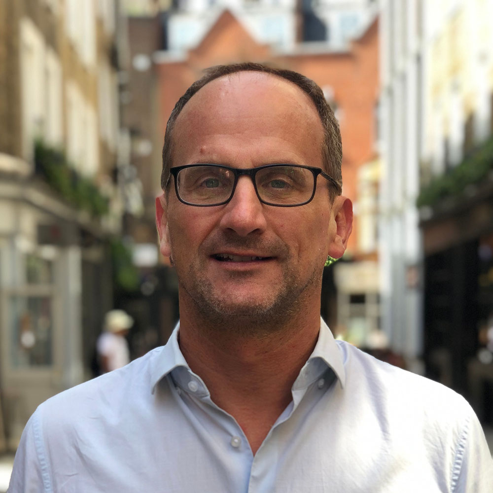
Andrew began his career in web design and development in the late 1990s. His eagerness to embrace the medium saw Andrew setting up Reactive Graphics in 2004. With over 20 years plus working as a London web designer supporting a wide range of clients, Andrew’s experience in web design, web development and graphic design have helped him to build a growing business.