If you run a business, then the likelihood that you use email marketing is probably quite high.
Billions of businesses send newsletters every day, so how can you ensure yours is getting read? Aside from the content, design is a very important aspect of your email newsletter.
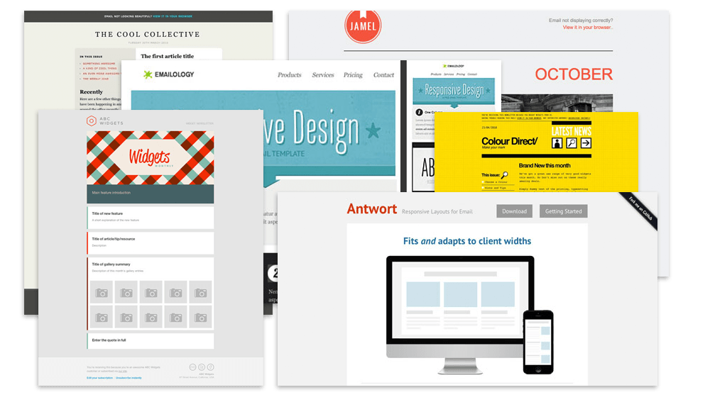
There are thousands of free templates online that can make it so easy for you to send a newsletter, but you really should take the time and effort to customise a template or better yet, create one from scratch. There’s nothing worse than a blocky template that looks like hundreds of others.
Remember that your newsletter is an extension of your website and represents your work and who you are. Yes, getting started with a blank canvas can be daunting but it is actually very easy to create an attractive, engaging and responsive email newsletter.
[box style=”2″]Before you start thinking about your newsletter design, we recommend you read our Email Marketing Guide for further information on choosing your email format, creating the email, launching your campaign and charting your success.[/box]Once you’ve figured out the ins and outs of your e-newsletter, you can then start thinking more about the design. Here are some of the most important things to consider within your email campaign.
The Overall Look →
The Subject Line →
The Header →
The Footer →
The Use of Images →
The Overall Look
Background
Taking into consideration your target audience, how many of these readers will view your email on a mobile or tablet device? Probably more than half – so we recommend bearing this in mind when choosing between an image, a simple colour or no background at all. An image background could also distract from other elements such as your header or opening picture, so you don’t want one that’s too busy.
Colour
Think about your readers and what they expect to see from you. Maybe your audience like bright and bold colours or maybe they like something a little more clean and sophisticated. If you have a colour scheme on your website or in your logo, use the same colours for your newsletter. This will instantly help readers establish a link between your emails and your company.
Fonts
Unfortunately you cannot simply download a fancy font that you think looks perfect in your email, because it’s more than likely not universally supported. With HTML emails, there are limitations. It’s best to try and stick with simple cross-platform fonts. MailChimp have put together a great guide for choosing your email fonts.
Here are some of our top recommendations: Arial, Courier, Century Gothic, Verdana, Times New Roman and Helvetica to name but a few.
The Subject Line
The subject line of your email is potentially the most important part, and quite often the tricky little one-liner most people get stuck on!
Make it personal
We love emails that start with our name. Yes, we all know that they haven’t personally written to us, but it does add that little something extra. Alternatively, if you’re targeting a specific location, add that instead! For example, “Reactive, see what’s happening in Fulham this weekend” is great because it has our name and also our location. It’s also intriguing enough for us to think “Ooh.. I wonder what is happening in Fulham this weekend!”
Keep them short
When you receive an email, the first thing you see is the subject. If you consider how many people will be opening your email on mobile or tablet, they may only see half a subject line so it’s always best to try and keep them short and to the point.
Grab your reader
Having an opening subject line that pulls your reader in is very important. Is it a sale, a promotion, an event, something free? Put it in. Grabbing your reader is great, but so is maintaining their interest. If you send one email once a month, be sure to change up the subject line, otherwise they may think the content is the same as before. If it’s something simple like “Our Monthly Newsletter”, add in the month so your readers know it’s fresh.
The Header
Your header is the part of your newsletter that’s right at the top. It should include at least your company logo but you may also want to add contact details or your social media links if you have any (and if you don’t… read why you should here).
It’s important to spend time working on your header and to be happy with it, as this will be the same for every newsletter you send and it will also be one of the first things your reader will see. You want it to be identifiable and for your readers to feel like they’re being handed a treat as opposed to more spam.
The Footer
Like your header, your footer also plays a crucial role in your newsletter design. As with your website, the footer should be the hub of any extra information your readers may need. For example, your address and contact details, links to important pages on your website, social media share links and lastly but most importantly – your unsubscribe link.
It’s the law that your newsletters must have an unsubscribe link and there’s absolutely no reason for you to try and disguise this, as that’s very bad form and not the picture you want to put across about your company. It doesn’t matter if people unsubscribe, what’s most important is sending an email campaign to someone who is going to enjoy it rather than someone who is going to trash it.
The Use of Images
People love pictures – it’s true. But that doesn’t mean you need to fill up your newsletter with them.
A great way to catch your readers’ attention is to go big – have bold images that make a statement. If you have an abundance of small pictures, this can lead to a messy looking email and, like the background, distract from other elements.
Pictures in your newsletter are there to accompany your content and should never be used to display important content. There’s a chance that some of your readers may have images disabled, so having content placed in an image is useless to them. Remember to always add alt text to your images, this is alternative text that will appear in place of your image should your readers choose not to load them.
Need help?
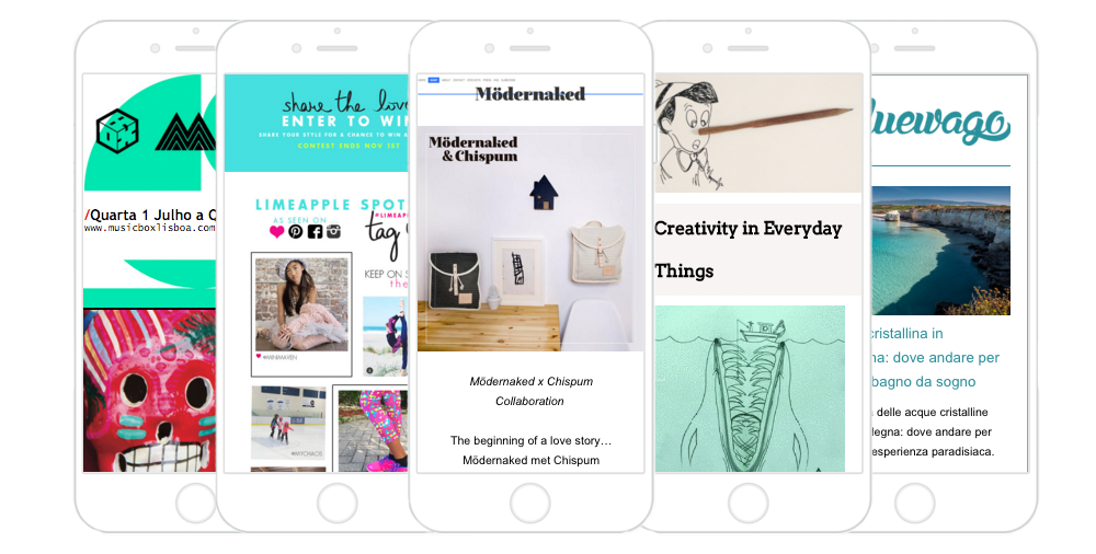
One more important thing you should consider when creating your e-newsletter is whether or not it is responsive. If your email newsletter isn’t responsive then it’s likely not going to look great when your readers are on the go and reading from their phones or tablets. This can be tricky and leads more into the creation of the newsletter as opposed to just the design.
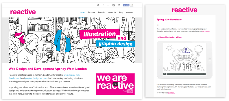
Even if you’ve read this and you still feel a little daunted by the prospect of creating and designing your email newsletters, don’t worry! Reactive Graphics have years of experience designing and building responsive HTML emails and we are more than happy to help.
Why not get in touch with us or even pop in for a chat in our on-site cafe.


